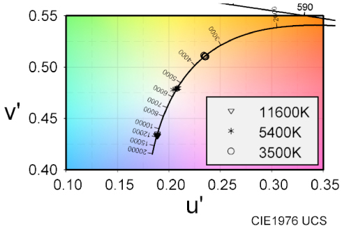
In recent years, the effects of light pollution have become significant, and the need for image reproduction of a faithful and preferred starry sky has increased. Previous studies have analyzed the relationships between the luminance, size, and color temperature of stars and the fidelity and nature of their appearance, as well as color perception. This study examines the depth perception of stars. We consider starry sky images as a set of “small-field light sources” that can be viewed as point light sources with minimal viewing angles. Our goal was to experimentally elucidate the cues for depth perception. In our experiments, observers viewed two points of different sizes, luminances, and color temperatures and selected the one perceived to be in front to confirm the relationship between the three depth cues of retinal image; size, light attenuation, and color, and their association with depth perception. Results confirmed that retinal image size and light attenuation were relevant for a small-field light source. Results also suggest that the interaction between retinal image size and light attenuation may be explained by retinal illuminance. However, the effect of color was small, and the point with higher saturation was more likely to be perceived in front, when the hue was close to that of the point.
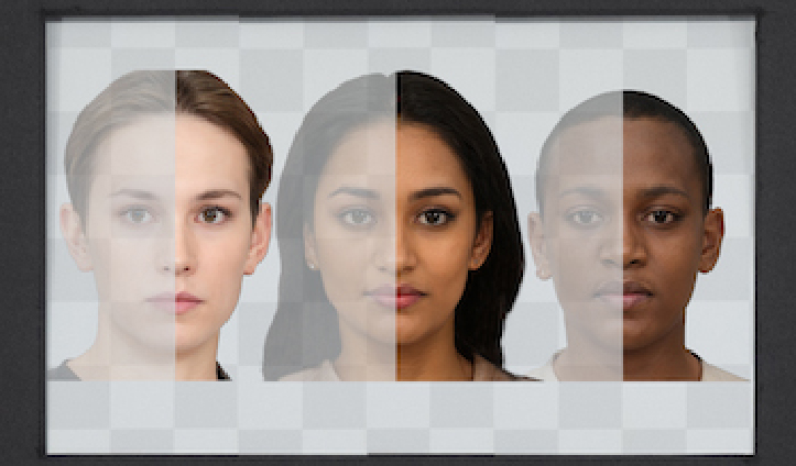
Augmented reality (AR) combines elements of the real world with additional virtual content, creating a blended viewing environment. Optical see-through AR (OST-AR) accomplishes this by using a transparent beam splitter to overlay virtual elements over a user’s view of the real world. However, the inherent see-through nature of OST-AR carries challenges for color appearance, especially around the appearance of darker and less chromatic objects. When displaying human faces—a promising application of AR technology—these challenges disproportionately affect darker skin tones, making them appear more transparent than lighter skin tones. Still, some transparency in the rendered object may not be entirely negative; people’s evaluations of transparency when interacting with other humans in AR-mediated modalities are not yet fully understood. In this work, two psychophysical experiments were conducted to assess how people evaluate OST-AR transparency across several characteristics including different skin tones, object types, lighting conditions, and display types. The results provide a scale of perceived transparency allowing comparisons to transparency for conventional emissive displays. The results also demonstrate how AR transparency impacts perceptions of object preference and fit within the environment. These results reveal several areas with need for further attention, particularly regarding darker skin tones, lighter ambient lighting, and displaying human faces more generally. This work may be useful in guiding the development of OST-AR technology, and emphasizes the importance of AR design goals, perception of human faces, and optimizing visual appearance in extended reality systems.
The area of uncertainty visualization attempts to determine the impact of alternative representations and evaluate their effectiveness in decision-making. Uncertainties are often an integral part of data, and model predictions often contain a significant amount of uncertain information. In this study, we explore a novel idea for a visualization to present data uncertainty using simulated chromatic aberration (CA). To produce uncertain data to visualize, we first utilized existing machine learning models to generate predictive results using public health data. We then visualize the data itself and the associated uncertainties with artificially spatially separated color channels, and the user perception of this CA representation is evaluated in a comparative user study. From quantitative analysis, it is observed that users are able to identify targets with the CA method more accurately than the comparator state-of-the-art approach. In addition, the speed of target identification was significantly faster in CA as compared to the alternative, but the subjective preferences of users do not vary significantly between the two.
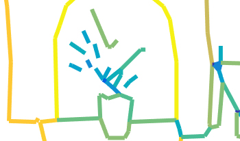
Individuals with aphantasia report either absent or dramatically reduced mental imagery compared to control participants. The image of an object or scene produced “in the mind’s eye” lacks detail for these individuals or is simply not there. Line drawings made from memory are a straightforward way to assess the contents of visual imagery for aphantasic individuals relative to controls. Prior analyses of the Aphantasia Drawing Database have revealed specific impairments in visual memory for objects, but relatively spared scene accuracy, suggesting that the encoding of visual scenes in aphantasia is more complex than an overall reduction in imagery might suggest. Here, we examined the mid-level image statistics of line drawings from this database to determine how simpler visual feature distributions differed as a function of aphantasia and reliance on image recall rather than direct observation during image reproduction. We find clear differences across several different sets of mid-level properties as a function of aphantasia, which offers further characterization of the nature of visual encoding in this condition.
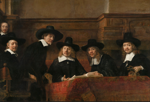
Pictorial research can rely on computational or human annotations. Computational annotations offer scalability, facilitating so-called distant-viewing studies. On the other hand, human annotations provide insights into individual differences, judgments of subjective nature. In this study, we demonstrate the difference in objective and subjective human annotations in two pictorial research studies: one focusing on Avercamp’s perspective choices and the other on Rembrandt’s compositional choices. In the first experiment, we investigated perspective handling by the Dutch painter Hendrick Avercamp. Using visual annotations of human figures and horizons, we could reconstruct the virtual viewpoint from where Avercamp depicted his landscapes. Results revealed an interesting trend: with increasing age, Avercamp lowered his viewpoint. In the second experiment, we studied the compositional choice that Rembrandt van Rijn made in Syndics of the Drapers’ Guild. Based on imaging studies it is known that Rembrandt doubted where to place the servant, and we let 100 annotators make the same choice. Subjective data was in line with evidence from imaging studies. Aside from having their own merit, the two experiments demonstrate two distinctive ways of performing pictorial research, one that concerns the picture alone (objective) and one that concerns the relation between the picture and the viewer (subjective).
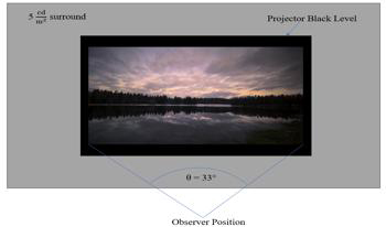
Modern production and distribution workflows have allowed for high dynamic range (HDR) imagery to become widespread. It has made a positive impact in the creative industry and improved image quality on consumer devices. Akin to the dynamics of loudness in audio, it is predicted that the increased luminance range allowed by HDR ecosystems could introduce unintended, high-magnitude changes. These luminance changes could occur at program transitions, advertisement insertions, and channel change operations. In this article, we present findings from a psychophysical experiment conducted to evaluate three components of HDR luminance changes: the magnitude of the change, the direction of the change (darker or brighter), and the adaptation time. Results confirm that all three components exert significant influence. We find that increasing either the magnitude of the luminance or the adaptation time results in more discomfort at the unintended transition. We find that transitioning from brighter to darker stimuli has a non-linear relationship with adaptation time, falling off steeply with very short durations.