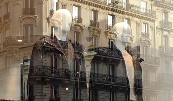
Optical see-through Augmented Reality (OST-AR) is a developing technology with exciting applications including medicine, industry, education, and entertainment. OST-AR creates a mix of virtual and real using an optical combiner that blends images and graphics with the real-world environment. Such an overlay of visual information is simultaneously futuristic and familiar: like the sci-fi navigation and communication interfaces in movies, but also much like banal reflections in glass windows. OSTAR’s transparent displays cause background bleed-through, which distorts color and contrast, yet virtual content is usually easily understandable. Perceptual scission, or the cognitive separation of layers, is an important mechanism, influenced by transparency, depth, parallax, and more, that helps us see what is real and what is virtual. In examples from Pepper’s Ghost, veiling luminance, mixed material modes, window shopping, and today’s OST-AR systems, transparency and scission provide surprising – and ordinary – results. Ongoing psychophysical research is addressing perceived characteristics of color, material, and images in OST-AR, testing and harnessing the perceptual effects of transparency and scission. Results help both understand the visual mechanisms and improve tomorrow’s AR systems.
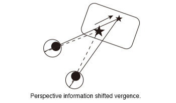
The vergence of subjects was measured while they observed 360-degree images of a virtual reality (VR) goggle. In our previous experiment, we observed a shift in vergence in response to the perspective information presented in 360-degree images when static targets were displayed within them. The aim of this study was to investigate whether a moving target that an observer was gazing at could also guide his vergence. We measured vergence when subjects viewed moving targets in 360-degree images. In the experiment, the subjects were instructed to gaze at the ball displayed in the 360-degree images while wearing the VR goggle. Two different paths were generated for the ball. One of the paths was the moving path that approached the subjects from a distance (Near path). The second path was the moving path at a distance from the subjects (Distant path). Two conditions were set regarding the moving distance (Short and Long). The moving distance of the left ball in the long distance condition was a factor of two greater than that in the short distance condition. These factors were combined to created four conditions (Near Short, Near Long, Distant Short and Distant Long). And two different movement time (5s and 10s) were designated for the movement of the ball only in the short distance conditions. The moving time of the long distance condition was always 10s. In total, six types of conditions were created. The results of the experiment demonstrated that the vergence was larger when the ball was in close proximity to the subjects than when it was at a distance. That was that the perspective information of 360-degree images shifted the subjects’ vergence. This suggests that the perspective information of the images provided observers with high-quality depth information that guided their vergence toward the target position. Furthermore, this effect was observed not only for static targets, but also for moving targets.
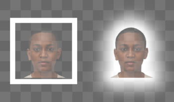
Ubiquitous throughout the history of photography, white borders on photo prints and vintage Polaroids remain useful as new technologies including augmented reality emerge for general use. In contemporary optical see-through augmented reality (OST-AR) displays, physical transparency limits the visibility of dark stimuli. However, recent research shows that simple image manipulations, white borders and outer glows, have a strong visual effect, making dark objects appear darker and more opaque. In this work, the practical value of known, inter-related effects including lightness induction, glare illusion, Cornsweet illusion, and simultaneous contrast are explored. The results show promising improvements to visibility and visual quality in future OST-AR interfaces.
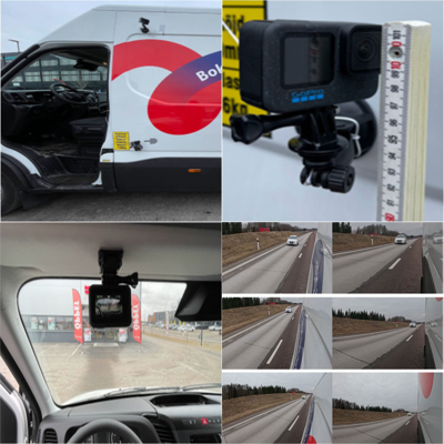
This study investigates how different camera perspectives presented in digital rear-view mirrors in vehicles, also known as Camera Monitor Systems, impact drivers’ distance judgment and decision-making in dynamic driving scenarios. The study examines (1) the effects of field of view and (2) camera height on drivers' ability to judge distances to rearward vehicles and to select safe gaps in potentially hazardous situations. A controlled lab-based video experiment was conducted, involving 27 participants who performed distance estimations and last safe gap selections using a simulated side-view mirror display. Participants viewed prerecorded driving scenarios with varying combinations of field of view (40°, 76°, 112°) and camera heights (1 meter, 2.3 meter). No significant effects were found for camera height, but wider field of views led to more accurate distance estimations. However, the use of a wider field of view also increased the risk of potentially dangerous overestimations of distance, as evidenced by the last safe gap results. This suggests that a wider field of view leads to the selection of smaller and potentially risky gaps. Conversely, narrow field of views resulted in underestimations of distance, potentially leading to overly cautious and less efficient driving decisions. These findings inform Camera Monitor Systems design guidelines on how to improve driver perception and road safety, to reduce accidents from vehicle distance misjudgments.
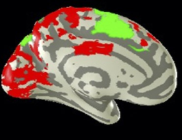
Does the functional organization of the brain connectivity of the visual motion areas depend on the loss of form vision? We report large-scale reorganization in low vision individuals following a unique form of non-visual spatial navigation training. Participants completed five sessions of the haptic Cognitive-Kinesthetic Memory-Drawing Training with raised-line tactile navigational maps. Pre- and post-training, whole-brain fMRI scans were conducted while participants (i) haptically explored and memorized raised-line maps and then (ii) drew the maps from haptic memory while blindfolded. Granger Causal connectivity was assessed across the network of brain areas activated during these tasks. Before training, the participants’ hMT+ connectivity in low vision was predominantly top-down from the sensorimotor pre- and post-central cortices, supplementary motor areas, and insular cortices, with only weak outputs to occipital and cingulate cortex. Large-scale reorganization of the connectivity strengthen the pre-top-down inputs to hMT+, but also dramatically extended its outputs throughout the occipital and parietal cortices, especially from right hMT+. These results are consistent with the fact that low vision individuals have a lifetime of visual inputs to hMT+, and it may become one of the principal perceptual inputs as their form vision is reduced, making it a key source of navigational information during the unfolding of the drawing trajectory. When forced to perform the spatiomotor task of haptic drawing without vision, however, hMT+ becomes a key conduit for signals from the executive control regions of prefrontal cortex to the medial navigational network and occipito-parieto-temporal spatial representation regions. These findings uncover novel forms of brain reorganization that have strong implications for the principles of rapid learning-driven neuroplasticity.
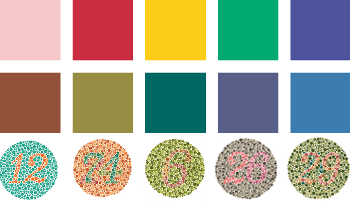
The topic of how colour emotion and colour vision deficiencies interact with each other is barely researched, and existing studies have contradicting results. This study will investigate how these two topics interact with each other and try to prove that colour emotion is affected by colour vision deficiencies. This was done through an online colour-emotion associations questionnaire in two phases. The first phase had 60 participants, of which 15 reported having colour vision deficiencies and the second had 18 participants, of which 8 were identified to have colour vision deficiencies. Within the questionnaires, the participants selected emotions from the Geneva Emotion Wheel which they associated with 12 colour patches or 4 colour terms and then rated how strong this association is from 1 to 5. Results show indications that colour vision deficiencies lead to reduced strength of colour-emotion associations and a higher number of people who do not associate emotions with certain or all colours. Additionally, it was found that the colour vision deficiency group associates fewer emotions with each colour than the normal vision group and differences in specific colour-emotion associations were found between the two groups.
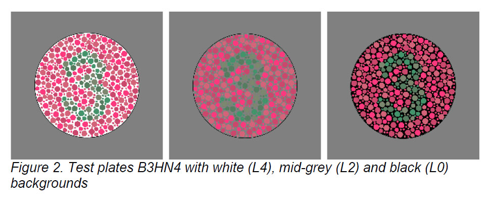
Pseudo-isochromatic plates with varying background lightness were used in a display-based colour vision experiment. As in previous work, the background was found to have a small effect on the ability of observers to identify the patterns on the plates. The time taken to recognize the patterns was significantly affected for both colour-normal and colour vision deficient observers, with darker backgrounds associated with shorter response times and white backgrounds having the longest response times, suggesting a greater degree of task difficulty. Possible reasons for the results when test plates were presented with a white background are suggested, including lower apparent colourfulness and greater difficulty in visual integration of the figure.
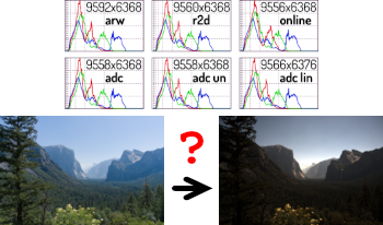
Image data is now commonly represented in any of a myriad of file formats, from proprietary raw formats through standards like JPEG or PNG. In addition to recording pixel values, most of these formats contain metadata that defines how pixel values translate into colors and brightnesses. Unfortunately, when non-trivial computations are used to transform pixel values, it is often necessary that both the metadata and file format used be changed. For example, using a program called parsek, this tool aligns images and produces a “raw” super resolution result which has problematic shifts in color and tonality. The goal of the current work has been to understand what is causing these shifts and how they can be avoided. Toward that goal, the color and tonal metadata information representations in a variety of file formats is reviewed. The effectiveness of preserving appearance when file format is changed is then reviewed. A reference color and tonal rendering is obtained by examining specific metadata and preview renderings embedded in several file formats.
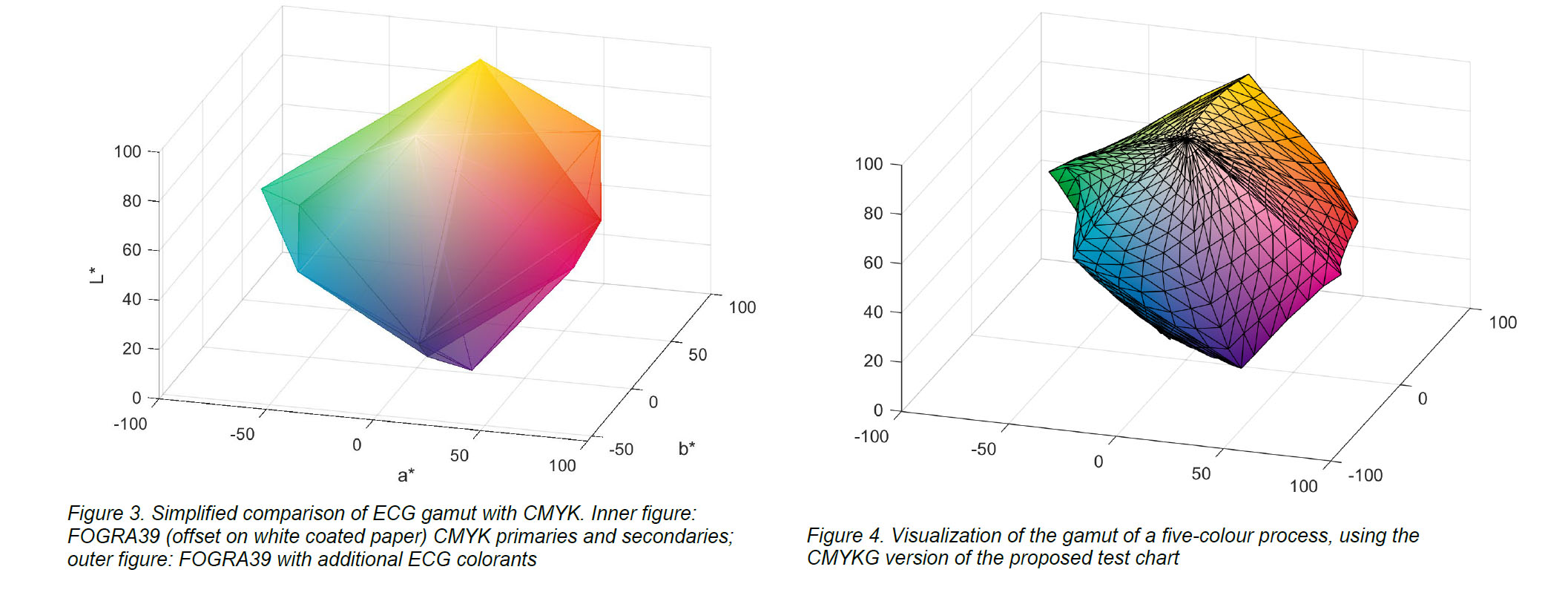
A gamut boundary test chart can be used to define the gamut of a colour reproduction system as a set of vertices and triangular faces. This makes it possible to analyse characteristics of a reproduction system gamut, such as its volume. A standard chart is currently defined only for RGB and CMYK colour spaces, but the increased adoption of extended colour gamut printing requires a different approach. Here a new test chart is proposed that extends the colour spaces to include extended-gamut printing, with up to seven colorants.

Rudd and Zemach analyzed brightness/lightness matches performed with disk/annulus stimuli under four contrast polarity conditions, in which the disk was either a luminance increment or decrement with respect to the annulus, and the annulus was either an increment or decrement with respect to the background. In all four cases, the disk brightness—measured by the luminance of a matching disk—exhibited a parabolic dependence on the annulus luminance when plotted on a log-log scale. Rudd further showed that the shape of this parabolic relationship can be influenced by instructions to match the disk’s brightness (perceived luminance), brightness contrast (perceived disk/annulus luminance ratio), or lightness (perceived reflectance) under different assumptions about the illumination. Here, I compare the results of those experiments to results of other, recent, experiments in which the match disk used to measure the target disk appearance was not surrounded by an annulus. I model the entire body of data with a neural model involving edge integration and contrast gain control in which top-down influences controlling the weights given to edges in the edge integration process act either before or after the contrast gain control stage of the model, depending on the stimulus configuration and the observer’s assumptions about the nature of the illumination.