30th Color and Imaging Conference Final Program and Index
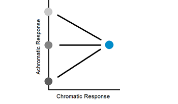
Luminance underestimates the brightness of chromatic visual stimuli. This phenomenon, known as the Helmholtz-Kohlrausch effect, is due to the different experimental methods—heterochromatic flicker photometry (luminance) and direct brightness matching (brightness)—from which these measures are derived. This paper probes the relationship between luminance and brightness through a psychophysical experiment that uses slowly oscillating visual stimuli and compares the results of such an experiment to the results of flicker photometry and direct brightness matching. The results show that the dimension of our internal color space corresponding with our achromatic response to stimuli is not a scale of brightness or lightness.
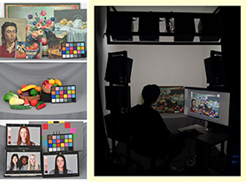
In order to reproduce the colour appearance between real scene and images on self-luminous display, this study conducted a series of psychophysical experiments using threshold method. Three types of real scenes were built up in a lighting room, including painting, fruit and vegetable, skin colour chart. Sixteen adapting conditions were designed including four CCTs (3000K, 4500K, 6500K, 8000K) and 4 luminance levels (10lux, 100lux, 500lux, 1000lux). Four displays with different sizes were studied. The result indicated that the colour appearance of real scene and the image on the display were different, especially for low CCT and luminance level. The contents of scene and size of display didn’t show a significate impact. The prediction performance of CIECAM16 was tested, and a revised formulation was proposed with high accuracy.
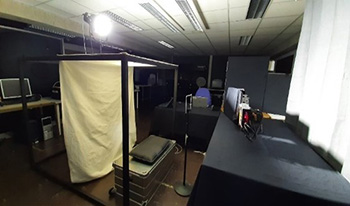
Automotive cockpits are becoming more and more digital day by day and this is evident by the increase in the number of displays inside the cockpit. With the advent of OLED displays, automotive cockpits not only have LCD but have started having mixed display technologies. A recent example of such a cockpit display is the MBUX Hyperscreen in Mercedes EQS. A general situation is most mid ranged cars from Renault includes several displays inside the cockpit. These displays are placed at different locations inside the cockpit and go through various changes in external environmental condition during day and night. A vehicle cockpit experiences a wide range of illumination change during the day, from 35 kLux in bright sunlight to a few Lux during the night. The displays are generally used in high luminance range during the day and very low luminance during the night. Traditional color difference formulae like the CIEDE76 or CIEDE2000, the latter being the current industry standard, are defined for a specific set of evaluation conditions. For the myriad of different conditions that the displays undergo inside the cockpit, there isn’t a recommended color difference formula which can be used to quantify the color difference between any two chosen displays inside the cockpit. An attempt has been made to include various real time parameters involving color difference evaluation between two displays, one of which is an LCD and other OLED. The motive of this study is to find out which color difference formula is the most representative of the perceived color difference between two mixed technology displays for a group of observers. The metric used for this the study is the CIE recommended STRESS index. The outcome of this research is to serve as a reference regarding the choice of color difference metric by display manufactures and OEM suppliers.
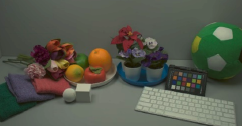
The development of various new imaging systems introduces new viewing conditions that did not exist in the past. Mixed reality systems, which capture the real environment and renders the captured image on display with virtual objects superimposed, require more immersive and realistic feeling than virtual and augmented reality systems, especially when users just put on the headsets. Therefore, the rendering shown on the display needs to be carefully adjusted to match the appearance in the real environment. In this study, we specifically focus on reproducing the overall color tone of the real environment under different ambient illumination color by shifting the white point of the display. The human observers viewed a real environment under different ambient illumination conditions, in terms of CCT and chromaticities, and evaluated the rendering of the captured scene with 44 white points. The results clearly suggested that the display white point should be adaptive to the ambient illumination color, especially when the ambient illumination had a CCT below 4000 K, to provide a good user experience.
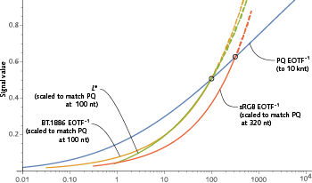
High dynamic range (HDR) technology enables a much wider range of luminances – both relative and absolute – than standard dynamic range (SDR). HDR extends black to lower levels, and white to higher levels, than SDR. HDR enables higher absolute luminance at the display to be used to portray specular highlights and direct light sources, a capability that was not available in SDR. In addition, HDR programming is mastered with wider color gamut, usually DCI P3, wider than the BT.1886 (“BT.709”) gamut of SDR. The capabilities of HDR strain the usual SDR methods of specifying color range. New methods are needed. A proposal has been made to use CIE LAB to quantify HDR gamut. We argue that CIE L* is only appropriate for applications having contrast range not exceeding 100:1, so CIELAB is not appropriate for HDR. In practice, L* cannot accurately represent lightness that significantly exceeds diffuse white – that is, L* cannot reasonably represent specular reflections and direct light sources. In brief: L* is inappropriate for HDR. We suggest using metrics based upon ST 2084/BT.2100 PQ and its associated color encoding, IC<sub>T</sub>C<sub>P</sub>.
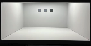
Various uniform color spaces and color appearance models were mainly developed for characterizing stimuli under a low dynamic range condition. Real scenes in daily life, however, are commonly high dynamic range (HDR), containing highlights with luminance beyond the diffuse white, whose color appearance characterization was never investigated in the past. This study was carefully designed to investigate the color appearance characterization of highlights in HDR scenes, covering extremely wide ranges of diffuse white luminance (up to 11000 cd/m<sup>2</sup>), stimulus luminance (up to 49000 cd/m<sup>2</sup>), stimulus chromaticities (reach Rec. 2020 gamut), and scene luminance contrast (up to 72045). The observers viewed two stimuli, including one highlight and one dark stimulus, in a viewing booth, and were asked to adjust the color appearance of another stimulus, so that the color differences between the adjusted stimulus to each of the other two stimuli appeared the same. The results clearly showed that none of the existing models, including the one (i.e., IC<sub>t</sub>C<sub>p</sub>) that was recently designed for HDR scenes, has a good performance. The models using a power function to characterize the non-linear compressive responses of the human visual system (i.e., CIELAB and IPT) had a slightly better performance. The findings provided some guidance for performing tone mapping and chroma/saturation adjustments, and clearly suggest the necessity to carry out further work to develop a better model for HDR scenes.
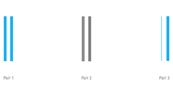
Imaging is enabled by the limitations of the human visual system, which is blind to certain physical differences. The trichromacy of human vision, e.g., allows for very different materials to be combined in a way that results in the same signals triggered by the eye’s cones. As a result a print can elicit the same response as a display, or a projection can yield colors like those in a painting. The limits of spatial acuity too allow for discrete patterns, e.g., those resulting from halftoning, to appear continuous. This paper turns its attention to the limits of color difference perception in stimuli with a very small subtense, such as thin lines or fine features of 3D objects. A first set of psychophysical data, obtained in an on-line visual experiment, indicates a dramatic relaxation of perceptibility thresholds when comparing very thin with thicker lines. The second half of the paper then presents printer imaging pipeline strategies that take advantage of these experimental findings to successfully render fine lines while taking advantage of the more limited sensitivity with which their specific colors are perceived.
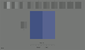
An experiment was carried out to investigate separation and CMF effects on colour-difference evaluation using display colours. In total, 1120 sample pairs around 5 CIE recommended colour centres were assessed 20 times using the grey-scale method. Sample pairs were selected to have colour-difference of 4 and 8 CIELAB units, include or exclude separation between two colours on a pair, have four fields of view (FoVs), 2º, 4º, 10º and 20º. The experiment results were used to test 3 colour-difference equations or uniform colour spaces, CIELAB, CIEDE2000 and CAM16-UCS. For separation (S) sample pairs, CIEDE2000 performed the best, followed by CAM16-UCS and CIELAB the worst. For no-separation (NS) sample pairs, all models gave worse performance than separation (S) sample pairs. The parametric formula derived earlier was verified to predict colour-difference for sample pairs to have no-separation line. Five colour matching functions (CMFs), CIE 1931, CIE 1964, CIE 2006-2º, CIE 2006-10º and 2006-4º were tested and the results indicated very small CMF effect on calculating colour-difference.
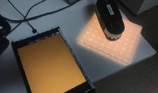
For a few years, the automotive industry has produced new cars with continuous changing display models, this by combining display sizes, forms, and technologies all together to bring new experiences to the users. In this paper we will present the color matching solution implemented for a new car display system where regular LCD display technology and LED lighting tiles are mixed together. The solution we proposed is based on accepted display model providing the transformation device RGB space to CIE XYZ independent color space and in reverse. The approach we followed choose the LCD display as reference, then transformation matrix is derived to modify the RGB LED control values. Once the color matching operation is applied, the color difference between the two display areas is greatly reduced.