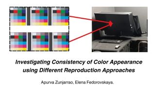
Consistency of color appearance (CCA) can be defined as an image attribute that gives a sense of identity among a set of images with different tones and colors, where the relationship between a group of colors in one embodiment is consistent with the relationship between the corresponding set of colors in another image. The consistency of color is a complex and important aspect of color reproduction. Maintaining color consistency is particularly crucial for printing and graphic communications, in general, where precise reproduction is required for scene identification, brand identity, and image quality. Characterizing consistency of color appearance in images is a challenging task because it is affected by differences in reproduction processes, viewing environments, and the output requirements. This research addressed the necessity for standardized approaches to assess and model CCA, a pivotal aspect in ensuring precise and uniform color replication across diverse media and platforms. In the experiment observers evaluated and compared the effects of gamut and gray balance variations on visual appearance of printed and displayed images and correlated the resulting CCA scale with image-based colorimetrical data. The study results showed that there is a close similarity between observed CCA for images presented under hard proofing (printed images) and soft proofing (display images) conditions. A high correlation between image-based CCA metrics for displayed and printed images when tested with observers' CCA responses, indicates the feasibility of using display images to study CCA for print production. The use of image data in the analysis offers a fruitful approach for modeling CCA.

Vividness and Depth are widely used in image and textile industry. And these scales were derived from one-dimensional scales of CIELAB L* and C*ab. However, these scales are limited to relative scales with a reference white, which makes it difficult for them to adapt to the variation in the world. This paper has introduced an experiment that focuses on assessing the wide range of luminance levels in a visual context, ranging from 10 cd/m2 to 10000 cd/m2. The experiment employed a method called magnitude estimation to gauge the perception of Vividness, Depth, Whiteness, and Blackness scales. The judgments were obtained through 10 observer x 40 NCS Sample x 4 lux level x 4 scales x 1.1 (10% repeat set), resulting in a total of 7040 assessments. This article mainly introduces the development of vividness and depth scales using combinations of relative scales, absolute scales, and the mixture scales like CAM16-UCS.

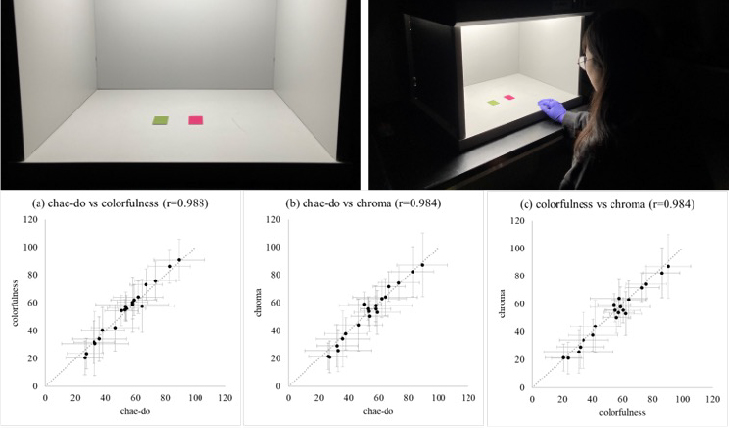
In this study, the relationships between chae-do, the commonly used Korean terminology to describe chromatic attributes, CIE definition for colorfulness, Munsell definition for chroma, Berns’ definition for CIELAB based vividness and depth are investigated. Although only the definitions were presented, without corresponding terminologies, the observers’ responses showed that chae-do is understood very similarly to the definitions of CIE colorfulness and Munsell chroma. Responses for the definitions of vividness and depth also showed high correlation with Berns’ CIELAB based vividness and depth predictions, which shows that definitions were well understood. No correlations were found between the definition of CIE colorfulness and the definition of vividness, which shows that the definition of vividness is understood differently to the definition of colorfulness. Comparing the response with color appearance model predictions, the responses showed good correlation with the predictions. Especially, colorfulness definition responses showed the highest coefficient correlation with CIELAB-based Berns’ depth prediction, implying the possibility of colorfulness predictor modification for better prediction. The findings can be further investigated to observers from other non-English speaking countries and collect meaningful cross-cultural color appearance data.

Material appearance is a perceptual phenomenon that the brain interprets from the retinal image. Though, it is not easy to analyze what features of optical images are effectively related to the stimulus inside the visual cortex. For this reason, an intuitive or heuristic approach has been taken to simulate the material appearance. The simulation results are expected to drive innovation for not only traditional craft or plastic arts industry but also more realistic picture displays on 4K/8K HDTV and Virtual Reality or Computer Graphics. Optical surface property of material is modeled by BRDF (Bidirectional Reflectance Distribution Function). Specular S and Diffusion D components are responsible for the "glossiness" and "texture" and are used to emphasize the material appearance by simply adjusting the mixing ratio. This study introduces the following two key models to emphasize the material appearance of a given image without using such measuring means as BRDF and discusses how they work individually and cooperatively. (1) α-based Dehazing model to emphasize clarity, wetness, gloss. (2) β-based Contrast model to emphasize texture, roughness.

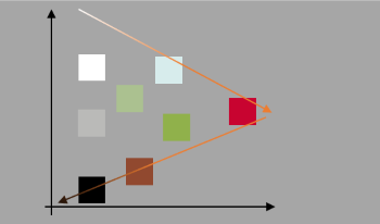
The appearance of color stimuli with luminance levels beyond the diffuse white is gaining importance due to the popularity of high dynamic range (HDR) displays. Past work on color appearance of stimuli, color appearance models, and uniform color spaces mainly focused on the stimuli with luminance levels below the diffuse white, which were produced using surface color samples or conventional standard dynamic range (SDR) displays. In this study, we focused on the perception of white appearance for stimuli with luminance beyond the diffuse white. Human observers adjusted the color appearance of a stimulus to the whitest under different adapting conditions, including a dark condition and 12 illuminated conditions. It was found that the chromaticities for producing the white appearance under the dark condition were generally similar to those under the 6500 K conditions, regardless of the adapting luminance levels. In comparison to a recent study focusing on the stimuli with luminance below the diffuse white, the perception of white under the conditions with the adapting CCT levels of 2700, 3500, and 5000 K was significantly affected by the lightness level of the stimulus, which cannot be accurately characterized by CAM02-UCS. The results can be used for reproducing white appearance for highlights in HDR scenes. Further investigations on uniform color spaces for characterizing stimuli with luminance beyond the diffuse white are urgently needed for processing and displaying HDR images.

The surface appearance in additive manufacturing (AM) has attracted attention in recent years due to its importance in evaluating the quality of 3D printed structures. Fused Deposition Modeling (FDM), also known as Fused Filament Fabrication (FFF), holds an important share of the AM market because of its large economic potential in many industries. Nevertheless, the quality assurance procedure for FDM manufactured parts is usually complicated and expensive. The enhancement of the appearance at different illumination and viewing angles can be exploited in various applications, such as civil engineering, aeronautics, medical fields, and art. There are two steps in improving the microstructure and material appearance of printed objects, including pre-processing and post-processing. This study aims to elucidate the role of the pre-processing phase in the development of FDM parts through the assessment of color differences. For this purpose, a set of polymeric samples with different wedge (slope) angles were 3D printed using an FDM printer. The color difference between the elements is discussed and correlated with the pre-processing parameters. It is revealed that the wedge angle of the elements in the design, slicing process, and infill density could alter the color appearance of the printed parts in a predictable trend. This research suggests that low infill density and wedge angles in polylactide filaments can result in a more stable color appearance.

The quantification of material appearance is important in product design. In particular, the sparkle impression of metallic paint used mainly for automobiles varies with the observation angle. Although several evaluation methods and multi-angle measurement devices have been proposed for the impression, it is necessary to add more light sources or cameras to the devices to increase the number of evaluation angles. The present study constructed a device that evaluates the multi-angle sparkle impression in one shot and developed a method for quantifying the impression. The device comprises a line spectral camera, light source, and motorized rotation stage. The quantification method is based on spatial frequency characteristics. It was confirmed that the evaluation value obtained from the image recorded by the constructed device correlates closely with a subjective score. Furthermore, the evaluation value is significantly correlated with that obtained using a commercially available evaluation device.