

Large Language Models (LLMs) are advanced neural networks designed to interpret and generate human-like text thanks to their structure and to having been trained on vast amounts of data. They can perform a wide range of natural language processing tasks, including text generation, translation, summarization, and question-answering, and are the engines of conversational AI platforms like ChatGPT, Gemini or Claude. A key feature of such LLMs is their inference of a subsequent piece of text from preceding pieces of text. As such, their computational structure lends itself to making other, similar sequential inferences. While the acquisition of color measurements may at first seem far removed from the domain of LLMs, it too can be thought of as a sequential process, consisting of the measurement of a sequence of stimuli, and therefore open to sequential inference. The present paper introduces an adaptation of LLMs to color data, and more broadly to sensor data, and their application to generating measurements from a preceding sequence, based on pre–training transformers with sensor data sequences. Promising first results are shared that point to low color differences when models are prompted with similar magnitude data to those being constructed using generative AI (GenAI).

Three main aspects of the appearance of metallic coatings are color, gloss and texture (including graininess and sparkle). All three aspects can now be objectively measured using instruments according to ASTM and other international standards. However, there is no reason why these three aspects would be independent from each other. Indeed, it is known for more than a century that variations in color influence the perception of gloss. Here, we present the first systematic investigation on the influence of gloss variations on the occurrence of sparkle and graininess. We created a new, dedicated set of 462 solid and metallic paint samples, with systematic variations in color and gloss. We measured the multi-angle reflectance properties for all samples. Our results confirm that color strongly influences measured gloss values, especially for metallic coatings. We also show that there is a substantial influence from glossiness to the measured graininess and sparkle properties. For example, by applying a matte clearcoat instead of a more common high-gloss clearcoat on top of a metallic basecoat, the measured graininess reduces by 0.6±0.3 units and the sparkle grade at 15° by 3.3±1.7 units. This is in line with visual assessments on matte car paints: matte metallic paints hardly show sparkle. A physical explanation for these trends is presented.
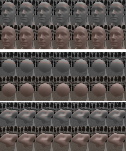
Human faces are considered an important type of stimuli integral to social interaction. Faces occupy a substantial share of digital content, and their appearance can meaningfully impact how they are perceived and evaluated. In particular, past work has shown that facial color appearance can directly influence such perceptions. However, little is known regarding the perception of facial gloss and its influence on facial skin color appearance. The current work investigates how skin roughness influences perceived facial gloss and how these in turn affect facial color appearance for 3D rendered faces. Here, “roughness” refers to a parameter of the microfacet function modeling the microscopic surface. Two psychophysical experiments were conducted to model the interaction among skin roughness, perceived facial gloss, and perceived facial color appearance using varied facial skin tones. The results indicated an exponential relationship between skin roughness and perceived facial gloss, which was consistent across different skin tones. Additionally, gloss appearance influenced the perceived lightness of faces, a pattern not observed to the same extent among non-face objects included in the experiment. We expect that these results might partially be explained by discounting specular components for surface color perception to infer color attributes and by simultaneous contrast induced by a concentrated specular highlight. The current findings provide guidance for predicting visual appearance of face and non-face objects and will be useful for gloss and color reproduction of rendered digital faces.

Today, different models and instruments exist to study and model color vision and color vision deficiency. These systems are often modeled at spectral and retinal levels. In this study, we propose a novel approach to set up models and aids for color vision deficiencies, considering the role of spatial color processing in human visual system. In particular, we present the results of a perceptual test to identify the role of the spatial arrangement in color discrimination by Color Deficient Observers (CDOs) and Color Normal Observers (CNOs), using simultaneous contrast effect.
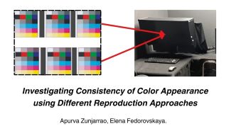
Consistency of color appearance (CCA) can be defined as an image attribute that gives a sense of identity among a set of images with different tones and colors, where the relationship between a group of colors in one embodiment is consistent with the relationship between the corresponding set of colors in another image. The consistency of color is a complex and important aspect of color reproduction. Maintaining color consistency is particularly crucial for printing and graphic communications, in general, where precise reproduction is required for scene identification, brand identity, and image quality. Characterizing consistency of color appearance in images is a challenging task because it is affected by differences in reproduction processes, viewing environments, and the output requirements. This research addressed the necessity for standardized approaches to assess and model CCA, a pivotal aspect in ensuring precise and uniform color replication across diverse media and platforms. In the experiment observers evaluated and compared the effects of gamut and gray balance variations on visual appearance of printed and displayed images and correlated the resulting CCA scale with image-based colorimetrical data. The study results showed that there is a close similarity between observed CCA for images presented under hard proofing (printed images) and soft proofing (display images) conditions. A high correlation between image-based CCA metrics for displayed and printed images when tested with observers' CCA responses, indicates the feasibility of using display images to study CCA for print production. The use of image data in the analysis offers a fruitful approach for modeling CCA.

Whether two stimuli appear to be of different colors depends on a host of factors, ranging from the observer, via viewing conditions to content and context. Previously, studies have explored just noticeable difference thresholds for uniform colors viewed with or without spatial separation, for complex images and for fine features like lines in architectural drawings. An important case that has not been characterized to date is that of continuous color transitions, such as those obtained when selecting two colors and generating a sequence of intermediate colors between them. Such transitions are often part of natural scenes (e.g., sunsets, the sky, curved surfaces, soft shadows, etc.) and are also commonly used in visual design, including for backgrounds and various graphical elements. Where the just noticeable difference lies in this case will be explored here by way of a small-scale, pilot experiment, conducted in an uncontrolled, on-line way. Its results suggest a threshold in the region of 0.5 to 0.8 ΔE2000 for the few stimuli evaluated in the pilot experiment reported here and indicate a behavior that is in the region of viewing solid colors without a gap. A pilot verification with complex images also showed thresholds with a comparable range.
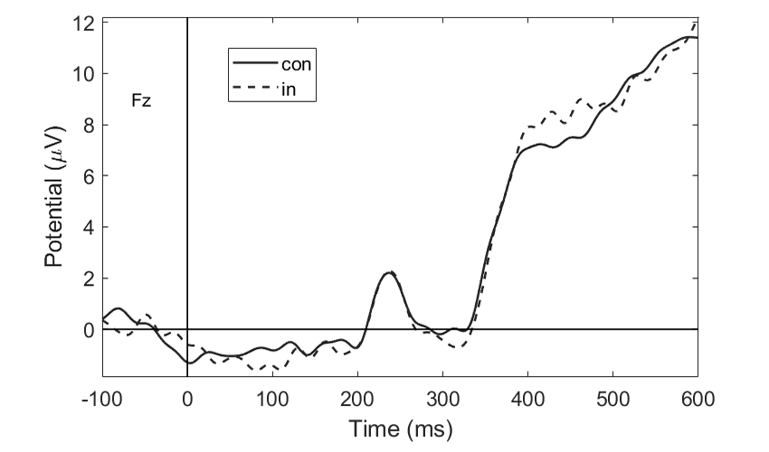
The cross-modal association is a specific connection experienced between stimuli, attributes, or perceptual dimensions. Most previous studies related to the cross-modal association of color and temperature use subjective report methods, and the underlying mechanisms behind this association are unclear. This study used the Implicit Association Test (IAT) paradigm combined with event-related potentials (ERPs) elicited by color stimuli to explore the cross-modal association between color, in terms of hue, saturation, and brightness, and temperature. Cross-modal associations between hue and temperature, as well as saturation and temperature were found. There was no evidence for the existence of a brightness-temperature cross-modal association. Additionally, significant differences in the average N1 amplitudes were observed in the hue IAT task. Significant differences in the average N2 and N400 amplitudes were observed in both the hue and saturation IAT tasks, indicating that both corresponding cross-modal associations have a semantic basis to some degree.
Professional digitization of cultural heritage items in the Polish State Archives can be divided into two major branches: digital imaging of transparencies and reflectives. While the latter has been meticulously standardized in accordance with ISO 19264 and domestic guidelines, the case is much different for the former. This paper is aimed at addressing the issue of color in mass digitization projects.