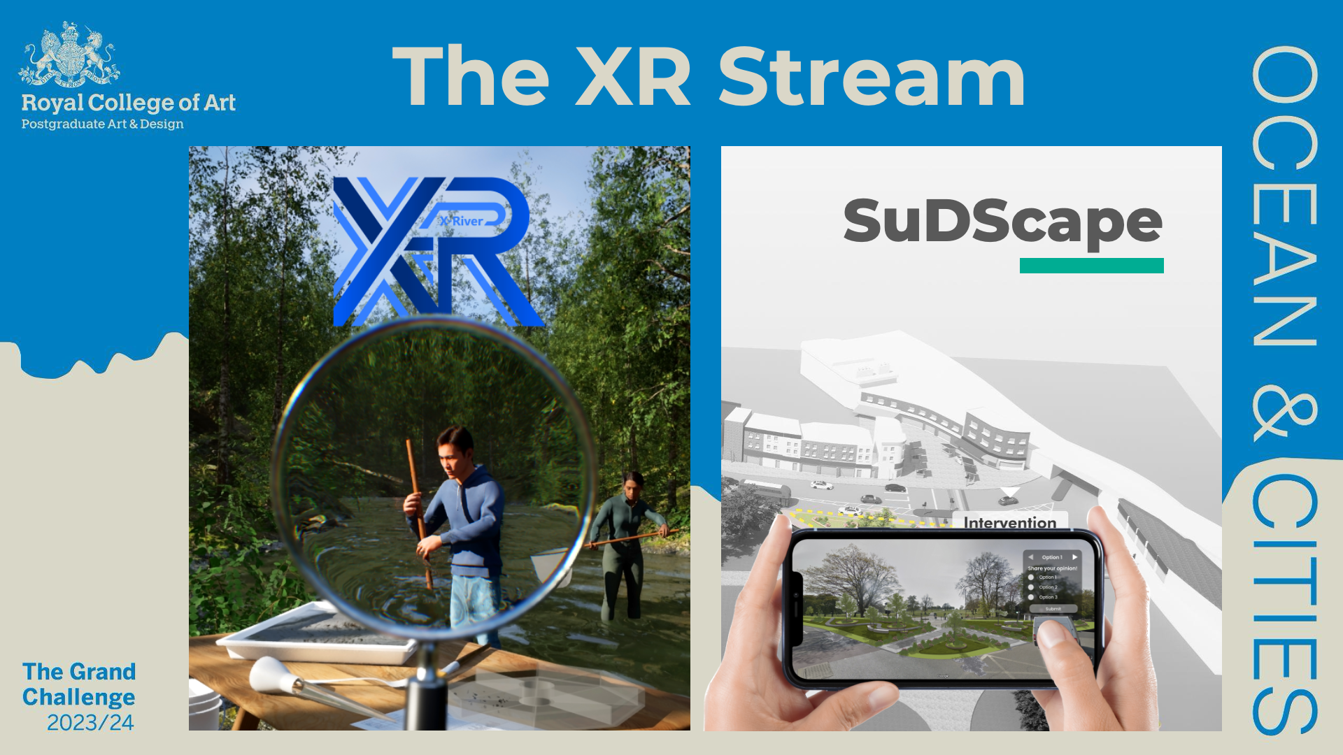
In 2024, we brought London closer to the ocean: Nearly 700 design students at the Royal College of Art participated in the Grand Challenge 2023/24. In teams of five, the students were tasked with tackling challenges around London and the Ocean from a design perspective. The challenge involved multiple methodologies, including design engineering, speculative design, service design, materials- and fashion-related approaches. Each team had one month to develop a compelling proposal. Fifty students participating in the Grand Challenge were able to join the Extended Reality/XR Stream: Ten teams of five students each came up with different design solutions using the Unreal Engine 5. This paper presents how Unreal Engine 5 was introduced to students through lectures and hand-on sessions, and how XR technologies were employed to creatively interpret the original brief of the Grand Challenge and how it inspired our students to come up with unique design propositions. In particular, we discuss here two case studies in detail: XRiver and SuDScape. These two student projects were among the top 13 teams exhibited at the final Grand Challenge show, offering insights and recommendations for incorporating XR into design education.
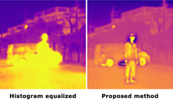
The dynamic range of the intensity of long-wave infrared (LWIR) cameras are often more than 8bit and its images have to be visualized using histogram equalization and so on. Many visualization methods do not consider effects of noise, which must be taken care of in real situations. We propose a novel LWIR images visualization method based on gradient-domain processing or gradient mapping. Processing based on intensity and gradient power in the gradient domain enables visualizing LWIR images with noise reduction. We evaluate the proposed method quantitatively and qualitatively and show its effectiveness.
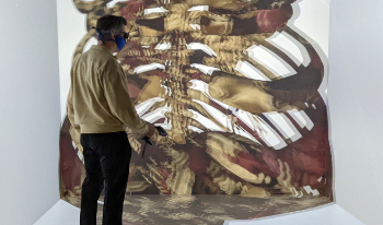
Virtual and augmented reality technologies have significantly advanced and come down in price during the last few years. These technologies can provide a great tool for highly interactive visualization approaches of a variety of data types. In addition, setting up and managing a virtual and augmented reality laboratory can be quite involved, particularly with large-screen display systems. Thus, this keynote presentation will outline some of the key elements to make this more manageable by discussing the frameworks and components needed to integrate the hardware and software into a more manageable package. Examples for visualizations and their applications using this environment will be discussed from a variety of disciplines to illustrate the versatility of the virtual and augmented reality environment available in the laboratories that are available to faculty and students to perform their research.
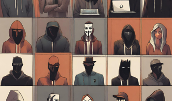
Numerous studies of social media analytics (SMA) shed light upon interesting insights into the information flow in social media. As social media becomes a crucial part of human society, bridging and merging these studies could shape ideas and designs for real-world applications that allow more transparency and understanding of social media. Among several challenges of SMA, this paper focuses on two issues of 1) invasive and greedy analysis methods concerning user privacy, and 2) lack of comprehensive representations of analysis results. We use our analysis on Telegram data to propose that pursuing persona profiling using generalizing contextual analysis via Natural Language Processing (NLP) technologies could address the first problem. For the second problem, we propose to visualize the analysis results, i.e. persona profiles, to increase both comprehensibility and interpretability.

This paper describes the development and application of a novel supervised segmentation technique used for conservation documentation based on visible appearance changes of Cultural Heritage (CH) metal surfaces. The technique is based on employing a linear discriminant analysis model to classify Reflectance Transformation Imaging (RTI) reconstruction coefficients. The Hemispherical Harmonics (HSH) reconstruction coefficients for each pixel are first calculated and then normalized. This normalization increases the robustness and invariance of the application making it possible to apply it for documenting different surfaces and at different time intervals. In this paper, we presented three case studies related to corrosion assessment of CH objects through detection of corrosion and monitoring the degree of silver tarnishing. For each case study, a supervised data set is constructed, teaching the algorithm to recognize as distinct a specified appearance characteristic (such as corrosion, metal etc.) by comparing it to the reconstruction coefficients of each pixel. The segmented information is visualized by a simplified colormap. The calculated results are afterwards verified by visible inspection from conservation-restoration experts. The method can segment surfaces with changes in micro-geometry, but it reaches its limitation on surfaces with minimal topography and high specularity.

Computational modeling frequently generates sets of related simulation runs, known as ensembles. These simulations often output 3D surface mesh data, where the geometry and variable values of the mesh are changing with each time step. Comparing these ensembles depends on comparing not only geometric properties, but also associated field data. In this paper, we propose a new metric for comparing mesh geometry combined with field data variables. Our measure is a generalization of the well-known Metro algorithm used in mesh simplification. The Metro algorithm can compare two meshes but doesn't consider field variables. Our metric evaluates a single variable in combination with the mesh geometry. Combining our metric with multidimensional scaling, we visualize a low dimensional representation of all the time steps from a set of example ensembles to demonstrate the effectiveness of this approach.

This paper presents an online tool for heritage education that visualizes large-scale digital architectural data of the Roman Forum in Rome, Italy. Leveraging Potree and WebGL, the tool enables the web-based visualization of registered point cloud data as the base framework for the context and the reconstructed geometries with mesh models wrapped with images of standing monuments as the focus. The tool enables users to overview the entire heritage site and examine the fine monument details. The 3D reconstructed mesh and surface models are built to allow users to explore and study the site as it exists today in relation to its reconstructed views. The site is tagged with historical information and imagery for further referencing. The paper concludes with a report on visualization results and an ad-hoc evaluation provided by domain experts.

To improve clinical care practice, it is important to understand the variability of clinical pathways executed in different contexts (e.g., pathways in different geographical locations, demographics, and phenotypic groups). A common way of representing clinical pathways is through network-based representations that capture trajectories of treatment steps. However, first-order networks, which are based on the Markovian property and the de facto standard model to represent transitions between steps, often fail to capture real trajectories. This paper introduces a visual analytic tool to explore and compare pathways represented in higher-order networks. Because each higher node in the network is a subtrajectory (i.e., partial or full history of treatment steps), the tool can display true sequences of treatment steps and compute the similarity of the two networks in a space of higher-order nodes. The tool also highlights areas in which the two networks are similar and dissimilar and how a certain subtrajectory is realized differently in different pathways. The paper demonstrates the tool's usefulness by applying it to multiple antidepressant pharmacotherapy pathways for veterans diagnosed with major depressive disorder and by illustrating heterogeneity in prescription patterns across pathways.

Teaching color science to Electrical Engineering and Computer Science (EECS) students is critical to preparing them for advanced topics such as graphics, visualization, imaging, Augmented/Virtual Reality. Color historically receive little attention in EECS curriculum; students find it difficult to grasp basic concepts. This is because today's pedagogical approaches are non-intuitive and lack rigor for teaching color science. We develop a set of interactive tutorials that teach color science to EECS students. Each tutorial is backed up by a mathematically rigorous narrative, but is presented in a form that invites students to participate in developing each concept on their own through visualization tools. This paper describes the tutorial series we developed and discusses the design decisions we made.

The development of interactive visualization applications that are applicable to many real-world problems is a challenging affair. For every new project, developers need to follow the same repetitive steps of fetching the raw data, transforming the data into processable form, defining visual structures and then displaying them appropriately. To accelerate this, we propose the Versatile Visual Analytics Framework for Exploration and Research (VVAFER). VVAFER is planned to be an extensible visual analytics framework, upon which different applications can be developed with minimum overload at the development side. Through modular architecture, unified data formats, reusable templates and software components, developers will be able to quickly deploy and create their visualization applications by configuring existing templates with their own specific functionalities. In this paper, we describe our motivation for this future framework and its architectural design.