1.
Introduction
Understanding why certain visual designs are preferred over others remains an important topic in design theory and visual cognition. Although previous studies have shown the psychological principles behind design preference—such as Novelty, typicality, and fluency—there is still no consensus on how these factors interact quantitatively. Moreover, most existing theories are descriptive, and their relationships to measurable image features are not always explicit. In this study, we investigate the relationship between perceived Clarity, Novelty, and observer preference in flyer design using image feature representations. We propose a hypothesis-driven computational formulation to examine how these factors may jointly shape hedonic responses.
In this paper, the term “image” refers to both graphic designs and visual representations of three-dimensional objects. The term “design” denotes visually appealing works, excluding purely functional items.
1.1
Related Studies
The Most Advanced Yet Acceptable (MAYA) theory, proposed by the industrial designer Loewy (1951), is a key principle for achieving optimal design [
8]. This theory assumes that although people prefer Novelty, excessive Novelty can lead to rejection; thus, the most highly rated designs achieve a balance of being advanced yet acceptable. The MAYA theory is consistent with Wundt’s conceptual account of the relationship between stimulus intensity and hedonic tone [
24]. It is further supported by Berlyne’s arousal potential theory [
3], which reinterpreted and formalized Wundt’s original ideas. In this framework, Berlyne described hedonic value (pleasure or displeasure) as a function of arousal potential, which serves as the determinant of hedonic response. The conceptual diagram illustrating the relationship between stimulus intensity and hedonic tone, as suggested by Wundt and later reinterpreted by Berlyne, is represented as an asymmetric curve and is now often referred to as the Wundt curve.
To formalize this relationship, Yanagisawa proposed the free energy model [
25,
26] in which arousal potential is operationalized in terms of free energy. The free energy is mathematically defined as the sum of two components: information gain and posterior uncertainty. Information gain corresponds to the degree of surprise arising from the difference between memory (prior belief) and observed sensory data, and is associated with Novelty or conflict. Uncertainty corresponds to the cognitive load caused by the ambiguity of prior information and the complexity of the physical sensory stimulus. This model consistently captures the elicitors of the arousal potential theory [
3], and its validity has been supported by subsequent studies [
14,
20]. Although the free energy model provides a principled interpretation of arousal potential, it does not explicitly prescribe a unique functional relationship between arousal potential and hedonic value.
In business studies, there is an ongoing debate over whether consumers prefer typical or highly novel designs depending on the product [
11].
To explain the effect of typicality on Likability, Whitfield and Slatter proposed the preference-for-prototype theory to account for this effect [
22]. Their study, using furniture as the evaluation target, showed that the more strongly a design was recognized as representative of its style category, the better it explained aesthetic preference. Their theory has been supported by subsequent studies [
6,
9]. This line of research suggests that aesthetic preference is closely tied to the perceived typicality of a design. According to the preference-for-prototype framework, greater typicality leads to higher levels of Likability.
Regarding the effect of Novelty on Likability, Morinaga reviewed multiple theories and concluded that none had been sufficiently validated, indicating a need for further research [
11]. Among these, the Conjunctive Enablers proposed by Noseworthy et al. offer a framework that explains how physical Novelty influences Likability through cognitive processing [
13]. Morinaga integrated this and related studies under the term Conjunctive Theory, which posits that within a given design category, cognitive discrepancy between typical and novel designs affects acceptability. Specifically, extreme discrepancy may prevent a design from being recognized as part of the category. However, if the discrepancy remains within a tolerable range, consistent with the MAYA principle [
8], the design can still be accepted when cues clarify the designer’s intent. We expected that such cues facilitate understanding of the design’s meaning and that aversion to Novelty stems not from Novelty itself but from difficulty in interpretation. Under this assumption, a novel design that is easily understood is less likely to be rejected.
From the perspective of difficulty in interpretation, which is closely related to cognitive fluency, similar effects have been reported in studies of visual art. A previous study has shown that aesthetic appreciation decreases when the title of a figurative painting does not correspond to the meaning of its depicted motif [
2]. This finding supports the hypothesis that perceived difficulty reduces aesthetic evaluation. Hence, cognitive fluency, or the ease of understanding meaning at a higher cognitive level, is an important factor influencing the hedonic value of paintings. These results suggest that images perceived as difficult to understand tend to receive lower aesthetic evaluations.
Cognitive fluency refers to the ease with which one can process and understand visual stimuli. It is related to the complexity involved in interpreting the meaning of an image. From a conceptual standpoint, this notion shares similarities with constructs such as complexity or uncertainty discussed in prior theoretical models [
25,
26]. Novelty, described in terms of information gain in the same framework [
25,
26], also entails uncertainty in interpretation, and thus partially overlaps with cognitive fluency in terms of perceived difficulty. Accordingly, treating information gain and uncertainty as fully independent variables may not sufficiently capture psychological responses to paintings and closely related graphic design.
From the perspectives of Clarity, Likability, and fluency, Reber et al. [
17] empirically demonstrated that reduced perceptual fluency leads to lower Likability. Perceptual fluency refers not to higher-level semantic processing, but to the ease with which low-level visual features, such as visual Clarity, contrast, and presentation duration, are processed in geometric figures. Perceptual fluency for low-level processing is typically distinguished from cognitive fluency, as they arise at different stages of cognitive processing, with cognitive fluency engaging higher-level cognitive processes. Nevertheless, both types of fluency share the characteristic of increasing processing load when fluency is low, potentially leading to reduced Likability. Therefore, we considered that Clarity should be treated as a unified construct, encompassing both the Clarity of visual features and the Clarity of semantic meaning without differentiating between the two.
In addition to fluency-related effects, recent empirical studies in empirical aesthetics have demonstrated that perceptual Clarity and Novelty are both closely related to hedonic evaluation. Vessel et al. reported that aesthetic appreciation engages brain regions associated with internally meaningful and semantically interpretable representations, suggesting a positive association between perceptual Clarity, in the sense of interpretability, and hedonic value [
21]. Similarly, Blijlevens et al. showed that Novelty-related visual features in product appearance significantly influence aesthetic appreciation, suggesting that Novelty contributes to hedonic evaluation when appropriately balanced with recognizability [
4]. These findings provide empirical support for treating Clarity and Novelty as perceptual determinants of hedonic value in visual design.
1.2
Hypothesis
Considering the prior studies reviewed in Section
1.1, we expected that the factors determining the Likability of design images could be narrowed down to two key variables: Novelty and Clarity. The rationale for this assumption is described below.
From the perspective of designers’ empirical knowledge, Loewy proposed that both excessively low and excessively high levels of Novelty can reduce Likability, a principle known as the MAYA theory [
8]. We expected that this principle would also apply to the field of graphic design addressed in the present study. In addition, experimental psychology frameworks proposed by Wundt [
24], Berlyne [
3], and Yanagisawa [
25,
26], although formulated using different terminologies such as stimulus intensity, arousal potential, and free energy, can be broadly interpreted as describing variations in perceived Novelty or stimulus strength. In these frameworks, the concept of hedonic value corresponds to the Likability of the observed visual stimulus. Furthermore, since stronger visual stimuli are generally perceived as more salient and easier to process, stimulus strength can be regarded as one contributing factor to perceived Clarity. Taken together, these findings suggest that Likability may be explained in terms of Novelty and Clarity and that their effects are interdependent rather than independently additive.
Previous studies further indicate that Novelty alone does not monotonically increase Likability. Highly novel designs tend to be rejected when they are difficult to understand but can be accepted when semantic understanding is facilitated, suggesting an interaction between Novelty and Clarity [
11,
13]. Likewise, Clarity has been shown to positively influence Likability both at the perceptual and semantic levels [
17].
In the context of empirical aesthetics [
4,
21], Likability may be regarded as an operational measure of hedonic value, reflecting the degree to which a visual stimulus elicits positive affective evaluation or aesthetic appreciation. Accordingly, in the present study, Clarity and Novelty were conceptualized as perceptual determinants of hedonic value, and Likability was interpreted as the observable outcome of their combined influence.
Following this conceptualization, we hypothesized that Likability emerges from the interaction between Clarity-related and Novelty-related hedonic contributions. To capture this interaction in a parsimonious mathematical form, Likability was modeled as the product of perceived Clarity and perceived Novelty. In this framework, Clarity and Novelty represent perceptual components contributing to hedonic value, and their interaction gives rise to the overall hedonic evaluation expressed as Likability.
In addition, to formalize our hypothesis, we interpreted the horizontal axis of the Wundt curve as a physical quantity reflecting the characteristics of a visual stimulus as perceived by an observer. Following the MAYA framework, this physical quantity was defined as a feature-based distance from the mean image feature of typical design images in each target domain, labeled here as “Distance from Typical Designs” and later operationalized as “Neural Feature Distance” in Section
2, such that larger distances correspond to higher perceived Novelty. Moreover, it was assumed that perceived Clarity and perceived Novelty exhibit sigmoid-shaped behavior with respect to this distance. This assumption is consistent with common practice in psychophysics, where the relationship between physical stimulus properties and perceived psychological quantities is often modeled using sigmoid-type functions [
23].
It should be noted that the Neural Feature Distance introduced in this study is an objective computational similarity measure derived from high-dimensional visual feature representations. It is not intended to directly quantify psychological constructs such as memory, arousal, or free energy. Rather, it serves as a physically defined proxy variable used to examine whether systematic variations in image feature space correspond to variations in subjective evaluations.
These hypotheses are represented by Eqs. (
1)–(
3). Figure
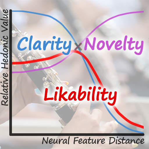
1 illustrates the conceptual diagram of our hypothesis. As the Distance from Typical Designs increases, perceived Novelty is assumed to increase while perceived Clarity decreases, and Likability is hypothesized to arise from their interaction, with a baseline preference reflecting the generally favorable evaluation of typical designs.
Here, the constant
b reflects findings from previous studies suggesting that even typical designs are perceived as having a certain baseline level of Likability [
22]. The remaining constants serve as scaling and adjustment parameters to align the hypothesized functional forms with the rating scales obtained from subjective evaluations. For Novelty, perceived Novelty is defined to take its minimum value when the Distance from Typical Designs is zero. Accordingly, Novelty is formulated such that it is anchored at zero at this reference point. Based on these considerations, Novelty was modeled using a sigmoid function scaled to the range [0, 1], such that it increases with the Distance from Typical Designs. In contrast, Clarity was assumed to exert both positive and negative influences on the hedonic value. There is no theoretical or empirical evidence suggesting that reduced Clarity enhances preference. Therefore, lower levels of Clarity were expected to decrease Likability whereas higher Clarity would increase it. Accordingly, Clarity was formulated as a transformed sigmoid function centered around zero such that it can symmetrically modulate the hedonic value in both positive and negative directions. This formulation yields a range of approximately [−1, 1] and ensures that Clarity decreases as the Distance from Typical Designs increases.
Figure 1.
Conceptual diagram of the proposed hypothesis inspired by the Wundt curve. As the Distance from Typical Designs increases, perceived Novelty is assumed to increase and perceived Clarity to decrease. Likability is modeled as the interaction between Clarity and Novelty, together with a baseline preference indicating that typical designs tend to be moderately liked.
![]()
1.3
Objective and Intended Advancement
The objective of this study is to evaluate the validity of the hypotheses presented in Section
1.2. The determination of the constants in Eqs. (
1)–(
3) is left for future work, while the present paper focuses on examining the validity of the proposed functional forms of the model.
The advancement of this study over previous studies is twofold. First, while previous studies that proposed mathematical models of arousal potential, which forms the horizontal axis of the Wundt curve, have not been directly applied to the processes of graphic design production and evaluation, this study proposes a practical model that can be applied to these processes. Second, this study operationalizes arousal potential using a feature-based distance derived from physical stimulus properties, and proposes a framework in which Likability (hedonic value) is explained as an interaction between Clarity and Novelty arising from those differences.
To the best of our investigation, no prior study has explicitly formulated the hedonic value as the product of Clarity and Novelty in a quantitative framework. Accordingly, the present study provides a novel theoretical perspective in the field of visual design evaluation and serves as a useful foundation for future research in this domain.
2.
Methods
An experiment was conducted to examine how subjective evaluations of flyer design images change as their visual features deviate from those of typical designs within a given domain.
To characterize typical designs, 30 publicly available flyer images related to clarinet recruitment were collected from the web and used only as reference samples. Visual features were extracted from these images, and their mean feature vector was computed to represent the typical design in feature space. These reference images were not used as evaluation stimuli.
Based on this reference, 15 flyer design images were newly created specifically for the experiment. Their visual features were systematically varied so that their feature-based distances from the typical design spanned a wide range. Participants evaluated these images in a subjective rating task.
2.1
Experimental Conditions
2.1.1
Participants
The participants were 22 males and females aged from their teens to their sixties. They had voluntarily chosen to join an amateur wind orchestra and had at least one year of experience performing in such ensembles. Among these participants, four were clarinet players.
2.1.2
Presented Stimuli
The presented stimuli consisted of flyer design images announcing the recruitment of clarinet members for the wind orchestra in which the participants were affiliated. Fifteen design images were prepared. Each design image was generated as a JPEG file at a resolution of 1080 × 1528 pixels with an embedded sRGB ICC profile, ensuring that the colors remained within the Japan Color 2011 Coated color gamut.
Prior to determining the content of the design images, quantitative metrics representing the visual features of a typical flyer design image targeting clarinet players were defined using the following procedure.
First, images associated with the Japanese keywords “clarinet” and “flyer” were retrieved via Google Image Search, and the first 30 results displayed on the platform were collected. These images were examples of flyer designs publicly displayed in this domain, targeting clarinet players. The most typical flyer design was conceptualized as being characterized by visual features closest to the average of the collected images. Thus, the mean feature vector of these images was defined as “Standard Vector,” a representative feature vector of a typical flyer design, which is formally defined below.
Standard Vector Calculation
Each image collected as a publicly distributed example was resized to 224 × 224 pixels, and pixel values were scaled to a range of 0–1. Then, a pretrained EfficientNet-B0 [
19] deep learning model was employed, with the fully connected layer removed and a global average pooling [
7] layer applied, to extract a 1280-dimensional feature vector from each image. The mean of these feature vectors was calculated and defined as the Standard Vector. Furthermore, this Standard Vector was normalized using the L2 norm. The resulting normalized Standard Vector was regarded as the vector representing the visual features of the most typical design image.
The 1280-dimensional feature vectors extracted by EfficientNet-B0 represent learned visual features in a high-dimensional physical feature space, including color, texture, spatial structure, and object-related patterns. These features do not correspond to predefined psychological constructs but rather to abstract representations of visual structure derived from the convolutional network.
Subsequently, we calculated the difference between the feature vector of each design image presented in the experiment and the Standard Vector. This difference was used as the Neural Feature Distance, a quantitative measure representing the Distance from Typical Designs (Fig.
1).
Neural Feature Distance Calculation
Each input image was processed in the same manner as in the computation of the Standard Vector: it was resized to 224 × 224 pixels, normalized, and represented as a 1280-dimensional feature vector using EfficientNet-B0. The cosine similarity between the feature vector of each image and the previously defined Standard Vector was then computed. The Neural Feature Distance was defined as 1 minus the cosine similarity, yielding a distance-like measure in which larger values indicate greater deviation from the typical design. For convenience and to align the distance measure with the scale used in subsequent analyses, the resulting values were linearly normalized to a range from 0 to 1 and used as the quantitative measure of the Distance from Typical Designs.
The Neural Feature Distance serves as a computational measure indicating the degree of physical similarity between a design image and the reference image set used to compute the Standard Vector.
The design images presented in the experiment were created by the experimenter with reference to the visual characteristics of typical designs identified in the collected reference images.
In total, 29 candidate design images were created from scratch by the experimenter and were not modified versions of the 30 reference images used to compute the Standard Vector. The reference images exhibited diverse color schemes without any noticeable bias toward a particular hue or saturation level. Among the collected reference images, the image whose feature vector was closest to the Standard Vector was characterized by a gray-dominant color scheme with relatively weak hue impressions and intermediate brightness. Based on this observation, the design intended to represent the most typical example among the candidate stimuli was also constructed using a gray-based color scheme.
These reference images shared several common characteristics: (1) the presence of a performer-related photograph; (2) an image of a clarinet; (3) prominent textual emphasis on the word “clarinet” in either Japanese or English; and (4) a generally text-heavy layout. These shared characteristics were adopted as baseline characteristics for the creation of the experimental stimuli while allowing systematic variation.
During stimulus creation, the experimenter adjusted visual elements such as layout, image composition, and spatial balance so that the resulting designs satisfied the predefined design constraints from (1) to (4) while exhibiting variation in their Neural Feature Distance from the Standard Vector. Regarding characteristic (1), because the purpose of the flyers was recruitment rather than the promotion of individual performers, faces were deliberately excluded even when a performer’s body was depicted. In accordance with characteristics (2) and (3), all designs included a visual representation of a clarinet, and the most prominent text displayed the recruitment message “Clarinet Member Recruitment.” In addition, the textual information included in all design images was standardized, and the contrast between the text and background was freely adjusted as long as legibility was maintained. Furthermore, the generally text-heavy layout (4) observed in typical designs was used as a baseline reference for constructing both more typical and more atypical design variations.
During the stimulus creation process, the Neural Feature Distance from the Standard Vector was calculated for each design image using the previously described method. Based on the computed distance values, the experimenter iteratively adjusted visual elements so that the Neural Feature Distance approached the intended range. Through this repeated process of calculation and refinement, a total of 29 candidate design images were produced. From these candidates, 15 images were selected such that their Neural Feature Distances were approximately evenly distributed across the normalized range from 0 to 1 and covered as broad a span as possible. These 15 images constituted the final set of presented stimuli used in the experiment. Figure
2 shows the complete set of stimuli used in the experiment.
Figure 2.
The 15 distinct design images were used as experimental stimuli. The images are published with permission after applying mosaic processing to prevent the organization from being identifiable based on the images alone.
![]()
2.1.3
Experimental Procedure
The stimulus images were presented online in pairs, with one image evaluated relative to the other, which served as the reference. Among the 15 images, the one with the smallest Neural Feature Distance was always presented as the reference image. Thus, this experiment conducted a relative evaluation using these 15 images. The magnitude estimation method was used for the evaluation. Participants were instructed to assign numerical values to the target image presented alongside the reference image, assuming the reference image had a fixed value of 100, such that the assigned values reflected proportional differences relative to the reference.
First, participants received an explanation of the magnitude estimation procedure.
Second, participants carefully read the questions displayed on the screen and provided their evaluation scores in the order of Clarity, Novelty, and Favorable Interest. The stimuli were displayed randomly. Each participant evaluated each image once per question. The questions presented and their intended purposes are as follows.
Questions
1.
Clarity
Assuming that the clarity of the reference design is 100 when evaluating only the content depicted excluding textual information, how much clarity does the target design seem to have?
2.
Novelty
Assuming that the novelty of the reference design is 100, how much novelty does the target design seem to have?
3.
Likability (Favorable Interest)
Please answer how much favorable interest you would feel if this flyer were clearly understood in advance as a flyer for recruiting band members, and you are in a situation where you are looking for a band to join.
Assuming that your level of interest in the reference design is 100, how much interest do you feel toward the target design?
Note: Please answer while imagining that the clarinet is replaced with your own instrument.
Caution: Please answer about favorable interest, not the kind of interest you might feel when looking at something unpleasant that stands out conspicuously (e.g., bad attention).
In the question assessing Clarity, participants were instructed to ignore textual information to ensure that their evaluations would be based on design elements such as layout and visual motifs, rather than on the content of the text. In the question assessing Likability, the expression Favorable Interest was used as the evaluation criterion to measure the attractiveness of the flyer design in terms of whether it would appear appealing to prospective members, rather than its artistic beauty. This phrasing aimed to reduce errors arising from differences in respondents’ interpretations.
2.2
Data Analysis
2.2.1
Data Standardization and Normalization
Standardization was performed for each participant by converting raw scores into z-scores (subtracting the individual mean and dividing by the standard deviation) to account for differences in scale use among participants. The standardized scores from all participants were averaged for each design image. Furthermore, the scores for all images were normalized separately for each evaluation item, and these normalized scores were used as the final evaluation scores. Normalization scaled the scores for Clarity and Likability to a range of −1 to 1 and the scores for Novelty to a range of 0 to 1. The rationale for setting the normalization ranges is as follows. The product of Clarity and Novelty was assumed to be proportional to Likability. The Likability was assumed to range from −1 to 1, where −1 corresponds to the state with the lowest relative hedonic value and 1 corresponds to the state with the highest. Novelty was assumed not to have a negative effect on Likability by itself; therefore, the Novelty score for the most typical design image was set at 0 with a maximum value of 1. Based on prior findings on processing fluency, Clarity was assumed to be higher at lower Neural Feature Distance values and to contribute positively to Likability. Conversely, as the Neural Feature Distance increases, the reduction in Clarity was assumed to exert a suppressive effect on Likability. Accordingly, the range of Clarity was set from −1 to 1 so that the product of Clarity and Novelty would span both negative and positive values.
2.2.2
Model Fit Evaluation
Since the scores for Clarity, Novelty, and Likability represent relative evaluations, plotting them against Neural Feature Distance places a relative hedonic value on the vertical axis. However, the values themselves do not carry an intrinsic meaning; the focus is on whether the shapes of the fitted functions align with the proposed hypothesis.
Using the Neural Feature Distance as the explanatory variable defined in Section
2.1.2, Clarity and Novelty were plotted individually with this variable on the horizontal axis and the normalized Clarity and Novelty scores on the vertical axis. In this study, subjective ratings of Clarity and Novelty are interpreted as indicators of their relative contributions to hedonic evaluation. That is, higher ratings on Clarity or Novelty are assumed to correspond to higher hedonic relevance attributable to each perceptual attribute. Based on this modeling assumption, the vertical axis in Figures
3 and
4 is labeled Relative Hedonic Value for Clarity, Novelty, and Likability. Logistic functions were fitted to these data. The product of the fitted Clarity and Novelty functions, multiplied by a constant and added to an intercept, was used to approximate the Likability scores. Specifically, Eq. (
1) was used. The parameters
a and
b were adjusted to fit the predicted Likability values to the observed scores.
Figure 3.
(a) Relationship between Neural Feature Distance and perceived Clarity and Novelty. The dots show the subjective evaluation results, and their error bars represent the standard deviation. The curves represent the results of fitting logistic functions to the observed scores for Clarity and Novelty. (b) The observed scores for Likability along with the fitted functions for Clarity and Novelty, and Likability. The lengths of the upper and lower limits of the error bars represent the standard deviation.
![]()
Figure 4.
Observed Likability scores together with the fitted functions for Clarity, Novelty, and Likability. “Likability (Eq. (
4))” represents the results obtained using the extended model (Eq. (
4)). The other curves are identical to those shown in Fig.
3(b) and are included here to facilitate comparison with the originally proposed model (Eq. (
1)).
![]()
Goodness of fit was then evaluated for three models: the logistic function for Clarity against the Clarity scores, the logistic function for Novelty against the Novelty scores, and the Likability function (Eq. (
1)) against the Likability scores. Based on these results, the validity of the hypothesis described in Section
1.2 was assessed.
3.
Results
Figure
3(a) shows the relationship between Neural Feature Distance and Clarity or Novelty. The correlation coefficient for the former was
R = −0.8562 (
p < 0.0001) and that for the latter was
R = 0.8248 (
p = 0.0002), confirming the expected tendencies.
A strong negative correlation was observed between Novelty and Clarity (
R = −0.8828,
p < 0.0001). This result indicates a clear trade-off between these two perceptual attributes in the present stimulus set such that designs perceived as more novel tend to be perceived as less clear. However, around a Neural Feature Distance of approximately 0.4 in Fig.
3, Clarity exhibits a local peak while Novelty shows a corresponding dip.
The experimental data were first fitted using Eqs. (
2) and (
3) to estimate the parameters for Clarity and Novelty. Subsequently, Eq. (
1) was fitted to the Likability data using the estimated Clarity and Novelty values. The fitted forms (Eqs. (
1′)–(
3′)) with the estimated coefficients explicitly substituted are given below.
The parameters were iteratively adjusted so as to minimize the RMSE/SD value. Given the limited number of stimuli, the fitted parameters should be interpreted as illustrative rather than definitive, and further validation with larger datasets is required.
Table
I presents the correlation coefficients among variables relevant to the hypothesis. A strong negative correlation was found between Clarity and Novelty. The relationships between Neural Feature Distance and each variable followed the hypothesized directions shown in Fig.
1. Although the correlations between Neural Feature Distance and both Clarity × Novelty and Likability were substantial, they were smaller than those found for other variable pairs. This may be attributable to the nonlinear relationship assumed in Fig.
1, where Likability follows an inverted U-shaped (Wundt-type) function of Neural Feature Distance. In addition, a strong positive correlation was found between Clarity × Novelty and Likability, supporting the hypothesis that these variables are proportional. A very strong correlation (
R = 0.9292) between Clarity and Likability suggested that Clarity may have had a particularly strong influence on Likability in this experiment.
Table I.
Correlation coefficients among other variables relevant to the hypothesis.
| Clarity | Novelty | Clarity × Novelty | Likability |
|---|
| Neural Feature Distance | −0.8562 (p < 0.0001) | 0.8248 (p = 0.0002) | −0.7836 (p = 0.0005) | −0.7328 (p = 0.0019) |
| Clarity | | −0.8828 (p < 0.0001) | 0.8728 (p < 0.0001) | 0.9292 (p < 0.0001) |
| Novelty | | | −0.6995 (p = 0.0037) | −0.7297 (p = 0.0020) |
| Clarity × Novelty | | | | 0.8657 (p < 0.0001) |
Table
II presents the statistical indices indicating the goodness of fit of the fitted functions for Clarity, Novelty, and Likability based on the method described in Section
2.2.2. The ratio of the root mean square deviation to the standard deviation of the observed scores (RMSE/SD) and the coefficient of determination (
R2) were 0.453 and 0.784 for Clarity, and 0.520 and 0.713 for Novelty, respectively, indicating a good fit for both. For Likability, the values were 0.65 and 0.55, respectively, indicating moderate explanatory power. Figure
3(b) presents the observed scores for Likability along with the fitted functions for Clarity and Novelty, and the Likability values calculated from their product and a constant term as defined in Eq. (
1).
Table II.
Statistical indices indicating the goodness of fit of the fitted functions for Clarity, Novelty, and Likability.
| Clarity | Novelty | Likability |
|---|
| RMSE/SD | 0.453 | 0.520 | 0.648 |
| R2 | 0.784 | 0.713 | 0.550 |
| p-value (corr.) | <0.0001 | 0.0002 | 0.0026 |
4.
Discussion
In this study, we first examined the correlation coefficients among variables related to the hypothesis shown in Fig.
1 and confirmed that the observed tendencies were consistent with it. Subsequently, the model fitting based on the hypothesis demonstrated a moderate level of goodness of fit, moderately supporting the validity of the proposed model.
Furthermore, by aligning the observed phenomena with the aspects of Clarity (comprehensibility) and Novelty (pleasurable surprise), which are highly valued by both marketers who utilize graphic design and designers who create it, this study provides a step toward a more practical modeling framework for exploring the prediction and evaluation of design quality in real-world contexts. These findings may offer preliminary insights to researchers conducting related studies in the field of visual communication and design evaluation.
However, since the RMSE/SD values were relatively large and the R2 value for the Likability model was only 0.550, there is room for improvement. The following discussion examines issues that remain unresolved in this study.
4.1
Clarity and Likability
The highest positive correlation was found between Clarity and Likability. This relationship may be specific to graphic design aimed at information visualization, particularly in advertising contexts. Clarity plays a critical role in usability and is a key factor in positive evaluations as also noted by Arunkumar et al. [
1]. According to their findings, insufficient Clarity reduces the perceived ease of understanding, which can lower the overall Likability of the design. This pattern may also be interpreted in light of the commonly discussed trade-off between ergonomic quality (Clarity and usability) and hedonic quality in design research, where functional comprehensibility can dominate evaluative judgments when information communication is prioritized. It should be noted that the negative effect of Clarity on Likability may not be uniform across the entire range of Neural Feature Distance. The results suggest that this effect was more pronounced when the Distance from Typical Designs was sufficiently large, where reductions in Clarity were more likely to negatively impact hedonic evaluation.
Arunkumar et al. [
1] further showed that when an image is perceived as an “image” rather than as “information,” it tends to elicit emotion-oriented aesthetic enjoyment and is perceived as appealing and enjoyable, but less suitable for analytical understanding. This suggests that when the primary purpose of a design is to convey an image rather than information, the influence of Clarity may be reduced, making it easier to observe the effect of Novelty on Likability. Therefore, if the designs had been intended to promote a brand image rather than to communicate concrete information such as a recruitment message, the influence of Clarity on Likability might have been weaker and the effect of Novelty more pronounced. Such a context may provide a more suitable setting for isolating the role of Novelty in the proposed model (Fig.
1).
4.2
Novelty, Clarity, and Neural Feature Distance
A strong negative correlation (R = −0.8828, p < 0.0001) was found between Novelty and Clarity, indicating a trade-off between these two perceptual attributes. This finding is consistent with a core assumption of the proposed mechanism of the present study: as the Neural Feature Distance increases, Novelty increases, which in turn reduces processing fluency and results in lower perceived Clarity.
The following discussion addresses the remaining issues in this study from the designer’s perspective, focusing on the creation of design images with varying levels of Novelty.
The experiment evaluated flyer designs intended to visualize information about recruiting new clarinet players. Publicly available flyer designs in this domain with similar objectives were used as a baseline, and design images were created to vary in predicted levels of Novelty. Specifically, the evaluation was based on images manipulated to differ in Neural Feature Distance as defined in Section
2.1.2. On the other hand, through interviews with professional designers and analysis of design handbooks, Quispel et al. [
16] reported that Clarity is regarded as the most important factor in information visualization design. Given this, it was expected that the baseline design would be the most easily understood design.
Accordingly, we hypothesized that as the Neural Feature Distance increases, Novelty would increase monotonically while Clarity would decrease monotonically. However, the results showed that designs with a Neural Feature Distance around 0.4 (Fig.
2: ③, ④, ⑤) were rated higher in Clarity than those with values around 0.3 (Fig.
2: ①, ②). Novelty scores for images ④ and ⑤ were also slightly lower than those for ① and ②.
This may be because images ① and ② were deliberately made to closely resemble the typical images in this domain, whereas ③–⑤ incorporated various visual techniques to enhance salience and message emphasis. These findings suggest that publicly available flyer designs at the time had room for improvement in Clarity. Additionally, images ④ and ⑤ exhibited higher Clarity but slightly lower Novelty compared to images ① and ②. This may be because the designs conveyed the content more effectively, reducing the sense of surprise and perceived Novelty. Although this result supports the hypothesis that greater Clarity leads to lower Novelty, it does not fully align with the assumption that greater Neural Feature Distance should correspond to greater Novelty. One possible explanation is that the Neural Feature Distance represents an objective computational metric, and its precise relationship to subjective psychological responses remains to be clarified.
Therefore, in flyer designs where Clarity is of primary importance, the insufficient Clarity of the reference images used to compute the Standard Vector may have introduced noise in the experiment. Developing methods to eliminate such noise remains future work.
4.3
The Inflection Point of Likability
As illustrated in Fig.
1, the final hedonic value represented by Likability can only reach its maximum when the inflection points of Clarity and Novelty hold a specific positional relationship. Namely, Clarity must begin to decline only after the Neural Feature Distance has increased sufficiently for Novelty to be perceived as high. However, the experimental results obtained in this study (Fig.
3(b)) showed that the inflection points of both Clarity and Novelty were located around a Neural Feature Distance value of approximately 0.5. This observation is consistent with the fitted sigmoid functions in which the inflection points of Clarity and Novelty (corresponding to the horizontal offsets of the functions) and their slopes were found to be relatively similar. This suggests that the separation between the two functions along the Neural Feature Distance axis was limited, resulting in a less pronounced inverted-U shape than expected from the idealized Wundt curve.
In the case of Novelty, since the Neural Feature Distance was normalized to a range from 0 to 1 based on the physical feature differences from typical images, it is reasonable to expect an inflection point in the Novelty scores around the midpoint of this range, approximately 0.5. On the other hand, in the present experiment, a strong negative correlation was found between Clarity and Novelty, suggesting a trade-off relationship between the two. This trade-off may have contributed to the observed inflection point of Clarity appearing around 0.5 along the Neural Feature Distance axis, similarly to that of Novelty.
Such a trade-off between stimulation-related attributes (e.g., Novelty and complexity) and fluency-related attributes (e.g., Clarity and ease of processing) has been widely reported in studies on the ergonomic and hedonic qualities of products. For example, Hassenzahl [
5] discussed how increases in hedonic stimulation are often accompanied by decreases in usability, which corresponds to Clarity in the flyer design context examined in this study. From this perspective, the positional relationship assumed in Fig.
1 should be regarded as an idealized formulation, and the observed deviation in the present data may reflect the influence of this empirically observed trade-off between Clarity and Novelty.
Hence, the present results suggest that the Clarity function should be shifted toward lower Neural Feature Distance values relative to the original hypothesis. That is, a discrepancy is observed between the peak of the fitted Wundt-type curve and the maximum of the measured Likability, with the curve peak appearing at a higher Neural Feature Distance. This interpretation is consistent with the final model adopted in this study in which the decline in perceived Clarity occurs earlier than originally assumed. To address the discrepancy in the peak positions described above, an extended formulation of the predictive model was examined, and the results are presented in Section
4.4. In this formulation, the peak of Likability shifts closer to the maximum observed value; however, the inverted-U shape becomes less pronounced. A detailed discussion of the extended model is provided in Section
4.4.
In addition, the presence of a Likability peak at a Neural Feature Distance slightly lower than the inflection point of Novelty suggests a resemblance to phenomena reported in studies of perceptual preference and image quality. Research on visual quality has shown that moderate increases in color saturation can enhance the overall preference, indicating that observers often favor images that deviate modestly from physically accurate or typical representations. In particular, studies of image naturalness and quality have demonstrated that the relationship between average saturation and perceived image quality can take an inverted U-shaped form, with the peak preference occurring at moderately saturated levels [
18]. Similarly, studies on preferred color reproduction have shown that observers tend to prefer colors that deviate moderately from physically accurate reproduction, reflecting the influence of memory color and subjective evaluation criteria [
12]. These findings indicate that the preferred color does not correspond strictly to physically accurate reproduction but rather falls within a certain range in perceptual color space, suggesting the existence of an optimal deviation that maximizes subjective preference. Taken together, these findings support the interpretation that Likability may be maximized when designs deviate moderately from typical features while preserving sufficient Clarity, consistent with the intermediate optimum predicted by the MAYA framework. Moreover, theories of processing fluency suggest that designs easier to cognitively process are perceived as more pleasurable, further supporting the role of Clarity in shaping hedonic responses [
17].
Based on these facts, it is considered difficult to shift the inflection point of Novelty along the axis of the Neural Feature Distance. Therefore, the state in which Likability is maximized, as shown in Fig.
1, is expected to be achieved by generating novel designs while consciously maintaining Clarity. However, this idea implies that the trend of Novelty with respect to the Neural Feature Distance remains stable regardless of design intentions, whereas the inflection point of Clarity may vary depending on such intentions. Clarifying this variation and incorporating it into Eq. (
1) will be important for further refinement of the present formulation. At the same time, it cannot be ruled out that the current model structure may have inherent limitations in fully capturing the relationship among Neural Feature Distance, Clarity, Novelty, and Likability. Evaluating the suitability of the proposed framework therefore remains an important subject for future investigation.
4.4
Extended Model
In addition to the original multiplicative hypothesis, we examined an extended model that incorporates both the product of perceived Clarity and perceived Novelty and their independent contributions to Likability.
A key point is that the subjective ratings used in the present study were linearly normalized before model fitting (Clarity and Likability to a range of −1 to 1 and Novelty to a range of 0 to 1). Under such transformations, a purely multiplicative relation between underlying perceptual quantities does not necessarily remain purely multiplicative on the transformed scales. Specifically, if the underlying variables are expressed as functions of the normalized scores, the interaction term expands to include not only the product term itself but also additive main-effect terms. This motivates evaluating a model that explicitly includes both the product of Clarity and Novelty and the main effects.
Accordingly, we modeled Likability as a multiple linear regression of the product term and the two main effects:
Here
C and
N denote perceived Clarity and perceived Novelty, respectively, and
β0,
β1,
β2, and
β3 are constants estimated by fitting to the subjective Likability scores shown in Fig.
3(b). The fitted coefficients are
The intercept (
β0) was approximately zero and therefore omitted for simplicity. Figure
4 shows the predictions of the extended model, and Table
III summarizes the goodness-of-fit indices in comparison with the original model (Eq. (
1)). As shown in Fig.
4, the Likability predicted by the extended model (Eq. (
4)) exhibits a shift of the inflection point toward lower Neural Feature Distance values compared to the original model (Eq. (
1)), indicating improved visual agreement with the observed data. Additionally, as shown in Table
III, the extended model achieved a modest improvement in fit.
Table III.
Statistical indices indicating the goodness of fit of the fitted functions for Likability. “Likability (Eq. (
1))” corresponds to the originally proposed model (Eq. (
1)), and “Likability (Eq. (
4))” corresponds to the extended model (Eq. (
4)).
| Likability (Eq. (1)) | Likability (Eq. (4)) |
|---|
| RMSE/SD | 0.648 | 0.606 |
| R2 | 0.550 | 0.607 |
| p-value (corr.) | 0.0026 | 0.0006 |
Importantly, the product term C × N retained a positive coefficient, indicating that the combined presence of Clarity and Novelty contributes to Likability. This supports the core premise of the proposed framework that Likability is not explained solely by either attribute in isolation but is shaped by their coupling. At the same time, the relatively large coefficient for Clarity (β2) suggests that in the present task context (information-oriented flyer design), Clarity exerted a strong direct influence on Likability. In contrast, the coefficient for Novelty alone (β3) was comparatively small, implying that Novelty by itself contributed little to Likability unless accompanied by sufficient Clarity.
Even in this extended formulation, the product term remains essential. A model relying only on the additive main effects of Clarity and Novelty would not reproduce the observed nonmonotonic peak structure of Likability along the Neural Feature Distance. Thus, the extended analysis further supports the view that the Likability peak is closely related to the product of Clarity and Novelty while also clarifying that main-effect contributions, especially that of Clarity, can be substantial under the present experimental conditions.
Although the importance of the product term was supported, the extended model did not exhibit a clear inverted-U pattern typical of the Wundt curve. As discussed in Section
4.1, this may be attributable to the specific task context of the present study in which the designs were primarily intended for information visualization and therefore required a particularly high level of Clarity. Under such conditions, the dominant influence of Clarity may have constrained the emergence of a pronounced inverted-U structure in Likability. As a direction for future research, it will be important to examine whether the extended model proposed in this study can also account for designs in which Novelty plays a more central role, such as those aimed at brand image formation or emotional appeal. Investigating such contexts would test rigorously whether the product-based formulation of Likability is generalizable.
In the present experiment, the contribution of Novelty alone was relatively small; however, given that the product term Clarity × Novelty was found to be essential, Novelty remains an important factor in explaining Likability. Therefore, despite the overall improvement in model performance achieved by the extended model, the relatively small contribution of Novelty and the strong trade-off observed between Clarity and Novelty warrant careful consideration when evaluating the validity of the proposed hypothesis. Beyond the specific context of this study (flyer design), two potential factors may account for the weak effect of Novelty and the observed trade-off: the definition of image features and the design of experimental stimuli.
First, the Neural Feature Distance defined as the image feature metric in this study does not explicitly distinguish lower-level visual attributes such as layout and color. However, these attributes are likely to contribute to both Clarity and Novelty. As a result, the current feature representation may not allow an independent manipulation of Clarity and Novelty, which may have led to the pronounced trade-off observed in the results. Improving the model to capture such design elements separately may enable a more accurate characterization of the behavior of Novelty.
Second, regarding the experimental stimuli, the designs used in this study were not constructed to vary Clarity and Novelty independently, and thus may have created conditions in which the two attributes inherently influenced each other. In other words, if the Distance from Typical Designs (the horizontal axis in Fig.
1) had been defined in a way that captures individual design elements such as layout and color as separate image features, it might have been possible to construct a stimulus set in which Novelty varies independently while Clarity is held constant. Alternatively, a more creative designer might be able to generate designs that achieve high Novelty while maintaining high Clarity, thereby enabling the construction of stimuli in which the two attributes vary independently. Such stimulus designs would allow a clearer separation of Clarity and Novelty contributions and enable a more rigorous evaluation of the proposed model.
Taken together, the relatively small contribution of Novelty alone and the strong trade-off observed between Clarity and Novelty in this study may not necessarily reflect an inherent relationship between perceptual attributes, but rather may arise from limitations in both feature representation and stimulus design. Addressing these issues through improved modeling and experimental design will be an important direction for further deepening the understanding of the Likability structure.
4.5
Limitations
In this study, the following limitations should be acknowledged. Addressing them constitutes an important direction for future work.
This study examined the proposed hypothesis using graphic design as the subject. However, given that the MAYA theory [
8] on which this study is based was originally proposed in the context of industrial design, it is expected that the proposed model could also be applicable to three-dimensional design. Nevertheless, the present study does not provide empirical evidence to confirm the model’s validity for such types of design.
This study focused on graphic designs primarily intended for information communication. In designs aimed at conveying abstract brand images rather than concrete information, the relative contributions of Clarity and Novelty to Likability may differ. However, the present findings do not provide sufficient evidence to assess the validity of this possibility.
In addition, the stimuli were derived within a single design domain and based on one primary flyer context. Although systematic variations were introduced, the structural characteristics of the base design remained constrained. Future studies should examine whether the proposed framework generalizes across multiple base designs with different structural and stylistic properties.
The experimental stimuli were designed to convey a recruitment message for clarinet players. The publicly available reference images collected using the keywords “clarinet” and “flyer” were used as a baseline for creating the stimuli. Although not statistically analyzed, postexperimental feedback from some participants suggested that images depicting group performance were more favorable. Since the motifs used in the stimuli included solo performance, ensemble scenes, and instruments alone, the presence or absence of ensemble depictions may have influenced perceived Clarity and introduced noise into the evaluation.
Since the experiment was conducted online, display size, color space, and ambient lighting conditions could not be standardized across participants. Although it is unclear to what extent such factors would affect the model fit, conducting future experiments under controlled viewing conditions would allow a more rigorous examination of the robustness and generalizability of the proposed framework.
Regarding Novelty, a positive correlation with Neural Feature Distance was observed. However, the Neural Feature Distance represents an objective computational metric whereas Novelty judgments are inherently subjective and influenced by individual visual memory. Since visual memory content differs across individuals depending on age, experience, and personal preferences, the same level of Neural Feature Distance may not correspond to the same perceived Novelty across participants. For example, previous studies have confirmed that preferences for colors and layouts vary with age [
15], and significant associations between personality traits and preferred colors have also been reported [
10]. The present experimental design did not allow for the analysis of such individual differences, which may have contributed to variability in the observed evaluations.
The number of participants in this study was not sufficient to verify the reproducibility of the fitted model. Future works are required to conduct replication experiments to validate the robustness of the proposed model.
The Neural Feature Distance is an objective similarity metric defined in feature space, and its relationship to subjective constructs such as Novelty, Clarity, and arousal is indirect. Although statistically significant associations were observed, the present study does not establish a direct psychological interpretation of this computational measure. Clarifying this relationship constitutes an important direction for future research.
In the present study, a hypothesis-driven approach was employed to explore the mechanisms underlying design Likability. In addition, data-driven approaches to model derivation are also expected to be useful for more comprehensively identifying the functional relationships that govern Likability.
5.
Conclusion
This study proposed a predictive model of design Likability based on the product of perceived Clarity and perceived Novelty, reinterpreting the Wundt curve in the context of graphic design. Using flyer designs with systematically varied visual features, the experimental results showed that Clarity and Novelty were inversely related and their product moderately predicted perceived Likability. The findings support the model’s potential applicability in practical design contexts, particularly for information-oriented visuals.
However, deviations from the hypothesized pattern and limitations in experimental control suggest the need for further refinement of the model. Future studies should examine broader design categories, control for individual memory and preference differences, and validate the model with larger samples and under standardized conditions.
In particular, clarifying the relationship between the objective computational measure (Neural Feature Distance) and the subjectively experienced arousal or Novelty will be crucial for strengthening the theoretical foundation of the proposed framework. Establishing this linkage may also facilitate a more explicit connection with related theoretical models, including free-energy-based accounts of aesthetic evaluation, thereby enhancing the broader relevance of the present study.

 Find this author on Google Scholar
 Find this author on PubMed

