Back to articles
Regular Articles
Volume: 2 | Article ID: jpi0116
Image
What is the “Opposite” of “Blue”? The Language of Color Wheels
  DOI :  10.2352/J.Percept.Imaging.2019.2.1.010401  Published OnlineJanuary 2019
Abstract
Abstract

A color wheel is a tool for ordering and understanding hue. Different color wheels differ in the spacing of the colors around the wheel. The opponent-color theory, Munsell’s color system, the standard printer’s primaries, the artist’s primaries, and Newton’s rainbow all present different variations of the color wheel. I show that some of this variation is owing to imprecise use of language, based on Berlin and Kay’s theory of basic color names. I also show that the artist’s color wheel is an outlier that does not match well to the technical color wheels because its principal colors are so strongly connected to the basic color names.

Subject Areas :
Views 236
Downloads 42
 articleview.views 236
 articleview.downloads 42
  Cite this article 

Neil A. Dodgson, "What is the “Opposite” of “Blue”? The Language of Color Wheelsin Journal of Perceptual Imaging,  2019,  pp 010401-1 - 010401-12,  https://doi.org/10.2352/J.Percept.Imaging.2019.2.1.010401

 Copy citation
  Copyright statement 
Copyright © Society for Imaging Science and Technology 2019
  Article timeline 
  • received June 2018
  • accepted January 2019
  • PublishedJanuary 2019

Preprint submitted to:
jpi
Journal of Perceptual Imaging
J. Percept. Imaging
J. Percept. Imaging
2575-8144
Society for Imaging Science and Technology
1.
Introduction
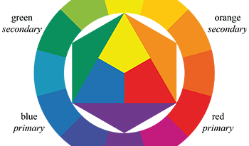
Color wheels provide a way to describe the ordering of hue and, in some cases, to aid in understanding color mixing. The artist’s color wheel (Figures 1 and 2), epitomized by Itten [23], is used extremely widely in teaching. Its primary colors are red, yellow, and blue. This is the color wheel that students meet in primary school. In this wheel, the opposite of blue is orange. When students meet more advanced material in color theory, they find apparent contradictions. The printer’s color wheel has primaries cyan, magenta, and yellow, which the student might be taught to understand as a refinement of blue, red, and yellow. But curiously, for the students the color labeled “blue” in the printer’s color wheel is opposite to yellow, not to orange. In my own early introduction to color, I found the art books’ insistence that orange was the opposite of blue conflicted with my observation that, in many works of art and design, yellow appeared to be the more apposite opposite. Further confusion comes to the student when they meet the opponent-color theory, in which there are four principal colors, with blue opposite yellow (Figure 3); and Munsell’s color system in which there are five principal hues, with blue opposite yellow-red (Figure 4). The challenge for the educator is in explaining these differences.
These differences can be downplayed in educational material. For example, one text for art students states that “Color wheels must always have an even number of hues and that number must be divisible by three. Any other combination would not be a true and accurate color wheel” [5, p. 66, emphasis mine]. This is a simplification by the author for the benefit of the students, as the author is well aware of the NCS and Munsell color systems which have four and five principal colors, respectively, [5, p. 31] and which have a well-defined notation for describing colors around the hue wheel.
Figure 1.
An Itten color wheel with twelve hues. The three primaries (red, yellow, and blue) combine to make three secondaries (green, orange, and purple). Each primary combines with its neighboring secondaries to make six tertiary colors.
One of the reasons to question the received wisdom is that almost all art texts, inspired ultimately by Itten’s seminal work [23], use angles on the color wheel to determine “harmonious” color combinations (Fig. 2). If the color wheel is not immutable, as the different color wheels suggest, then these harmonies rest on insecure foundations.
This is by no means a new problem [4, Ch. 6B] [7]. Some of the differences between the different color wheels can be explained from the principles underlying their constructions and the uses for which they are designed. There is a difference in how you construct your color space depending on whether you are mixing colored lights, mixing colored pigments, or dealing with human visual perception [9]. For example, Itten’s artist’s color wheel is based on subtractive color mixing of pigments; opponent-color theory is based on visual perception; and Munsell aimed to bring clarity to color communication by establishing an orderly system for accurately identifying all colors. All the color spaces discussed in this paper are ways of specifying or mixing colors, so all can be considered as ways of dealing with pigment.
The contribution of this paper is to argue that our understanding of color wheels is mediated by the terms we use to describe colors, in particular, in the use of basic color terms [3]. This leads to some of the apparent differences between color wheels in two ways. First, generally across all color wheels, we use the same basic color name, such as blue, to represent subtly different colors in different wheels (Section 5), which confuses the student. Second, and specific to the artist’s color wheel (Fig. 1), while the artist’s (RYB) and printer’s (CMY) color wheels should both be identical, because they are both subtractive color mixing models, I argue that the differences between them are largely owing to the artist’s color wheel being actively driven by basic color terms in a way that puts it at odds with the optimal physical color mixing embodied in the printer’s color wheel (Section 6).
Figure 2.
The artist’s harmonious color combinations: (a) complementary, (b) split complementary, (c) triadic, (d) tetradic rectangle, (e) tetradic square, (f) analogous. (b)–(e) are from Itten [23, Figs. 54, 55].
Figure 3.
An NCS color wheel with four principal hues [17, 31, 44]. The four principals are red, yellow, green, and blue. The circle is divided into 400 units, 100 between each pair of principals. Hues between the principals are indicated by a numeral between the two principals’ initial letters. In this chart we see units every ten steps for each of the four quadrants.
Figure 4.
A Munsell color wheel with five principal hues and five intermediate hues [30]. The five principal hues are red, yellow, green, blue, and purple. The intermediate hues are indicated by combinations of the color letters (e.g., YR=yellow-red). The wheel is further subdivided into ten sections for each principal and intermediate hue, indicated by numerals. In this chart we see the 5 and 10 units for each of the ten sections. The “5” unit is the prototypical version of each hue. The “10” unit is a half-and-half mix of the hues either side. Image used under a Creative Commons 3.0 license from WikiMedia author Thenoizz.
I first give a summary of the history of color spaces and color wheels (Section 2), then a history of color naming and an outline of Berlin and Kay’s theory of basic color terms (Section 3). I describe five of the most commonly used color wheels (Section 4). I demonstrate that imprecise use of color names explains a substantial amount of the apparent inconsistencies between the different wheels (Section 5), allowing us to reconcile these differences. This leads to the observation that the technical color wheels are broadly consistent with one another, provided we are precise about our specification of the principal colors in those spaces, but that the standard artist’s color wheel is substantially different from the technical color wheels (Section 6), because its primary and secondary colors are so strongly related to use of basic color terms in English.
2.
History
Color has fascinated philosophers and artists since antiquity, but it is only in the last century that we have come to understand the psychophysical and biological mechanisms of color vision; so early writers could be said to be working in the dark. Aristotle described seven principal colors (white, yellow, red, violet, green, dark blue, and black) which he considered all to be mixes of white and black [39], a misconception that started to be challenged in the fifteenth century [1] but still held some sway until the eighteenth century. The discovery that red, yellow, and blue are the artist’s primaries was made in the early seventeenth century. Shapiro cites Parkhurst and Gage as reporting that four scholars independently discovered the artist’s tri-chromatic primaries. All four scholars were conversant with both art and the natural sciences, giving them access to the understandings needed to make this discovery. Shapiro asserts that it “… was the most important discovery in color before Newton’s own theory” [39, p. 624].
In the late seventeenth century, Newton conducted extensive investigations into the nature of color, discovering that white light split into an infinite range of colors: the visual spectrum. This discovery was at odds with the widely held belief that white was “pure” and could not be split and also at odds with the three primary colors discovered earlier that century, discrepancies that caused him much trouble to attempt to reconcile and which led to substantial challenges in his work being accepted. Nevertheless, in his writings before Opticks, whenever he listed his principal colors of the spectrum, he always added some phrase such as “with their innumerable intermediate gradations” to indicate that there were countless discernible colors, but in Opticks he omits to say this in all but one place, possibly in an attempt to placate his critics [39, p. 619]. Newton’s early work described five principal colors: red, yellow, green, blue, and purple, but he later added orange and indigo, leading to English’s current seven-color rainbow (see a longer discussion in the Appendix).
At the start of the nineteenth century, Goethe launched a challenge on Newton’s purely physical approach, tackling color instead as a perceptual phenomenon. To a technically trained modern, some of Goethe’s arguments can seem misguided when compared with Newton’s empiricism. But Newton was, in his own way, blinkered: fitting the data to suit his hypothesis rather than the other way round [35, 36]. The challenge Newton faced was that his evidence was inconsistent, because he was assuming that mixing lights (additive color mixing) and mixing pigments (subtractive color mixing) should produce consistent results. It was only in 1852 that Helmholtz deduced that different rules apply to the mixing of pigments and of lights [39].
The chemist, Chevreul, dyemaster at the Gobelin work in Paris, published De la Loi du Contraste Simultané des Couleurs et de l’Assortiment des Objets Coloris in 1839 [23]. This, and other emerging color theories, had substantial influence on artists in the nineteenth and early twentieth centuries. Itten says that “Delacroix… is the founder of the tendency, among modern artists, to construct works upon logical, objective color principles, so achieving a heightened degree of order and truth.” [13, p. 418]. The impressionists and post-impressionists, in particular, used theories of color contrast and optical color mixing.
Several early commentators on color, including da Vinci, noted that there appear to be four fundamental colors: red, yellow, green, and blue, in addition to black and white [20]. Hering formalized this into the opponent theory of color vision [9, 22]. Hering’s theory was further developed by Hård, Sivik, and Tonnquist in their creation of the Natural Color System (NCS). There is evidence that the four opponent principal colors are physiologically determined [16, 19]. Hering’s theory was not widely embraced at the time because there was no understanding of how responses to two different colors of light could interact to create a color-opponent signal. We know today that the neurons in the retina process the outputs of the light-sensitive cones to produce three channels of data to the brain: a high-resolution luminance channel, a lower-resolution red-green channel, and an even lower-resolution blue-yellow channel [4, p. 16], [22]. The opponent-color channels explain well several features of human vision, including the way in which color blindness manifests and the complementary afterimages caused after fixating on a colored field. Consistent with this theory is that you cannot perceive a color as having simultaneous components from either end of an axis, so a yellowish-green and a bluish-green both make sense, but a human can never perceive a color that is “reddish-green,” such a mixture being a nonsense.
Over far more than a century, philosophers, scientists, and artists have grappled with ways to represent and understand color, leading to many systems of color representation. Basic introductions can be found in computer graphics and design texts [12, Ch. 13], [24], [40, Ch. 20–22] [41], with more detailed explanations in specialist texts [4, 5, 7, 26], and a full history of color spaces in Kuehni and Schwartz’s 2008 book [28].
A color space is a three-dimensional representation of color. We can restrict ourselves to three dimensions because the human visual system has three types of receptor for color vision. All of the color spaces are mathematical transformations of one another. Hunter gives a detailed history of nineteen color spaces developed in the attempt to create a perceptually uniform space, starting with the CIE 1931 color space and Munsell’s original system, through to the CIELUV and CIELAB systems of 1976 [21, Ch. 8]. Derefeldt gives the background of the most important color appearance systems, including Munsell, NCS, CIELAB, and CIELUV. She gives their basic attributes, and the principles for scaling and notation of the variables. In particular, she makes a comparison of the hue spacing of the different spaces [9]. Note that there is considerable evidence that color vision is non-Euclidean, so any color space is not going to be a metric space, perceptually [4, p. 64]. For example, the CIELAB system has a cube-root relationship with the signals that are received by the cones in the human eye. This is to better match the perceptual response of the human visual system but means that linear mixes in the CIELAB system do not necessarily match mixes of pigments.
A color wheel is a representation of one dimension of a color space: hue. Color wheels have been used for centuries. The earliest known drawing of a color wheel dates from 1611 [34], a century before Newton’s Opticks [32].
A color wheel or, more accurately, a hue wheel, is a circle that passes through all of the spectral colors and then through the purples to join the two ends of the spectrum (Fig. 1). Hue is explicitly one of the three dimensions in some color systems, including NCS (Fig. 3) and Munsell (Fig. 4), and is implicit in others, where hue is a function of two or three of the principal dimensions of the space. For example, in the case of CIELAB, h=tan1(ba). When considering a color wheel, the hues always appear in the same order around the wheel but they differ in which hues appear opposite each other and in the relative angular separation of pairs of hues.
A student may make an assumption that a “true” color wheel exists and that the different color wheels essentially stretch or contract sections of the “true” wheel to fit their predilections, as if the colors were painted on a rubber bicycle wheel and we nailed certain hues to certain points on the rim. The stretching and contracting is epitomized in the differences in the angles red-yellow and green-blue, shown in Table I. When a color wheel is used as a mechanism to describe hue, then such stretching or contracting is fair: the wheel is not purporting to show precise physical relationships. However, when a color wheel is used to describe relationships or mixes between distant hues, such as in defining the “opposite” of a hue or “harmonious color combinations” (Fig. 2), then this stretching and contracting becomes questionable.
Table I.
The first four color wheels from Fig. 7, showing the differences in angle between the pairs red-yellow and blue-green, and giving the opposite colors to red and blue.
red–blue–OppositeOpposite
Color wheelyellowgreenof redof blue
Opponent (RYGB)9090greenyellow
Munsell (RYGBP)72°72°blue–greenyellow–red
Printer’s (RYGCBM)60°120°cyanyellow
Artist’s (ROYGBP)120°60°greenorange
3.
Basic Color Terms
Berlin and Kay proposed the theory that there are basic color terms in all languages [3]. These are the terms that you teach small children and which produce categories of color that are irreducible, that is, all other color terms are considered, by most speakers of the language, to be variations on these basic color terms.
In antiquity, classical scholars certainly privileged certain colors above others. In the distant past, the fundamental colors appear to have been severely limited. Berlin and Kay quote Geiger as suggesting that “Democritus and the Pythagoreans [fifth century BC] assumed four fundamental colors, black, white, red and yellow” [3, p. 136]. Elsewhere, Geiger comments that Aristotle [fourth century BC] “in his ‘Meteorology’ calls [the rainbow] tri-colored, viz., red, yellow, and green” [14, p. 57]. By the fifteenth century, things had developed a little further. Alberti cites three fundamental colors: red, green, and blue, combined with gray [1, Bool 1, paragraph 9] while da Vinci lists what we now call the color-opponent set of principal colors: red, yellow, green, and blue [20]. In the seventeenth century, Boyle listed the standard artist’s primaries: red, yellow, and blue [20], but added green and purple when actually conducting his experiments on color [6, p. 187]. In the early eighteenth century, Newton started with these five principal colors: red, yellow, green, blue, and purple, then added orange and indigo (see a longer discussion in the Appendix).
There is a question of nature versus nurture: how much the color categories are inherent in our psychophysiology and how much they are cultural constructs. There is good evidence that black, white, yellow, red, blue, and green are strongly tied to the perceptual mechanisms in the human brain [19]. Hardin notes that the four principal colors (yellow, red, blue, green) “… prove to be both necessary and sufficient for an English speaker to describe any spectral stimulus” [18]. The other basic color categories may be more culturally determined. Children are able to match and discriminate colors long before they have consistently codified the boundaries in color space of the basic color terms, so providing evidence that the boundaries are a social construct [2]. In any case, in order to communicate clearly between members of a language group, the learned categories must be at least partly a social construct, reinforced by parents, kindergartens, and primary schools because all members of the language group broadly agree on them.
Berlin and Kay identified that the number of basic color terms range between two (representing light and dark colors) and twelve, depending on the language. In English there are eleven basic color terms: red, orange, yellow, green, blue, purple, pink, brown, black, gray, and white. As an example of the irreducibility of these basic terms, consider how difficult it is to convince a child that brown is really “dark orange” or that pink is “light red” [18, p. 210]. You may teach a particular child or student to make finer distinctions, as between “cyan,” “azure,” “indigo,” and “turquoise,” but there is a cultural push toward teaching and agreeing on the eleven basic color terms [26, Ch. 11], and there is demonstrated effect of these basic categories on the ability to perform color discrimination [43]. The maximum number of basic color terms in any language appears to be twelve. Russian, and a few other languages, distinguish light blue (Russian goluboy) from dark blue (Russian siniy) [33]. This paper considers the case of English though most other European languages use the same eleven categories, which is important to our discussion because Itten, in particular, was working in German.
Rather than conducting new perceptual experiments, we are able to make use of results from three previous studies [3, 37, 38], which used color chips evenly chosen from Munsell’s color space.
Ignoring the monochrome black, gray, and white, there are eight basic color terms in English. Roberson et al. [37] experimented with an array of 160 colored chips, evenly spaced within the Munsell color system, asking English speaking subjects to categorize each chip into one of the eight color categories.
Figure 5 shows the mean color chosen by subjects for each color chip. In addition, each color region contains a small cross that marks the “best-example choice” for each of the eight colors, as described by Rosch [38]. Notice the difference in sizes of the different color terms: orange (5.5 cells), yellow (6.5 cells), and brown (9 cells), each take up only a small part of the color space compared with green (52.5 cells) and blue (36 cells). While I acknowledge that Munsell’s color space is non-uniform and is somewhat compressed in the yellow-red area and expanded in the blue-green area, that cannot explain the full magnitude of this difference. Over 50% of the chart is categorized as one of two terms blue and green; by contrast, red, orange, and yellow between them take up just 14% of the chart (see also Hardin’s comments on the relatively small sizes of the “warm” colors’ regions compared with the relatively large sizes of the “cool” colors’ regions [19]). Describing a color as “red,” “orange,” or “yellow” will always give a color close to the “best-example choice,” that is, the color will be close to what an average person would imagine it to be. By contrast, describing a color as “green” or “blue” can give a color that is a significant distance from the “best-example choice.” Hardin discuses the consistency of such studies, noting that, across the many studies, “No matter how many basic color terms languages might have, their foci [“best-example choices”] tend to cluster reliably in relatively narrow regions of the [Munsell] array, whereas boundaries are drawn unreliably, with low consistency and consensus for any language.” [18, p. 208]. As evidence that there is consistency between observers, consider that the NCS color system is predicated on there being good agreement between observers on what Berlin and Kay call the “best, most-typical example” of the four principal colors red, yellow, green, and blue [17].
Figure 5.
Roberson, Davies, and Davidoff’s diagram of the eight basic colors in English (redrawn from [37, Fig. 1a]). The color space is that of the Munsell color system, which has five principal colors, red (R), yellow (Y), green (G), blue (B), and purple (P), and their various combinations along the horizontal axis, with brightness on the vertical axis (2=dark, 9=light). See Fig. 4 for an explanation of the notation. The experiments used a 160-chip Munsell array and the array shows, for each of the 160 cells, the mean color chosen by English speakers for each color chip. Some cells lie on the boundary, in which case the boundary passes through the center of the cell. The small crosses mark the “best-example choices” for each of the eight colors, as described by Rosch [38]. The color of each area matches that best-example choice, within the limits of the available gamut. The “best-example choices” are taken directly from Rosch’s 1972 paper [38]; the locations of several of these “best examples” are placed incorrectly in Roberson et al’s 2000 paper [37, Fig. 1a].
Figure 6.
Berlin and Kay’s diagram of the eight basic colors in English (redrawn from [3, Appendix I, p. 119]). As in Fig. 5, the color space is that of the Munsell color system. See Fig. 4 for an explanation of the notation. Berlin and Kay used a 320-chip Munsell array. They asked participants to determine, for each basic color term, x, (1) all those color chips which they would, under any conditions, call x, and (2) the best, most-typical examples of x. The small crosses mark the locations of the “best, most-typical example” for each color. The color of each area matches that best most-typical example, within the limits of the available gamut. The white areas represent color chips that were not given an unequivocal color name.
Berlin and Kay undertook a different experiment [3], using a 320-Munsell chip array, in which, for each basic color term, they asked English speaking subjects to select all those chips that they would, under any conditions, categorize as being of that color. Figure 6 shows the regions in which they got an unequivocal response from their subjects. One important result, for our investigation, from Berlin and Kay’s work is that both cyan and indigo were unequivocally described as “blue” by their subjects.
Figure 7.
Representations of the principal colors of five color wheels, as they might be constructed by a student. All colors are represented by their initial letter: Red, Orange, Yellow, Green, Cyan, Blue, Indigo, Purple, Violet, Magenta. All color names are taken at face value. Left to right: (a) color-opponent theory, with four principal colors, RYGB; (b) Munsell’s color system with five principal colors, RYGBP; (c) the printer’s color wheel with the three subtractive primaries for color printing CMY and their three secondaries RGB, RYGCBM; (d) the artist’s color wheel with the three painting primaries RYB and the three secondaries OGP, ROYGBP; (e) Newton’s color wheel, with the seven colors of the rainbow, ROYGBIV, notice that Newton’s colors are not evenly spaced round the wheel (see Appendix).
Note that pink and brown do not appear on the standard color wheel. Pink is a light variant of red. Brown is a dark variant of orange. The basic English color terms along the visual spectrum are thus red, orange, yellow, green, blue, and purple. Of these, orange is a relatively recent addition to the basic color terms in English. Red (Old English réod), yellow (geolu), green (grene), and blue (blaw) are all ancient color terms. Purple was brought into English, from the Latin, in the ninth century. Orange, by contrast, was adopted only in the early sixteenth century. Its first attested use as a color name was in 1512. Prior to this it had been known as yellow-red (Old English geoluréod). It is unclear when orange became a basic color term in English, but it is a possibility that Newton’s description of the spectrum was an influence. Similarly, in German, gelb, rot, blau, and grün are ancient terms with words for orange and purple being more recent [25].
4.
The Color Wheels
Figure 7 illustrates the principal colors of five color wheels in common use. It is immediately obvious that they do not map linearly to one another. The color that is diametrically opposite to blue ranges from yellow (Fig. 7(a),(c)) through orange (Fig. 7(b),(d)) to a red-orange (Fig. 7(e), but see also the Appendix). I briefly describe each of the five color spaces, including the purposes for which it was designed and the principal colors it uses.
4.1
Opponent-Color Spaces, RYGB, Figure 7(a)
The opponent-color spaces are based on the perceptual opponent colors of Hering. The opponent principal colors, RYGB, are used in the CIELAB color space [4, p. 67], which is designed to be a reasonably uniform space, perceptually (see Section 2), and in the Natural Color System (NCS) [17], [4, p. 39], [10, p. 99], [31, 44] (Fig. 3), which is designed for specifying color in a similar manner to Munsell’s color system but, in the case of NCS, using the observer’s in-built understanding of what is meant by a “pure” red, yellow, green, blue, black, and white [31]. Derefeldt notes that “The development of the NCS began by psychometric testing of Hering’s conceptual framework having observers estimate qualitative color attributes by assuming that observers could imagine six elementary colors by means of verbal definitions only. These imaginary colors, which constitute cognitive, natural reference points, were used as references in absolute judgments without any physical representation of the references. … The definitions of the six elementary colors… follow Hering’s definitions of primary colors closely”. Both CIELAB and NCS are used for specifying color rather than purporting to represent color mixing. Because CIELAB is non-linear, a linear mix in CIELAB space will not necessarily create the same color as mixing matching pigments. Because NCS is entirely perceptual, there is, again, no guarantee that a linear mix of two NCS colors will match the mix of two pigments. The principal colors, RYGB, are four of Berlin and Kay basic color terms.
4.2
Munsell Color System, RYGBP, Figure 7(b)
The five principal colors in this space are those used by Boyle in his seventeenth century color experiments [6, p. 187] and are the original five colors of the rainbow specified by Newton. Munsell formalized this in the early twentieth century, using the “… guiding principal of equality of visual spacing” [4, p. 36]. The color space was designed to aid in color specification, originally for schoolchildren. The specific colors of the five principal hues were determined visually. Munsell’s color order system was extensively reworked (“renotated”) in the 1940s by the Optical Society of America. This was a painstaking process of measuring the discriminability of the colors and adjusting the spacing of the colors to optimize them for use in science and industry [29, 30]. It should be made clear that Munsell’s space is not a uniform color space: small steps should be roughly equal visually but large steps cannot be compared. Berns implies that having five principal hues leads to greater visual equality between neighboring hues than a system based on the four principal unique hues of red, green, yellow, and blue [4], though Kaiser and Boynton suggest that there is evidence that the Munsell principal hues are not necessarily spaced evenly perceptually, in particular that P and PB are too far apart [26, p. 494]. All five principal hues are Berlin and Kay basic color terms.
4.3
Printer’s Color Wheel, RYGCBM, Figure 7(c)
This is the most pragmatic of the color wheels, relating directly to how printing works. The color space is explicitly designed for color mixing. The three principal colors, cyan, magenta, and yellow, are the primaries of subtractive color mixing, as used in printing. Each primary is physically realized as a pigment that absorbs certain wavelengths of light. When two primaries are mixed or superimposed, the mixture absorbs the wavelengths that are absorbed by each pigment in proportion to the amounts of each primary mixed. The specific primaries chosen are pigments that, when mixed, allow production of a large gamut of colors. Good choices for primaries, that produce close to the largest gamut achievable with three pigments, are broadband yellow, broadband cyan, and broadband magenta (see Section 6). Mixing each pair of primaries produces the three secondaries, which are called red, green, and blue, although these turn out to be rather imprecise descriptions (see Section 5.6). While four of these six colors are Berlin and Kay basic color terms, it is important to our discussion that cyan and magenta are not. As a consequence, cyan and magenta are relatively precise terms, and each is well-localized in color space compared to say, blue or green.
4.4
Artist’s Color Wheel, ROYGBP, Figure 7(d)
This is the wheel that Itten exemplified (Fig. 1) [23]. This color wheel has been known for over two centuries, but Itten’s work in the 1950s and 1960s pushed it to preeminence. Prior to Itten, other color wheels had been used in art teaching. For example, an opponent-color system designed by Wilhelm Ostwald was used in British art education between the two world wars, in which the color wheel had four principal colors, though Ostwald used a bluish-green opposite red [7, Sec. 7.3] rather than the pure green used by NCS and Hering. Itten, by contrast, designed his color wheel on the foundations that there must be three primaries and that diametrically opposite colors must mix to gray [23, p. 21]. Briggs comments on how pervasive Itten’s influence has become: “Itten’s book [The Art of Color (1961)] has been so influential that it defines the limits of artistic color theory for the majority of sources on the internet today… As a result of its half century of ascendancy, many artists today assume that traditional color theory has dominated art education continuously since its origins, and assume modern color theory is a very recent intrusion” [7, Sec. 11.3]. Itten himself developed the concepts of harmonious combinations of color (Fig. 2), which are specified by precise angular relationships around the color wheel. The artist’s color wheel is used to help artists understand color relationships and color mixing. Red, yellow, and blue are the primary colors (in which primary is used in the same sense as in the printer’s color wheel, Section 4.3), mixing to make the three secondaries: orange, green, and purple. All six of the primary and secondary colors are Berlin and Kay basic color terms (see Section 6 for a discussion of the implications of this).
4.5
Newton’s Rainbow, ROYGBIV, Figure 7(e)
This is the prototypical early color wheel, from when evidence was beginning to be gathered about how colored light and color mixing worked. It is misguided in several respects (see the Appendix). Newton originally described the rainbow as having five colors, the same five that Munsell used two centuries later, but Newton quickly adopted two extra colors (orange and indigo) to make the seven-color rainbow that is taught in all English-language primary schools. His color wheel is not evenly spaced and his use of the terms “blue” and “indigo” do not match their modern uses, but this color wheel has gained almost unstoppable traction in English education about color, to the confusion of many students. Newton’s rainbow has the same colors as the artist’s color wheel plus indigo.
5.
Reconciling the Different Color Wheels
Consider the structure of the various color wheels as a student would view them. Fig. 7(a)–(d) shows the result if you place the principal colors evenly spaced around the wheel, as they are in all diagrams in the student’s text books (e.g., Figs. 1, 3, 4). Table I tabulates the angle a student would measure between red and yellow and that between green and blue. The red-yellow angle varies from 60 (Fig. 7(c)) to 120 (Fig. 7(d)), while the green-blue angle varies from 120 (Fig. 7(c)) to 60 (Fig. 7(d)). In a non-metric space, these angles are, at best, approximate, but a student will still worry about why the angular distances around the wheels differ so markedly, especially if they have been trained to build the harmonious color combinations of Fig. 2, which explicitly require consideration of angle. They will also be concerned to understand why diametrically opposite color pairs differ between color spaces.
5.1
What is Meant by “Opposite”?
Let us return to the question “what is the opposite of blue?.” The discussion above has implicitly assumed that the “opposite” of a given hue is the hue that is on the opposite side of a diameter through the center of a color wheel. There are at least three other useful definitions of opposite [13, 20].
Additive complementaries: two colored lights that, when mixed, give white.
Subtractive complementaries: two pigments that, when mixed together, produce a gray. In theory, opposites on the artist’s and printer’s color wheels (Fig. 7(c) and (d)) should do this.
Perceptual complementaries: a color’s opposite is the color perceived as an afterimage after fixating on the first color for a significant period of time.
As Harkness shows [20], each of these give slightly different opposites for any given color. For example, fixating on Itten’s red and then looking away will give a blue-green sensation rather than the green that is diametrically opposite on the artist’s color wheel [7, Sec. 11.3]. So the word “opposite” needs to be defined carefully in order to give a clear answer to our question. This means that we should not expect the Munsell or opponent-color wheels to have the same color diametrically opposite blue as do the printer’s or artist’s color wheels, because the Munsell and opponent-color color spaces were not designed using criteria by which opposite colors necessarily represent complementary colors. Indeed, these color spaces are non-linear spaces and therefore, attempts to use them for accurate color mixing will fail.
However, we would expect the printer’s and artist’s color wheels to have the same diagonally opposed colors, because they are both constructed by the same principle of subtractive complementarity. We find that they do not: the diagonal opposite of blue is yellow in the printer’s color wheel and orange in the artist’s. As the definition of “opposite” is the same in these two wheels, we must consider the definition of “blue.”
5.2
What is Meant by “Blue”?
When asked to imagine a blue, the average person will choose a color close to the “best, most-typical example” at 10B/4.5. But when asked if a particular color is “blue,” the answer is “yes” for a range from cyan through indigo (Fig. 6). “Blue” can refer to any spectral color from about 490 nm (a greenish-blue, cyan) to 450 nm (a purplish-blue, indigo). What we mean by “blue” changes the answers to questions about that color. As Itten says, “unless our color names correspond to precise ideas, no useful discussion of color is possible” [23, p. 30].
The answer to “what is the opposite of blue?” depends both on what you mean by “opposite” and on what you mean by “blue.” Some of the differences in the “opposite of blue” column in Table I are owing to differences in the meaning of “opposite” and some are explained by the word “blue” referring to different hues in the different cases.
Figure 8.
The color wheels of Fig. 7(a)–(d) and Figure A2(b) redrawn to reflect the actual color represented by each of the principal color names. An uppercase letter represents the same color as in Fig. 7, a lowercase letter indicates a color modifier, with “-ish” added to the end of the color name; for example, oR is “orangish-red.” Inside each wheel are labels for the actual colors represented by each colored disc. Outside each wheel are the approximate locations of the best, most-typical examples of Red, Yellow, Green, and Blue. The thick arc indicates the green-blue angle. The thick dotted arc indicates the red-yellow angle. The six color wheels are: (a) CIELAB, one variant of RYGB; (b) Munsell’s RYGBP; (c) the printer’s color wheel, RYGCBM; (d) the artist’s color wheel, ROYGBP; (e) Newton’s ROYGCBV where we have used the correct angles from Figure A1 and applied the color corrections discussed in the Appendix; (f) NCS, a second variant of RYGB in which the color names match their best, most-typical examples of that color.
Figure 9.
Mixing real primary inks to produce the three secondaries. Inner ring: primary color toners mixed on a color laser printer [Fuji Xerox FX ApeosPort-IV C3375 v3018.103 PS]. Outer ring: primary fluid acrylic paints mixed with a paintbrush [paints from Golden Artist Colors, Inc: Primary Cyan (pigments PW6/PB15:4/Titanium White/Phthalo Blue(GS)), Primary Magenta (pigment PV19/Quinacridone), Primary Yellow (pigments PY3/PY73/PW6/Hansa Yellow Light/Hansa Yellow Medium/Titanium White)].
5.3
Imprecision in color naming
More generally than blue, we find that the color names are imprecise in several cases in our various color wheels, where the actual principal color used in the color system does not match the “best most-typical” example of that color name. If we consider the colors by how they actually appear, rather than by their basic color names, we find that it is possible to reconcile a great deal of the apparent differences between the wheels.
Consider the color wheels in light of the linguistic ambiguity inherent in the color names and in terms of the true appearance of each color. In Fig. 7, we assumed, as a student might, that each color represented the “best, most-typical example” of that color, marked by the crosses in Fig. 5. Figure 8 redraws those diagrams to reflect the actual color that is represented by each of the general color terms. We consider each wheel in turn.
5.4
Opponent systems (CIELAB and NCS), RYGB
In the standard CIELAB system (Fig. 8(a)), yellow and blue match their best, most-typical examples, but red and green do not. CIELAB red is a purplish-red; CIELAB green is a cyanish-green [20].
By contrast, in the Natural Color System (NCS), the four principal colors all do match their best, most-typical examples (Fig. 8(f)) because NCS is defined explicitly in terms of the colors that an observer would consider to be “pure” red, yellow, green, and blue [17, p. 181] [31].
5.5
Munsell, RYGBP
Both the principal green and the principal blue have a cyanish cast to them (Fig. 8(b)), so true green and true blue are closer to yellow and purple, respectively.
5.6
Printer’s, RYGCBM
To assess the printer’s color wheel (Fig. 8(c)), consider the colors in Figure 9. This shows two different example sets of CMY inks mixed to make two sets of RGB secondaries. Note the consistency between the two sets of secondaries. Here “green” is close to the “best, most-typical” green, but “red” is an orangish-red, rather than the “best, most-typical example” of a red, and “blue” is far removed from “best most-typical,” being a deep purplish-blue: an indigo.
5.7
Artist’s, ROYGBP
Following Itten [23], the artist’s principal colors match their “best, most-typical” examples, by definition, because, in the absence of any other concept, the student will use their internal linguistic definition of the color to ensure that their red is neither shading toward yellow nor shading toward blue, and likewise for all the other colors (see Section 6).
5.8
Discussion
Consider the six revised wheels of Fig. 8. Here, I have indicated the actual hue of each of the principal colors and indicated an approximate location for the “best most-typical examples” of yellow, red, blue, and green. We find that CIELAB (Fig. 8(a)), Munsell (Fig. 8(b)), and the printer’s color wheel (Fig. 8(c)) are now all very similar. Our linguistic adjustments push all three of these color spaces close enough to one another, so that we can see that they are describing much the same thing. Newton’s ROYGCBV (Fig. 8(e) and Appendix) is a little distorted, with a larger red-yellow angle than those three color wheels, emphasizing the role of orange, but this was an early attempt at a color system so we can accept it as a rough approximation. We include it because of its continuing influence on children’s education about color. The NCS opponent-color system is distorted further, but it is designed for color specification not for color mixing and it is known to be perceptually uneven: there are more visually distinct hues between red and blue than between yellow and green [10, p. 100]. The outlier is the artist’s color system where the red-yellow section is clearly expanded and the blue-green section compressed compared with all the other wheels.
6.
Why is the Artist’s Wheel Different?
In theory, the artist’s RYB and the printer’s CMY color wheels should be identical. Both purport to have primaries that cannot be made by mixing other colors. Both purport to be able to create all hues from the three primaries. Both purport to have diametrically opposite colors that mix to make gray. However, the CMY color wheel is demonstrably the correct way to do this, given that these are the colors used in the vast majority of commercial color printing processes. The underlying theory is that each of the primaries theoretically absorbs exactly one-third of the visual spectrum. Berns [4, Ch. 6], for example, suggests splitting the spectrum into thirds at 500 nm and 600 nm. A theoretical cyan ink absorbs all red and orange light. A theoretical magenta ink absorbs all yellow and green light. A theoretical yellow ink absorbs all blue and violet light. Combinations of these three primaries can produce any hue. In practice, the spectra of the three inks are not perfect squares [4, pp. 154–5], [27, Figs. 1.4-20,-22], so the range of colors achievable is not as broad as would be possible with perfect theoretical primaries, but we can manufacture inks of sufficient quality to satisfy the vast majority of our printing needs.
The dramatic difference between the theoretically correct CMY color wheel and the artist’s RYB color wheel can be explained by considering the mechanism by which the artist’s colors are chosen. In Itten’s seminal writing on the color wheel [23], he writes: “… a person with normal vision can identify a red that is neither bluish, nor yellowish; a yellow that is neither greenish, nor reddish; and a blue that is neither greenish, nor reddish… The primary colors must be defined with the greatest possible accuracy.” There is no freedom here to allow red to be magenta, because magenta is a red that is distinctly bluish, nor is there freedom to allow blue to be cyan, because cyan is a blue that is distinctly greenish. I hypothesize that Itten is placing his three primaries at or near the “best, most-typical locations” in the Berlin–Kay sense. Itten then mixes his secondaries, which are all also Berlin–Kay basic color terms. So while Itten says that his hues are “… evenly spaced with complementary colors diametrically opposite each other,” his even spacing is in a linguistic sense rather than a physical one.
Note also how Itten defines his red, yellow, and blue. Red is “neither bluish, nor yellowish,” defined relative to the other two primaries. But yellow and blue are “neither greenish, nor reddish” (emphasis mine), so Itten’s three primaries are defined relative to the four principal colors of opponent-color theory [7, Sec. 11.3]. The NCS color system defines its principal colors in exactly the same way [17, p. 181], but uses this defining mechanism to create four principal colors rather than the three primary colors of the artist’s color wheel (Fig. 8(f) cf. 8(d)).
By having red and yellow as primaries in the artist’s color wheel, orange becomes a natural secondary and, because it is a basic color term, it is possible to mix orange so that, to the artist’s eye, it is neither too reddish or too yellowish, thereby occupying its “best most-typical” position in color space. With blue in the third of the primary positions, it is obvious from the English Berlin and Kay chart (Fig. 5) that the other two secondaries are going to be green and purple, if we wish them to also be basic color terms. As with orange, it is possible to mix these, as Itten says we should, so that they are well-balanced and not leaning toward the color on either side, which I hypothesize places them at the “best most-typical” positions.
The substantial difference between the artist’s color wheel and the other color wheels would not be a problem if the artist’s color wheel, as designed by Itten, were not so pervasive in education about color.
The challenge with creating the artist’s color wheel is that Itten had two aims that cannot be satisfied simultaneously: he wants his diametrically opposed colors to be perfect subtractive complementaries [23, p. 20] and he wants his primary and secondary colors to be mixed “very carefully” so that, perceptually, they do not “lean toward” either color on either side [23, p. 29]. The former is achieved correctly by the printer’s color wheel; the latter pushes the primary and secondary colors to their “best, most-typical locations” in perceived color space. The fact that the printer’s color wheel and the artist’s color wheel are substantially different demonstrates that these two aims cannot both be satisfied in the same color wheel (It is possible to create narrowband pigments for opposing colors in Itten’s scheme, so that the opposing colors mix to gray, but broadband pigments for the primaries do not allow coverage of as large a gamut as CMY.).
The artist’s RYB is thus an approximation to CMY, yet the artist’s color wheel remains by far the most popular color wheel, outside the technical sphere. This, in spite of the fact that the printer’s wheel is technically superior for mixing the widest possible range of colors. We must ask why it is that a color wheel that appears technically inferior should be so tenaciously held. I hypothesize that the artist’s color wheel’s success is owing to its use of the six basic color terms that correspond to spectral colors: if you are teaching color theory to children, you will gravitate toward using the color names with which they are most familiar.
One of the challenges in teaching technical printing is to explain to the student the special role of magenta and cyan, and to describe what they are in terms of the basic color terms (“reddish-pink” and “greenish-blue,” respectively). For example, Gleeson, in her text on the illustration of picture books, identifies magenta with red and cyan with blue [15, p. 53], while Cianciolo, writing on the same topic, twice mentions the four process colors, naming them as red, yellow, blue, and black [8, pp. 61, 88]. This is not necessarily a misunderstanding on the author’s part but a need to explain the technical concepts (“magenta” and “cyan”) in a language that is accessible to the general reader (“red” and “blue”).
As a framework for teaching color, RYB does admit the possibility of using colors other than the “best most-typical” and artists over the centuries have used a range of different reds, yellows, and blues as their primaries. However, magenta is outside the red zone in the Berlin and Kay diagrams. I hypothesize that the untrained observer has a challenge with accepting magenta as a primary, because it is not intuitively satisfying. Though magenta is the correct color for printing, it does not fall at one of the optimal points in Berlin and Kay’s diagram, being somewhere between red, pink, and purple. Red is much more satisfying, being one of the key colors in Hering’s theory of perception. Yellow, by contrast, is both a primary and an optimal point in linguistic color space, so we have no trouble accepting it. Cyan is a blue but it is not the most typical blue.
There is a further gloss on the use of RYB. Despite it being taught to children as a way of “mixing colors,” it would be extremely unusual for a professional artist to have just three colors on their palette. Rather, the artist’s color wheel is used as a framework within which to understand color relationships. This is because it is not possible to achieve all colors by mixing just a red, yellow, and blue; and because having a pure hue allows for consistency of color not achievable in repeated mixings. For example, Matisse used a palette of 17 colors, van Gogh 9 colors, and Fryer shows an example of his own work with a palette of 14 colors [13, p. 419]. And, while the color harmonies of Fig. 2 are widely taught, any professional artist or designer will use their own judgment of harmony rather than slavishly depend on this basic framework. Indeed, Itten himself says that different students find different combinations harmonious so that there cannot be a general principle that appeals to all [23, p. 23].
7.
Conclusion
Some of the apparent differences between the color wheels can be explained linguistically. The most obvious example is that we recognize that “blue” has a broad spectrum of meanings and that the “best, most-typical” blue is an imprecise approximation to the true color represented by the word. In the printer’s color space, “blue” is an indigo, in Munsell’s color space it is tending to cyan, in the NCS and artist’s color spaces it is sitting at the “best most-typical” position, and in the traditional rainbow, ROYGBIV, it transpires that “blue” was originally used by Newton to mean “cyan.” But all of these are described informally by the single term “blue.” Likewise “red” and “green” are used in some color spaces to refer to colors that are not the “best most-typical” example of the color.
What can educators conclude from this? Using commonly understood terms, like “opposite” or “blue”, to also have a specific technical meaning leads to problems, unless one is careful to define those terms to have precise meaning. When educating students about color, we need to be careful to be precise in what we mean when we use terms like “blue.” In the printing industry, we already have this precision when talking about the CMY space, because cyan and magenta are not basic color terms, so our students understand them to have precise meanings, and yellow is a precise term in common usage, because it occupies such a small part of the overall color space (Fig. 5). But terms like red, green, blue, and purple all have imprecise meaning in English and we must be careful to ensure that we are defining them appropriately.
There is a remaining challenge, which is that the artist’s color wheel is at such odds with all of the other color wheels and yet is the first color system that most people will meet. I hypothesize that one reason for its tenacity is that it is a convenient approximation that allows educators to use six of the basic English color terms in explaining how color works.
Appendix.
Newton’s Color Wheel
Newton’s seven-color rainbow is pervasive in English-language education but it is based on shaky foundations. Newton performed some of the earliest scientific work on understanding color. He had access to some of the earliest optical components that were of good quality and demonstrated that a prism split white sunlight into a spectrum of colors. In Newton’s earliest work on this, he names five colors of the spectrum: red, yellow, green, blue, and violet [39]. In his later work he augments this to seven colors adding orange (a relatively new word in English) and indigo (which was a recently discovered, imported dyestuff). The addition of these two colors appears to have been driven by his desire to get the spectrum to agree with the notes of the musical scale [32, p. 114]. Goethe critiques Newton for adding orange and indigo and criticizes his musical analogy as an attempt to impose on the colors a mathematical order they do not in fact have [36].
Figure A1.
Newton’s color wheel (adapted from [32, Book I, Part ii, Plate III, Fig. 11]). Notice that orange and indigo have segments of only 30 compared to the 60 allocated to the five other colors. The uppercase letters AG are intended to correspond to the notes of the musical scale, with orange and indigo corresponding to semi-tone intervals. The lowercase letters px are at the centers of the seven-color arcs. Notice that the blue (t) is directly opposite the boundary (E) between red and orange.
To get from a linear spectrum to a circular color wheel “Newton also notes that purples could be created by combining light from the two ends of the spectrum…” [42, p. 193] so allowing us to join up the two ends into a circle [39, p. 620]. Looking at Newton’s own drawings of his color wheel (Fig. A1), we see an oddity: in order to match the tones and semi-tones of a musical scale, Newton gives the new colors, orange and indigo, only half as much space on the wheel as the original five colors. If we take his color wheel at face value, we see that the opposite of blue is the boundary between red and orange. This is significantly different from any of the modern understandings, where the opposite of blue lies between orange and yellow.
With regard to his use of the color indigo, “a careful reading of Newton’s work indicates that the color that he called indigo, we would normally call blue; his blue is then what we would name blue-green or cyan” [42, p. 193]. Finlay points out that, in the eighteenth century, indigo referred to a much wider range of colors than it does today [11, p. 340], generated by different concentrations of indigo dye. Taking into account both this information about the meanings of words and also the non-uniform spacing of colors means that a naïve version of Newton’s color wheel (Fig. A2(a)) is incorrect and what he meant is much better represented by Fig. A2(b), where we replace Newton’s “blue” by “cyan” and his “indigo” by our modern “blue.” We now find that the opposite of blue is orange-yellow.
Figure A2.
Two representations of Newton’s color wheel. (a) The wheel as it would be generated from a naïve literal reading of the color names and from equal spacing around the wheel. (b) The wheel when we take into account that Newton’s “indigo” is a modern blue, his “blue” is cyan and his spacing around the wheel is non-uniform (Fig. A1).
How much easier would our explanation of the rainbow be if Newton had chosen to stick with his original five colors, or had chosen to introduce cyan as his seventh color instead of indigo? We may even have been on the way to having a twelfth basic color term adopted into English, as does Russian. Russian does have seven basic color terms in its rainbow [33]. As it is, indigo is a constant source of confusion in teaching color in English: children are taught that indigo is a fundamental color in the rainbow, but most people do not distinguish it as a separate color. The artist’s color wheel discards it without hesitation: the seven-color ROYGBIV becomes the six color ROYGBP.
References
1AlbertiL. B.On Painting19662nd ed.Yale University Pressa translation, with introduction and notes, by J. R. Spencer of the Latin De Pictura, first published 1435
2AndrickG. R.Tager-FlusbergH.1986The acquisition of colour termsJ. Child Language13119134119–3410.1017/S0305000900000337
3BerlinB.KayP.Basic Color Terms: Their Universality and Evolution1969University of California PressBerkeley, CA
4BernsR. S.Billmeyer and Saltzman’s Principles of Color Technology19813rd ed.WileyNew York, NY
5BleicherS.Contemporary Color: Theory and Use20122nd ed.Cengage LearningClifton Park, NY
6BoyleR.Experiments and Considerations Touching Colours1664Henry HerringmanLondon, England
7BriggsD. J. C.(2007) The Dimensions of Colour: modern colour theory for traditional and digital painting media. Visited on 2018–12–24. [Online]. Available: http://www.huevaluechroma.com/
8CiancioloP. J.Illustrations in Children’s Books19762nd ed.Wm. C. Brown Company PublishersDubuque, IA
9DerefeldtG.GourasP.1991Colour appearance systemsThe Perception of Colour218261218–61Macmillan
10FairchildM. D.Color Appearance Models2005WileyChichester, England
11FinlayV.Color: A Natural History of the Palette2007Random HouseNew York, NY
12FoleyJ. D.van DamA.FeinerS. K.HughesJ. F.Computer Graphics: Principles and Practice19902nd ed.Addison-WesleyBoston, MA
13FryerM. J.2006ComplementarityOptics & Laser Technology38417430417–30
14GeigerL.Contributions to the History of the Development of the Human Race1880Trübner & CompanyLondon, England
15GleesonL.Making Picture Books2003Scholastic PressGosford, NSW, Australia
16GourasP.GourasP.1991Cortical mechanisms of colour visionThe Perception of Colour179197179–97Macmillan
17HårdA.SivikL.TonnquistG.1996NCS, natural color system—from concept to research and applications. Part IColor Res. Appl.21180205180–20510.1177/1069397104267891
18HardinC. L.BackhausW. G. K.BackhausW.KlieglR.WernerJ. S.Basic color terms and basic color categoriesColor Vision: Perspectives from Different Disciplines1998Walter de GruyterBerlin, Germany
19HardinC. L.2005Explaining basic color categoriesCross-Cultural Research39728772–87
20HarknessN.2006The colour wheels of art, perception, science and physiologyOptics & Laser Technology38219229219–2910.1037/h0041403
21HunterR. S.The Measurement of Appearance1975WileyNew York, NY
22HurvichL. M.JamesonD.1957An opponent-process theory of color visionPsychological Rev.64384404384–404
23IttenJ.The Elements of Color1970Van Nostrand ReinholdNew York
24JacksonR.MacDonaldL.FreemanK.Computer Generated Color: A Practical Guide to Presentation and Display1994WileyNew York, NY
25JonesW. J.German Colour Terms: a study in their historical evolution from earliest times to the present2013Vol. 119John Benjamins PublishingAmsterdam, The Netherlands
26KaiserP. K.BoyntonR. M.Human Color Vision1996Optical Society of AmericaWashington, DC
27H. Kipphan, Ed., Handbook of Print Media: Technologies and Production Methods (Springer, Berlin, Germany, 2001)
28KuehniR. G.SchwarzA.Color Ordered: a Survey of Color Systems from Antiquity to the Present2008Oxford University PressNew York, NY
29Munsell Book of Color (Munsell Color Company, Baltimore, MD, 1976)
30Munsell Color, (2018) Munsell Color website. Visited on 2018–12–24. [Online]. Available: http://www.munsell.com/
31NCS Colour AB. (2018) NCS Colour website. Visited on 2018–12–24. [Online]. Available: http://www.ncscolour.com/
32NewtonI.Opticks: or, a Treatise of the Reflexions, Refractions, Inflexions and Colours of Light1704Royal SocietyLondon, England
33ParameiG. V.2005Singing the Russian blues: an argument for culturally basic color termsCross-cultural Research39103810–38
34ParkhurstC.FellerR. L.1982Who invented the color wheel?Color Research & Application7217230217–3010.1037/0096-3445.129.3.369
35PlattsJ.2006Newton, Goethe and the process of perception: an approach to designOptics & Laser Technology38205209205–910.1037/h0032606
36RibeN. M.“Goethe’s critique of Newton: A reconsideration,” Studies in History and Philosophy of Science Part A 16, 315–335 (1985)
37RobersonD.DaviesI.DavidoffJ.2000Color categories are not universal: replications and new evidence from a stone-age cultureJ. Experimental Psychology: General129369398369–98
38HeiderE. Rosch1972Universals in color naming and memoryJ. Experimental Psychology93102010–20
39ShapiroA. E.1994Artists’ colors and Newton’s colorsIsis85600630600–30
40ShirleyP.AshikhminM.MarschnerS.Fundamentals of Computer Graphics20093rd ed.AK PetersBoca Raton, FL
41StoneM.A Field Guide to Digital Color2003AK PetersBoca Raton, FL
42WaldmanG.Introduction to Light: The Physics of Light, Vision, and Color2002DoverMineola, NY
43WinawerJ.WitthoftN.FrankM. C.WuL.WadeA. R.BoroditskyL.“Russian blues reveal effects of language on color discrimination,” Proc. National Academy of Sciences 104, 7780–7785 (2007)
44NCS Standard, Swedish Standard, Swedish Standard SS 01 91 02 Colour Atlas, 2nd ed. (Swedish Standards Institution, Stockholm, Sweden, 1989)