Back to articles
Work Presented at CIC31: Color and Imaging 2023
Volume: 67 | Article ID: 050411
Image
Grey Balance in Cross Media Reproductions
  DOI :  10.2352/J.ImagingSci.Technol.2023.67.5.050411  Published OnlineSeptember 2023
Abstract
Abstract

Grey balance plays an important role in determining the device values needed to reproduce colours which appear achromatic throughout the tonal range. However, complete observer adaptation to the media white rarely occurs, and these designated device values can still appear non-neutral. This poses a problem for cross-media reproductions, where a mismatch in neutral colours is often the most noticeable difference between them. This paper presents two related experiments which investigate a means of gaining better visual agreement between reproductions which have different background colours or media whites. The first quantifies the degree of adjustment (the degree of media relative transform) needed to make an appearance match between grey patches on a white background and on background colours of various hues and colourfulness. It was found that the degree of adjustment was near-linearly related to the luminance of the patch itself, with lighter patches requiring greater adjustment towards the background colour. Neither the hue nor the chroma of the patch’s background had any significant effect on the underlying function. In the second experiment, this concept is applied to pictorial images on paper-coloured backgrounds. Three pixelwise rendering strategies were compared. In side-by-side viewing, the adaptive control of neutrals outperformed the media relative transform in all cases. Even for modest differences in paper colour (ΔEab of 3), images with significant neutral content benefited from the adaptive approach.

Subject Areas :
Views 122
Downloads 53
 articleview.views 122
 articleview.downloads 53
  Cite this article 

Gregory High, Peter Nussbaum, Phil Green, "Grey Balance in Cross Media Reproductionsin Journal of Imaging Science and Technology,  2023,  pp 1 - 15,  https://doi.org/10.2352/J.ImagingSci.Technol.2023.67.5.050411

 Copy citation
  Copyright statement 
Copyright © Society for Imaging Science and Technology 2023
 Open access
  Article timeline 
  • received May 2023
  • accepted August 2023
  • PublishedSeptember 2023
jist
JIMTE6
Journal of Imaging Science and Technology
J. Imaging Sci. Technol.
1062-3701
1943-3522
Society for Imaging Science and Technology
1.
Introduction
Reproduction prints can appear on multiple papers that are quite different to a standard proofing substrate. The resulting prints can have different colour gamut volumes and different media white points. The different paper colours appear most obviously in the unprinted areas, but they also affect the appearance of all printed colours, and in particular the reproduction of neutrals which are generally judged relative to the chromaticity of the paper itself.
In the case of backlit displays a mismatch in media whites is less prevalent, since most are tuned to the chromaticity of the D65 CIE standard illuminant [1]. However, differences may still be noticeable in multi-display applications.
Differences of appearance between reproductions, particularly when viewed simultaneously, pose a problem for printed products, brand colours and advertising images. Despite differences in their media whites and colour gamuts, maximising the visual similarity between reproductions is extremely desirable, with the topic of “consistent colour appearance” being an active area of CIE research [2, 3].
Mainstream print applications typically assume either no adaptation (making an absolute colorimetric match) or complete observer adaptation to the substrate colour (a media-relative match) [4]. In display applications, the white point of the device is usually taken as the dominate light source, and complete adaptation to it is assumed.
However, for mixed viewing conditions, such as displays with white points different to their viewing environment or prints on non-white substrates, complete observer adaptation is rarely achieved, having a particularly strong effect on the perception of neutral colours in the reproduction. The problem is very apparent in cross-media comparisons when viewing two or more reproductions side-by-side.
1.1
Motivation
The problem of mixed adaptation in side-by-side comparisons was previously investigated by High et al. [5]. Using a colour-managed display, a pair of colour patches or pictorial images were reproduced with two different coloured borders, lighter than the enclosed stimuli, against an extended grey surround. In a graphic arts application such borders would typically be areas of unprinted paper, and these would be used as the white points for a colour transform between the two media. However, rather than relying on absolute or media relative renderings, a variable degree of adjustment was used to create a hybrid rendering, with observers adjusting the reproduction somewhere between an absolute and media relative transform to make the best visual match with a reference patch or image.
The degree of adjustment applied towards the reproduction background colour was driven largely by the lightness of the stimulus, with lighter and more neutral patches receiving an adjustment closer to media relative, and darker and higher chroma patches adjusted closer to an absolute colorimetric match. A similar pattern emerged for pictorial images, with more neutral and lighter high-key images being adjusted closer to a media relative reproduction.
However, observers often pointed out that the adjustment of the images was imperfect. A good example of this was an image with large areas of light and dark greys. A single adjustment could be made so that either the light or dark greys made an appearance match to the reference image, but not both. This led to the hypothesis that, rather than using a single degree of adjustment, an adaptive lightness-dependent rendering strategy may benefit the matching of neutrals for images reproduced on coloured backgrounds or non-white substrates.
1.2
Aims and Objectives
Our first aim is to establish a baseline degree of adjustment needed to match grey patches on different coloured backgrounds. This can be achieved with the same display-based method of adjustment used in the previous work [5]. In particular, it is important to identify any hue dependency and the effect of more colourful backgrounds.
Our second aim is to test the hypothesis that an adaptive and content-dependent rendering strategy can provide a better appearance match for reproduction images than a rendering based on a single degree of adjustment. This is particularly applicable in graphic arts for images reproduced on different paper colours. Given the potential complexity of rendering images in real time, this task is best achieved using comparison between pre-rendered images.
2.
Background
Grey balance plays an important role in the control of imaging devices, determining the amounts of colorant required to produce colours which appear achromatic throughout the tonal range. In print reproduction, ISO 12647-1 [6] differentiates between the terms “grey balance” and “grey reproduction”, defining grey balance as the device values that appear as achromatic, and grey reproduction as the colorimetric values which appear as achromatic, under specific viewing conditions. Predetermined device values may therefore not achieve a neutral grey appearance if the reproduction substrate itself is non-neutral or different from a reference.
In the case of CMY K four-colour process printing, grey colours can be produced using either a halftone printed with K black ink only, or else a combination of C, M and Y halftones. When printing halftones with black ink only, the resulting grey colours will have the same chromaticity as the substrate (essentially a media relative transformation to whichever paper is used).
For the C, M and Y channels, several methods of press colour adjustment are recommended [7]. One approach is that a given ratio of C, M and Y should match the chromaticity of the K-only grey on that substrate across the majority of the tonal range. These values can also form the basis of process control for press operators throughout the print run. The correct ratio of C:M:Y will be different for every paper and ink combination, with methods used to calculate it described as equivalent neutral density (END) [8, p.107], and more recently as neutral print density (NPD) [9]. However, if the substrate is viewed as non-neutral, then the grey balance resulting from these methods may also look non-neutral.
2.1
Chromatic Adaptation and White Point Normalisation
Chromatic adaptation is the response of the human visual system which compensates for changes in colour stimuli when viewed under different light sources. By adapting to the prevailing light source, a human observer can view a scene under two different lighting conditions, successively and with adequate adaptation time, and yet still perceive it as retaining much the same colour appearance. The process of chromatic adaptation is analogous to the channel-independent “white balancing” of a camera when viewing objects under different light sources, acting as a kind of gain control for the long, medium and short (LMS) wavelength-sensitive cone receptors in the retina. Chromatic adaptation models (CATs) generally follow von Kries’ hypothesis of normalising the predicted LMS cone responses relative to the adapting white points of each viewing condition [10, Ch.9]. CATs with various levels of complexity and performance [1113] may be employed to predict the colorimetric values of these corresponding colours [14].
However, predicting the matching appearance of stimuli under two different light sources simultaneously is less satisfactory, since observers do not adapt to both white points. Under these circumstances a state of mixed adaptation can occur, for example, between a soft copy (displayed on a monitor) and a hard copy (a print illuminated by room lighting) where the white point chromaticities differ significantly.
A compromise solution is to choose an adapting white point somewhere between the two light sources [15], with many CATs including a degree-of-adaptation term D to facilitate its modelling.
An adaptation factor of between 0.4 and 0.6 for the display-to-print comparison was quantified by Katoh [16], though this was dependent on the display’s luminance level. Similar degrees of adaptation have been suggested in other cross media studies [17, 18].
In the case of images printed on different coloured substrates, but observed under a common light source and viewing condition, the unprinted paper may be considered an induction field which shifts the appearance of the printed content towards a hue which is complementary to the paper colour as a function of simultaneous contrast [19]. A modest effect towards the opposing hue can also be characterised as a shift in appearance of the content, away from the hue of the paper and towards the chromaticity of the adapting light source. To counter this effect, it is necessary to adjust the reproduction colorimetry toward the chromaticity of the paper (analogous to a chromatic adaptation transform). The observer’s perception of colours relative to the paper may therefore be thought of as local adaptation, with the paper colour itself having a large effect on the perception of achromatic colours in the reproduction [17, 18].
In practical terms, an adjustment of the content towards the media white point is achieved simply by printing onto the paper. This change in reproduction colorimetry due to the paper colour alone is well predicted by a white point normalisation (a linear scaling in the XY Z tristimulus domain) and this is usually applied or previewed with colour management software using a media relative or substrate correction transformation [4, 20]. However, complete observer adaptation to the substrate colour may not occur, and options for applying a degree-of-adaptation to a print are somewhat limited.
2.2
Media Relative Colorimetry in Print Applications
In mainstream colour management for printing, the media relative (MR) transformation [4] is used to convert colorimetry between source and destination substrate colours, with source XY Z tristimulus values being scaled relative to the two media white points. This is expressed in Eqs. (1)–(3), where Xmw1Y mw1Zmw1 and Xmw2Y mw2Zmw2 are the tristimulus values of the source and destination media whites respectively, X1Y 1Z1 is the tristimulus value of a source colour, and X2Y 2Z2 is the scaled value of the resulting MR destination colour.
(1)
X2=X1(Xmw2Xmw1)
(2)
Y2=Y1(Ymw2Ymw1)
(3)
Z2=Z1(Zmw2Zmw1)
The substrate correction method in ISO 12647-2 [21] is functionally identical to the ICC media relative transform [4].
2.3
Incomplete Adaptation to the Substrate Colour
The CIE describes incomplete adaptation as the phenomenon in which the adopted white in a given viewing environment does not actually appear white to an observer [22]. This definition may be extended to cover all grey colours, which similarly may not appear as achromatic, affecting the resulting grey balance in reproduction images.
However, an adjustment for incomplete adaptation to a substrate colour is problematic, since the source white point has to be mapped to the reproduction substrate colour (unless white ink is being used). Anything other than a full MR transformation to the reproduction substrate results in colours on or near the transformed white point falling outside the output gamut, leading to clipping artefacts in the highlights of the reproduction image.
2.4
Adaptation to Image Content
Although the optimal rendering of neutrals is known to rely on the luminance and chromaticity of the adapting white point, observer preference for grey colours is also highly dependent on content [23]. For example, observers often prefer a cooler and slightly negative ab for grey patches viewed under a D50 light source. However, for complex colour images the observer preference is dependent on the image content, including memory colours (such as skin-tones, landscapes, etc.), graphical elements (line art, charts, etc.) and images with large areas (low spatial frequency) of neutrals.
In an image based print-to-display comparison, Green and Oicherman [18] simulated reproductions on various coloured substrates using a colour managed display, and compared them to a reference print in a D50 viewing booth (a typical soft proofing setup). It was found that, for a given test image, the degree of observer adaptation remained broadly constant despite it being reproduced on different substrate colours (including various lightness and chroma values).
In a further grey balance experiment by Green and Otahalova [17], observers were asked to choose from grids of grey patches printed at different lightness levels on several different substrates. The patches within each grid differed in chromaticity, and observers were asked to select the patch that appeared most neutral. Lighter greys appeared neutral when they were closer to the chromaticity of the substrate (consistent with the media relative approach). However, darker greys appeared more neutral closer to an illuminant-relative chromaticity (closer to the absolute colorimetric approach). In further analysis a single adapting white point was fitted somewhere between the substrate colour and a perfect diffuser, with the adaptation factor broadly in agreement with Katoh’s work [16]. However, these results based on grey patches suggested that a non-linear lightness-dependent model may have provided a better fit.
Printers have long observed that the appearance of some images is more susceptible to variations in grey balance than others. Brunner [24] noted that images with higher colour contrast, higher spatial frequency and fewer neutrals could remain acceptable despite a change in the grey balance of the press, whereas observers were far more sensitive to changes in images with more muted colours and lower spatial frequency.
Farnand [25] made similar observations when comparing print reproductions on the same substrate, but with changes to the reproduction grey balance consistent with the variability seen during a realworld press run. Differences in the CMY neutrals were found to be a good overall predictor of acceptibility.
These finding were echoed by Baah et al. [26] when looking at the acceptability of MR transformations between similar substrates. It was found that tolerances for lighter and more neutral patches were tighter than for higher chroma and darker solid patches. This indicated different levels of observer adaptation to the reproduction substrate, dependent on the colour of each patch.
2.5
Use of Soft Proofing Methods
For the experiments described in this paper we have employed standard graphic arts soft proofing methods to accurately preview images and their borders on a colour managed display under controlled viewing conditions [2729]. Room lighting, display white point and the grey surround in the user interface are all set to a chromaticity corresponding to D50, with the 2 standard colorimetric observer used throughout. This allows images and patches to be displayed with a variety of border colours, including some common paper colours, in a way that is consistent with industry practice and the simulation of hardcopy prints.
3.
Experiment #1: Adjustment of Neutral Patches on Chromatic Backgrounds
In this first experiment, we set out to expand on the previous study by High et al. [5] to determine the degree of media relative adjustment required to make an appearance match between grey patches reproduced on different coloured backgrounds. Based on the previous work, there was an expectation that the degree of adjustment towards each border colour would be a function of the patches’ lightness.
3.1
Method
Following a method similar to the previous study [5], an Eizo CG248-4K graphic arts display was calibrated and profiled with a Konica Minolta CS2000 telespectroradiometer (TSR) and ColorNavigator software, which was set to prioritise the control of achromatic greys throughout the tonal range of the display. The fluorescent room lighting, simulating D50, had been adjusted to provide dim ambient illumination, and the luminance of a calibration tile was measured at the faceplate of the display equivalent to 5.5 cd/m2 for a perfect reflecting diffuser. In this way, the TSR measurements also included any reflected ambient light when captured from the position of a seated observer. The display was prepared to a D50 white point at a target luminance of 200 cd/m2. Both accuracy and uniformity of the system was found to be well within the recognised tolerances for soft-proofing described in ISO 14861 [29], with a mean error of 0.38 ΔE00, and a maximum of 1.24 ΔE00. When checking the accuracy of the achromatic colours (R = G = B) throughout the tonal range a maximum ΔE00 of 0.26 was found for an RGB white of [255,255,255].
3.1.1
User Interface and Method of Adjustment
A colour-managed interface was developed using Matlab, with a colour transform from LAB to display RGB based on the display’s ICC profile. Target colorimetry was converted to CIE XYZ values, and scaled by a factor of 0.6 (to achieve a UI white point of 120 cd/m2 instead of the display’s native 200 cd/m2 peak luminance), before conversion back to LAB and then to display RGB using the colour transform. In this way the hardware’s native white point was hidden from view, and the extra “headroom” in luminance allowed for colour stimuli which might normally be clipped by a traditional display setup. The resulting D50 white point at 120 cd/m2 was in accordance with the P2 viewing conditions described in ISO 3664 [27]. An in situ measurement of the UI white point was made, reporting an XY Z = [118.61,122.46,102.34], where Y is luminance.
Figure 1.
User interface on 24′′ display with viewing conditions, and keyboard controls to make adjustments to grey appearance.
The user interface (UI) consisted of two grey patches with physical dimensions of 90 × 90 mm (see Figure 1). Each was surrounded by a 12 mm border, one a D50 reference white border and the other a chromatic border. (This presentation mode is consistent with the viewing conditions in graphic arts where it is usual to present reproductions with an unprinted border [30, 31].) Each patch with its border subtended an angle of approximately 10 from an observer sitting 65 cm from the faceplate of the display (this stimulus size matched the geometry used in the previous work [5], and also allowed images to be arranged 3-up in Experiment #2).
Using the keyboard controls observers were able to adjust the grey patch with the chromatic border until a visual match was made to the D50 reference patch.
3.1.2
Method of Adaptation
This experiment is based on the classic media relative (MR) transformation, since there is no benefit to using more complex chromatic adaptation transforms (CATs) when transforming achromatic colours between two media white points (though better visual agreement might be achieved for chromatic colours).
Equations (1)–(3) are therefore modified to include a degree of adjustment D, where a D of 1 would represent a complete scaling to the destination substrate (a media relative transform) and a D of 0 would represent a null-transform (an absolute colorimetric transform). Changes in D create a single dimension of adjustment between the two border colours, expressed in Eqs. (4)–(6).
(4)
XTest Patch=DXTest Sub .XRef .Sub .+1DXRef .Patch
(5)
YTest Patch=DYTest Sub .YRef .Sub .+1DYRef .Patch
(6)
ZTest Patch=DZTest Sub .ZRef .Sub .+1DZRef .Patch
3.1.3
Observers
Fourteen observers participated in the study, 8 males and 6 females, with an average age of 34 years. Nine out of the 14 considered themselves as having expertise in imaging.
3.1.4
Observer Tasks and Stimuli
Observers were screened against colour vision deficiency (CVD). A short training session provided ample time to adapt to the viewing conditions, and to gain familiarity with the keyboard controls. Although the experiment was presented on a display, instructions were couched in terms of print reproduction:
Images and colours are often printed on paper that is not plain white. A good example of this is the Financial Times newspaper (please see hard copy example). During this experiment you will evaluate a series of colour patches that are simulated to look as if they are printed on different papers. There will be approx. 60 pairs in total. For each pair, you will adjust the reproduction patch so that it has an appearance that is as similar as possible to the reference patch.
Table I.
Experiment #1 adjustment of reproduction grey patches. Target colorimetric values of user interface, patches and borders.
User interface (D50 chromaticity)LabCabhabXY Z
Grey surround50.000.000.000.000.0017.7618.4215.19
Reference patch’s white border (D50 chromaticity)LabCabhabXY Z
Reference white border100.000.000.000.000.0096.42100.0082.49
Reference grey patches (D50 chromaticity)LabCabhabXY Z
Grey #191.680.000.000.000.0077.1480.0065.99
Grey #280.460.000.000.000.0055.4457.5047.43
Grey #365.750.000.000.000.0033.7535.0028.87
Grey #442.000.000.000.000.0012.0512.5010.31
12 chromatic borders around reproduction patchesLabCabhabXY Z
(6 hue angles, 2 chroma and lightness values)
Red #187.5010.836.2512.5030.0073.6071.0352.65
Red #282.5021.6512.5025.0030.0068.5361.2340.15
Yellow #187.500.0012.5012.5090.0068.4971.0347.12
Yellow #282.500.0025.0025.0090.0059.0361.2331.32
Green #187.50 − 10.836.2512.50150.0063.6271.0352.65
Green #282.50 − 21.6512.5025.00150.0050.4661.2340.15
Cyan #187.50 − 10.83 − 6.2512.50210.0063.6271.0364.97
Cyan #282.50 − 21.65 − 12.5025.00210.0050.4661.2362.50
Blue #187.500.00 − 12.5012.50270.0068.4971.0371.79
Blue #282.500.00 − 25.0025.00270.0059.0361.2376.25
Magenta #187.5010.83 − 6.2512.50330.0073.6071.0364.97
Magenta #282.5021.65 − 12.5025.00330.0068.5361.2362.50
Reproduction grey patchesAdjusted by the observer to make an appearance match with the reference grey patches
The colorimetric values of the reference and reproduction patches and their borders, together with the UI, are given in Table I. Border colours at six hue angles (RY GCBM) were presented with Cab of 12.5 and L of 87.5, and again with Cab of 25 and L of 82.5, all within the display’s gamut. (The slightly decreased lightness used with the higher chroma values was selected to incorporate the Helmholtz–Kohlrausch (H–K) effect, which could make the colourful borders appear brighter than suggested by their colorimetric values [32].) Against each border colour four different reproduction grey patches were adjusted to make a visual match to their D50 references, with the darkest reference patch having an L of 42 (CIE luminance Y of 12.5).
The degree of MR adjustment applied to each reproduction grey patch was increased or decreased by tapping the control keys, which in turn increased or decreased the value of D in Eqs. (4)–(6). In addition, observers could modify the increment of change in order to fine-tune their adjustments. Patch order and left/right presentation was randomised. However, in order to avoid rapid changes in adaptation and issues with after-images, patches on each of the six substrate hues were presented in a block, followed by a three minute interval to adapt to the next substrate hue. The six substrate hues were then delivered in a random order for each observer.
3.2
Results
Figure 2 shows the mean adjustments for grey patches with six border colours with chroma Cab = 12.5 and lightness L = 87.5. We see that the degree of adjustment applied to each reproduction grey patch is highly correlated to the CIE luminance Y of the D50 reference patch, with lighter grey patches requiring an adjustment closer to a media relative transform, and darker patches needing an adjustment closer to an absolute colorimetric transform. This is consistent with the earlier works [5, 17].
Figure 2.
Degree of adjustment applied to grey patches with border colours of L∗ of 87.5 and C∗ of 12.5. Error bars show ±12 standard error of the average response.
The mean adjustments of the grey patches are very similar against backgrounds of all hues. At the 95th percentile confidence interval there is no significant difference between the six colour centres, and all fall within ±12 standard error of the average response. The relationship between the degree of adjustment and the grey patches’ luminance Y is close to linear, and these are fitted with linear trend lines in Fig. 2. However, the adjustments of the grey patches at Y = 35.0 appear to fall slightly below the linear trend lines for all hue angles. Extrapolation of the trend lines suggest that an observer would never be fully adapted to the reproduction background colour even when matching very light grey and near-white patches. Similarly, for very dark grey and near-black patches at least some adjustment would be required towards the reproduction background colour.
Figure 3 shows the mean adjustments on six border colours of Cab = 25.0 and lightness L = 82.5. Though far more colourful, these backgrounds produce near-identical responses to the less colourful borders in Fig. 2. This is consistent with previous work which found the same degree of observer adaptation for a given stimulus on different coloured substrates [18].
Figure 3.
Degree of adjustment applied to grey patches with border colours of L∗ of 82.5 and C∗ of 25.0. Error bars show ±12 standard error of the average response.
At both chroma levels, grey patches on the green backgrounds require the greatest adjustment towards the substrate colour, whereas patches on the red backgrounds require the least adjustment. This may signify a small degree of hue dependency, but it is clear that the relative luminance of the grey patch itself is the main driver of the degree of adjustment needed to make an appearance match.
3.2.1
Time Taken for Each Adjustment
The mean time taken to adjust each patch was 39 s. Darker patches were adjusted more quickly than lighter patches, taking on average 32.6 s (for patches Y = 12.5) compared to 44.6 s (for patches Y = 80.0). The effect of colourfulness of the substrate was less marked, but was seen consistently throughout, with patches on the higher chroma backgrounds (Cab = 25.0) taking on average 41.1 s to adjust compared to 37.0 s for those with lower chroma (Cab = 12.5).
3.3
Discussion
Previously, using a smaller patch set on a single background colour [5], it appeared that the degree of adjustment applied by observers was loosely correlated to lightness. However, this larger data set identifies the relationship as near-linear to CIE luminance Y using several different background colours.
The chromaticity of a grey patch on a chromatic background, which makes an appearance match to a reference grey patch on a neutral background, is variable depending on the luminance of patch itself. It will therefore be interesting to explore the applicability of a content-dependent degree of adjustment D when reproducing pictorial images on different backgrounds. For a practical graphic arts scenario this will involve using different paper colours.
4.
Experiment #2: Image Reproductions on Simulated Paper Colours
Adjusting and controlling the neutrals in colour images is an interesting topic, particularly with the aim of creating better visual agreement between reproductions.
In our previous study [5] it was seen that a low-frequency image featuring several large areas of grey could not be adequately matched using a single degree of adjustment, since on a blue substrate either darker greys would look too blue or lighter greys would look too yellow. We therefore wish to test the hypothesis that an adaptive MR transform based on pixel luminance will provide a better side-by-side match for reproductions on colourful substrates.
However, whereas printed images can appear surrounded by large areas of unprinted paper (for example, in a newspaper), many prints (such as full-page magazine advertisements) feature images which extend to the edge of the paper, with the unprinted substrate only visible within highlight areas of the image itself. It is therefore interesting to test whether the preferred rendering of neutrals is dependent on the presence of the unprinted border.
For printing applications, an additional problem is that the source white point has to be mapped to the reproduction substrate colour (unless white ink is being used). A compromise must therefore be struck between the observer’s incomplete adaptation to the substrate colour and the need to reproduce the image’s lightest colours within the constraints of the destination gamut.
It was therefore determined that a forced-choice pair comparison would be better than a method of adjustment for comparing different rendering strategies. Also, by preparing the reproductions in advance, a greater number of images and rendering strategies could be assessed.
4.1
Method
In preparation, the CG248-4K display was re-calibrated, validated and profiled to a D50 white point at a target luminance of 120 cd/m2, with the resulting ICC colour profile used to prepare images with the correct colorimetry, specifically for this display. All other viewing conditions remained the same as described earlier in Experiment #1.
4.1.1
Paper Colours and Rendering Strategies
A series of substrate colours was selected at a single hue angle (a bluish hab of 270, with increasingly negative b values at intervals of ΔEab of 3). As before, the lightness of the more colourful substrates was reduced slightly to avoid brightness-appearance issues associated with the H-K effect, and to fit within the display gamut. Their colorimetric values are given in Table II.
Table II.
Colorimetric values of simulated substrates used in Experiment #2 pair comparison task.
Reference white substrate (D50)LabCabhabXY Z
Reference white substrate (D50)100.000.000.000.000.0096.42100.0082.49
Bluish substrates (4 chroma levels)LabCabhabXY Z
Substrate 198.250.00 − 2.442.44270.0092.1295.5481.78
Substrate 296.500.00 − 4.874.87270.0087.9591.2281.06
Substrate 394.750.00 − 7.317.31270.0083.9187.0380.35
Substrate 493.000.00 − 9.759.75270.0080.0082.9779.65
Three rendering strategies were implemented based on the degree of adjustment method outlined in Eqs. (4)–(6), and applied in a pixelwise function based on the CIE luminance of each source image pixel value.
Figure 4.
Three rendering strategies based on a media relative transformation with D degree of adjustment. (a) D degree of adjustment applied by the three strategies based on each pixel’s CIE luminance. Average results from the previous patch-based experiment are shown as a dashed line. (b) An example of the effect of the three rendering strategies on neutral colours. In this example, the CIE chromaticities of the reproduction greys are shown when reproduced onto a bluish paper colour. (c) An example of the effect of the three rendering strategies on neutral colours. In this example, the CIELAB L∗ and b∗ values of the reproduction greys are shown when reproduced onto a bluish paper colour.
The first strategy (MR) was a straightforward media relative transform, whereby degree of adjustment D was held at 1.0 throughout. The second grey balance strategy (GB Lin) applied an adaptive transformation with the degree of adjustment increased linearly with the pixel luminance, starting at a D of 0.1 as per the patch average results, and increasing to a D of 1.0 which maps the source white point to the destination paper colour (see Eq. (7)).
(7)
D=(1.00.1)Ypixel100+0.1
The third strategy (GB Non Lin) implemented a second order non-linear function which, starting at a D of 0.1, applied a lower D for dark and mid tones, before increasing more steeply towards a D of 1.0, again mapping to the destination paper colour (see Eq. (8)).
(8)
D=0.000063Ypixel2+0.0027Y pixel+0.1
The resultant D for each strategy is plotted in Figure 4(a). For reference, the average results from our previous patch-based Experiment #1 are shown with a dashed linear trend line.
The effect of the three rendering strategies on reproduction neutrals is illustrated in Fig. 4(b) and (c). Achromatic pixels in the source image are mapped to a bluish substrate (in this example, b of − 7.3). The MR strategy produces a locus of points which has the same chromaticity throughout, and is linear in CIELAB from the substrate colour down to the black point, with chroma diminishing proportionally as lightness decreases (the knee point at L ≈ 8 is a function of the CIELAB calculation; in practice, a physical print’s black point would not have an L value this low). However, the two adaptive strategies (GB Lin and GB Non Lin) produce midtone neutrals which are drawn in towards b of 0 as lightness decreases.
4.1.2
Image Preparation
Seven images were selected for the study: four colour images and three greyscale images derived from the SCID images in ISO 12640-1 [33] and ISO 12640-4 [34], and these were normalised to the white point in CIELAB using an ICC media relative transform. The images were cropped, resized, and a white border added to match the dimensions of the patches in Experiment #1. Table III depicts the thumbnails of the test images. The reproduction images IM01, IM02, IM03 and IM04 are colour images. The reproductions of IM05, IM06 and IM07 are made of colour-encoded neutrals (3 colour channels rather than black channel only).
Table III.
Experiment #2 — image selection.
Seven test images for Experiment #2: four colour, and three greyscale converted to colour-encoded neutrals (original ISO SCID designation given in brackets).
The rendering strategies were applied to the source images using Matlab in the XY Z tristimulus domain. The reference and reproduction images were then converted to 16-bit display referred RGB using the previously generated D50 display profile, and saved as PNG files. PNG files are generally not colour managed in a web browser, and are treated as RGB device values. In this way, the images were designed to be viewed correctly using a standard web browser, but valid only for our calibrated display. The four different substrates appeared bluish when simulated relative to the display’s D50 white point and grey background.
A further set of reproductions was produced, but with the borders (simulating the unprinted substrate) masked out using a mid grey (an RGB of [128,128,128] for our web application). This hid the borders, though the substrate colours were still visible in the highlights of the images themselves. This is consistent with “full bleed” images that extend to the edge of a printed page along all sides.
4.1.3
Pair Comparison User Interface
A forced choice (with reference) pair comparison experiment was prepared using QuickEval software [35], and delivered using a web browser in full screen mode. Two reproductions, featuring two of the three strategies for a particular substrate, were randomly presented either side of the reference image. Please see Figure 5 for a visualisation of the experiment’s user interface.
Figure 5.
Pair comparison with reference – QuickEval UI.
Observers were asked to select the reproduction which was the closest visual match to the reference image.
Reproduction appearance on different substrates – pair comparison with forced choice. During this experiment you will evaluate a series of images that are simulated to look as if they are printed on different papers. There will be 102 pairs of reproduction images in total, each time positioned either side of a reference image. For each pair, please click on the reproduction image that has the appearance that is most similar to the reference image.
For images with the substrate border, 7 images × 4 substrates × 3 rendering comparisons gave 84 comparisons. A subset of 3 images (2 colour, 1 colour-encoded neutral) without the border was also included, using just 2 substrates, giving a further 18 comparisons.
4.1.4
Observer Selection
Twenty observers took part, 10 males and 10 females, with an average age of 34 years. Each completed the task twice. There was some concern that observers with a practical printing or photographic background might be more selective when judging reproduction images. Therefore, out of twenty observers, 7 were invited practitioners, whilst the remaining 13 observers were from a theoretical colour and imaging science background. Observers were screened for CVD in the usual way, with a short training session allowing ample time for adaptation to the room.
Figure 6.
Forced-choice pair comparison of three grey-balance rendering strategies against a reference, using 4 bluish substrate colours of increasing colourfulness. Z-scores are shown for the average results of a group of 4 colour images and a group of 3 colour-encoded neutral images. Error bars show confidence interval at 95% tile.
Figure 7.
Forced-choice pair comparison of three grey-balance rendering strategies against a reference. Images are reproduced to 2 bluish substrate colours, with and without a paper-coloured “unprinted” border. Z-scores are shown for the average results of a group of 2 colour images and a single colour-encoded neutral image. Error bars show confidence interval at 95% tile.
4.2
Results
The pair comparison results were summed to produce a matrix of the number of times one rendering strategy was preferred over another. Z-scores and confidence intervals were computed using the paircomp.m Matlab function [36] following Engeldrum and Morovic’s methods [37, 38].
4.2.1
Images With a Substrate-Coloured Border
Results for images with borders on the four bluish paper-colours are plotted in Figure 6. For the purpose of comparison, results are grouped together for the colour and colour-encoded neutral images. The pattern of z-scores is quite consistent, with small differences between the three rendering strategies for the least chromatic paper colour, and much larger differences exhibited as the papers increase in colourfulness. In all cases, the adaptive strategies (GB Lin and GB Non Lin) provide a significantly better match to images on the reference background than the MR transform. This differential is greatest for the colour-encoded neutral images. (In the example of the greyscale images on substrate 4, the extreme z-score of − 3.41 for the MR transform is a substitute value computed by logistic regression [38], since none of the observers chose the MR strategy for any of those reproductions.) The preference for the adaptive methods over MR is significant even for the palest blue substrate colour, which is only ΔEab of 3 different from the reference substrate.
4.2.2
Images Without a Border (“Full Bleed”)
A subset of images was masked to appear directly on the grey background and without a border. Results for these are compared to the previous images with a substrate-coloured border, and plotted in Figure 7.
The responses of observers to the images presented with and without borders are remarkably similar, and follow the same pattern as before, with greater preference for the adaptive renderings over the MR as the chroma of the substrate increases. This shows that the same judgement can be made based on the appearance of neutrals within the image itself, whilst not referring to the surrounding border. In fact, very few observers questioned the inclusion of the two presentation modes, or even noticed them.
4.2.3
Observer Performance and Time Taken
Time-per-click was recorded throughout Experiment #2, and this gives some additional clues as to how observers viewed the images. Timings are included in Figs. 6 and 7. We see that on average, observers were far quicker at evaluating the colour-encoded neutral images compared to the colour images (7.9 s compared to 14.5 s for images with the unprinted borders). We also see that the decisions made on higher chroma substrates were faster than for more neutral paper colours. Most interestingly, decisions made for the full-bleed images were quicker than for images with the substrate-coloured borders.
Observer experience, however, had little impact on performance. Participants were divided in to two groups of 7 imaging practitioners (graphic arts, printing or photography background) and 13 non-practitioners. Average results for the two groups were near-identical in every image and substrate combination, with no significant differences between their z-scores.
4.3
Image Dependency
During the intervals between sessions, observers were each given a printed page containing thumbnails of the source images, and were asked please score the images in terms of difficulty (where 1 = easiest, and 7 = hardest).
A frequency-of-preference matrix was prepared, with z-scores and confidence intervals computed using the rankorder.m Matlab function [36] following Engeldrum’s method [37].
Results are plotted in Figure 8. Immediately, we see that the two portraits, both greyscale (IM06) and colour (IM01), were deemed the easiest images to judge. The other greyscale images (IM05 and IM07), and the colour image of metallic tableware (IM04) were similarly ranked. The remaining two colour images, which were the high chroma fruit basket (IM03) and high spatial frequency café scene (IM02), were deemed hardest to judge when comparing reproductions on various substrates.
Figure 8.
Test images rated in rank order of difficulty. Error bars show confidence interval at 95% tile.
We therefore take a closer look at images IM02 (hardest) and IM06 (easiest). Results for these two images are shown in Figure 9(a) and (b) for Substrate 3 only, but these are indicative of all the paper colours.
Figure 9.
In all cases the two adaptive grey balance strategies (GB Lin and GB Non Lin) outperform media relative (MR). However, the optimal rendering strategy is image dependent.
As with the other images, the two adaptive grey balance strategies (GB Lin and GB Non Lin) outperform the media relative transformation. However, for IM02 (the high spatial frequency colour café scene containing many small areas of detail, including high chroma as well as neutral areas) the linear grey balance GB Lin is preferred for all substrates (though not significantly) as it applies a stronger degree of adaptation to the mid-tone neutrals, leaving them slightly closer to the substrate chromaticity (see Fig. 4(c)).
By contrast, results for IM06 (the greyscale portrait consisting of neutral-only colours, and containing large areas of mid and quarter tones) show that GB Non Lin makes a better match to the reference achromatic image, since it applies slightly less adaptation to the mid-tone neutrals, causing them to have an ab closer to [0,0].
Compared to the MR transform, an adaptive approach to grey balance is always more successful in these side-by-side comparisons. However, we conclude that the exact shape of the function in Fig. 4(a), and the resulting curve in Fig. 4(c) which provides the optimal reproduction, is somewhat image dependent.
Figure 10.
Heatmap showing areas within each test image referenced by observers in their decision making.
4.3.1
Areas of Interest Within the Test Images
Using the printed sheet provided, observers were then asked to “please mark areas of the images that were important in your decision making”. Observer markings were then converted to bitmap images, and overlaid to form a heatmap (see Figure 10).
The areas most referenced tend to be either consistent with memory colours or available areas of neutral colours. In both portrait images (IM01 and IM06) the main focus is the face and available skin tones, whereas for the café and harbour scenes (IM02 and IM05), the sky is targeted heavily. In the metallic tableware image (IM04) the large grey background and foreground areas are referenced. The high chroma fruit image (IM03) does contain a silver corkscrew, and this is the primary area of attention.
Interestingly, hardly any observers highlighted the substrate-coloured border as an area of interest.
4.4
Discussion
Though less commonplace now, when production costs were far higher for colour printing it was normal to see black and white images (printed with black K ink only) appearing alongside colour images (printed with CMY K inks) on the same or adjacent pages. By using an END-type approach to grey balance (essentially an MR transform), mid-greys in both the black and white and the colour images were produced with a common chromaticity, thereby producing a printed product with internally consistent neutrals.
However, single colour commercial printing is now a rarity, and it may therefore be more appropriate to prioritise consistency between different outputs. Applying an adaptive degree of substrate adjustment may help to achieve this, creating better visual agreement between mid and quarter tone neutrals even when the difference between substrate colours remains noticeable.
Though proprietary in nature, several software vendors now offer similar strategies, primarily to cope with substrates that contain large amounts of optical brightening agents (OBAs), and which appear particularly bluish when viewed in daylight or in a viewing cabinet with a UV source [39].
4.4.1
Media Relative Proofing Issues
A media relative transformation from a substrate colour to the user’s display white point underpins most image previews in desktop publishing (DTP) software, and is expected to provide a reasonable prediction of the finished printed work.
Previous work on the acceptability of colour differences caused by media relative proofs suggested a limit of around ΔEab of 8.5 for solid (brand) colours and around ΔEab of 1.3 for light tints [26], for both simultaneous and sequential print-to-proof comparisons. Acceptability limits for soft proofing a print on a display were somewhat higher.
Figure 11.
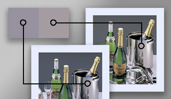
Greys optimised for a bluish substrate appear yellowish when previewed on a proofing device using an MR transformation.
However, the appearance of neutrals is more problematic. This is complicated by the use of papers high in OBAs, which can appear very bluish, and also causes their associated UV-included M1 colorimetry [40, p.5] to exhibit strong negative b∗ values.
Under these circumstances, the use of an adaptive grey balance to optimise the print’s neutrals, followed by an additional media relative transformation to a hard or soft copy proof, will have unintended consequences. In the case of a bluish paper colour, the neutrals optimised for the print will have a positive b∗ value when proofed to a more neutral proofing medium using the media relative transformation, appearing too yellowish in the proof. The creation of this mismatch in the appearance of neutral midtones is illustrated in Figure 11, with supporting colorimetry in Table IV.
Table IV.
Greys optimised for a chromatic substrate may appear non-optimal in a media-relative proof.
Bluish-white substrateSoftproof white point
LABXY ZXY ZLAB
94.750.00 − 7.3183.9187.0380.3596.42100.0082.49100.000.000.00
Greys throughout tonal range, optimised for bluish-white substrateGreys following an MR transform to softproof white point
LABXY ZXY ZLAB
76.490.00 − 3.4848.8850.6944.6156.1758.2445.8080.870.022.65
56.920.00 − 1.5023.9524.8421.2327.5228.5421.8060.380.003.34
37.550.00 − 0.629.499.848.2810.9011.318.5040.090.022.94
18.810.00 − 0.262.612.702.263.003.102.3220.450.142.02
It follows that, as an encoding space, print-referred colorimetry with a highly chromatic media white is not a good choice for preparing reference print images that are expected to be re-targeted to other substrates and print processes.
5.
Conclusions
The rendering of neutral colours to different substrates is a difficult issue for the printing industry, which is often tasked with re-targeting existing artwork to different printing processes and substrates. This study shows that a pixelwise adaptive approach (of varying the degree of adjustment to the substrate depending on the luminance or reflectance factor of each pixel) can give a better visual match than a standard media relative transformation.
A baseline function was established by adjusting a series of uniform grey patches presented with coloured borders of varying chroma and hue. The degree of adjustment D was found to be near linear to luminance, though extrapolation suggested observer adaptation was always incomplete, either to the chromaticity of the prevailing viewing conditions for darker greys or the chromaticity of the border for lighter greys.
Reproduction images were presented both with and without unprinted borders. Interestingly, there was little difference in observer response for these, suggesting that the substrate colour apparent in the image highlights and neutrals alone was enough to determine the degree of adjustment required to make an appearance match. In all cases the adaptive strategies made a significantly better visual match than the MR transformation, regardless of the presence or absence of the substrate coloured border.
A single optimal adaptive transformation was not established here, but results demonstrate a degree of image dependency. In particular, the availability of neutrals within an image, whether or not the image is colourful, and the spatial frequency of the image (small areas of detail rather than large uniform areas) will determine the optimal rendering.
Where a single transformation is used to convert an entire document which contains many images (such as a DeviceLink profile used to convert source-to-output files) a more generic transformation will be required.
Grey balance remains an important part of process control in printing. It is still valid to use substrate correction methods to better predict the aim values and available gamut on a particular paper. Controlling the C:M:Y ratio of ink that gives a predetermined neutral colour also helps maintain grey balance throughout a press run. However, the content of the print may benefit from a re-rendering to the output gamut in order to increase similarity and consistency with prints on other substrates.
5.1
Future Work
In this study reproduction images were compared side-by-side to a single reference. An interesting extension would be to assess sets of reproductions on mixed substrate colours, to determine whether the adaptive degree of adjustment creates greater consistency within the set.
Acknowledgment
The authors gratefully acknowledge the time, care and efforts of all the observers.
References
1Recommendation ITU-R BT. 709-6 Parameter values for the HDTV standards for production and international programme exchange. Geneva, Switzerland: International Telecommunication Union (ITU); 2015
2RevieW. C.KondoH.In search of Common Colour Appearance. International Commission on Illumination (CIE); 2015. CIE Reportership R8-13 Common Colour Appearance
3CIE TC8-16. Consistent Colour Appearance [Article]. Accessed: 2021. Available from: https://color.org/resources/consistentappearance.xalter
4ICC.1:2022 Image technology colour management—Architecture, profile format, and data structure. International Color Consortium; 2022. Available from: https://color.org/specification/ICC.1-2022-05.pdf
5HighG.GreenP.NussbaumP.2017Content-dependent adaptation in a soft proof matching experimentProc. IS&T Electronic Imaging: Color Imaging XXII: Displaying, Processing, Hardcopy, and Applications677567–75IS&TSpringfield, VA10.2352/ISSN.2470-1173.2017.18.COLOR-037
6ISO 12647-1:2013 Graphic technology — Process control for the production of halftone colour separations, proof and production prints — Part 1: Parameters and measurement methods. Geneva: International Organization for Standardization; 2013. Edition: 3rd
7ISO/TS 10128:2009 Graphic technology — Methods of adjustment of the colour reproduction of a printing system to match a set of characterization data. Geneva: International Organization for Standardization; 2009
8YuleJ. A. C.FieldG. G.Principles of Color Reproduction: Applied to Photomechanical Reproduction, Color Photography, and the Ink, Paper, and Other Related Industries20002nd ed.GATFPressPittsburgh, USA
9CGATS/IDEAlliance TR 015-2015: Graphic technology — Methodology for Establishing Printing Aims Based on a Shared Near-neutral Gray-scale. Reston, Virginia: NPES The Association for Suppliers of Printing, Publishing and Converting Technologies; 2015
10FairchildM. D.Color Appearance Models20133rd ed.John Wiley & SonsChichester, UK
11CalabriaA. J.FairchildM. D.2001Herding CATs: a comparison of linear chromatic-adaptation transforms for CIECAM97sProc. IS&T/SID Ninth Color Imaging Conf.174178174–8IS&TSpringfield, VA
12GreenP.HabibT.TominagaSSchettiniRTrémeauAHoriuchiT2019Chromatic Adaptation in Colour ManagementComputational Color Imaging: 7th Int’l. Workshop134144134–44Springer International PublishingChiba, Japan
13FairchildM. D.2020Von Kries 2020: evolution of degree of chromatic adaptationProc. IS&T CIC28: Twenty-Eighth Color and Imaging Conf.252257252–7IS&TSpringfield, VA10.2352/issn.2169-2629.2020.28.40
14HuntR. W. G.1970Objectives in colour reproductionJ. Photographic Sci.18205215205–1510.1080/00223638.1970.11737557
15BraunK. M.FairchildM. D.AlessiP. J.1996Viewing techniques for cross-media image comparisonsColor Res. Appl.216176–1710.1002/(SICI)1520-6378(199602)21:1%3C6::AID-COL1%3E3.0.CO;2-%23
16KatohN.1995Appearance match between soft copy and hard copy under mixed chromatic adaptationProc. IS&T/SID CIC3: Third Color Imaging Conf.222522–5IS&TSpringfield, VA
17GreenP. J.OtahalovaL.2003Determining visually achromatic colors on substrates with varying chromaticityProc. SPIE5008356364356–6410.1117/12.473233
18GreenP. J.OichermanB.2003Reproduction of colored images on substrates with varying chromaticityProc. SPIE52939110091–10010.1117/12.531667
19LuoM. R.GaoX. W.ScrivenerS. A. R.1995Quantifying colour appearance. Part V. Simultaneous contrastColor Res. Appl.20182818–2810.1002/col.5080200105
20ChungR.TianQ.Substrate Correction in ISO 12647 [Presentation]2010ISO/TC 130/WG3Sao Paulo, Brazil
21ISO 12647-2:2013 Graphic technology — Process control for the production of half-tone colour separations, proof and production prints – Part 2: Offset lithographic processes. Geneva: International Organization for Standardization; 2013
22CIE S 017/E:2020 ILV: International Lighting Vocabulary, 2nd Edition. International Commission on Illumination (CIE); 2020
23BalaR.2001What is the Chrominance of “Gray”?Proc. IS&T/SID CIC9: Ninth Color Imaging Conf.102107102–7IS&TSpringfield, VA
24BrunnerF.1987System brunner PCP picture contrast profile: image contrasts determine the acceptance of color tolerancesTAGA Proc.Vol. 1256263256–63TAGAWarrendale, PA
25FarnandS. P.2003Using Delta E metrics for measuring color variation in hard-copy pictorial imagesProc. SPIE5008109111109–11
26BaahK.GreenP.PointerM.2013Perceived acceptability of colour matching for changing substrate white pointProc. SPIE865286520Q
27ISO 3664:2009 Graphic technology and photography — Viewing conditions. Geneva: International Organization for Standardization; 2009
28ISO 12646:2015 Graphic technology — Displays for colour proofing – Characteristics. Geneva: International Organization for Standardization; 2015. Edition: 3rd
29ISO 14861:2015 Graphic technology — Requirements for colour soft proofing systems. Geneva: International Organization for Standardization; 2015. Edition: 1st
30CIE 156:2004 Guidelines for the evaluation of gamut mapping algorithms. Vienna, Austria: International Commission on Illumination (CIE); 2004. 156. ISBN: 978-3-901906-26-8
31CIE TC8-16. Consistent Colour Appearance — test images [Article]. Accessed: 2021. Available from: https://color.org/resources/r8-13/CCA_test.xalter
32HighG.GreenP.2021The impact of the Helmholtz-Kohlrausch effect on the appearance of near-white paper coloursProc. IS&T CIC29: Twenty-ninth Color and Imaging Conf.241246241–6IS&TSpringfield, VA10.2352/issn.2169-2629.2021.29.241
33ISO 12640-2:2004 Graphic technology — Prepress digital data exchange – Part 2: XYZ/sRGB encoded standard colour image data (XYZ/SCID). Geneva: International Organization for Standardization; 2004
34ISO 12640-4:2011 Graphic technology — Prepress digital data exchange – Part 4: Wide gamut display-referred standard colour image data [Adobe RGB (1998)/SCID]. Geneva: International Organization for Standardization; 2011
35NgoK. V.StorvikJ. J.DokkebergC. A.FarupI.PedersenM.2015QuickEval: a web application for psychometric scaling experimentsProc. SPIE9396212224212–24
36GreenP. J.A Colour Engineering Toolbox; 2004. Available from: https://color.org/resources/ColourEngineeringToolbox.xalter
37EngeldrumP. G.Psychometric Scaling: a Toolkit for Imaging Systems Development2000Imcotek PressWinchester, MA
38MorovicJ.To develop a universal gamut mapping algorithm”, Doctoral Thesis (University of Derby, UK, 1998)
39Fogra Extra No. 42. Munich, Germany: Fogra Research Institute for Media Technologies; 2021. 42. Available from: https://fogra.org/fileadmin/files/1_forschen/Digitaldruck/13.006_Textile-RGB/fogra-extra-42-en.pdf
40ISO 13655:2017 Graphic technology — Spectral measurement and colorimetric computation for graphic arts images. Geneva: International Organization for Standardization; 2017