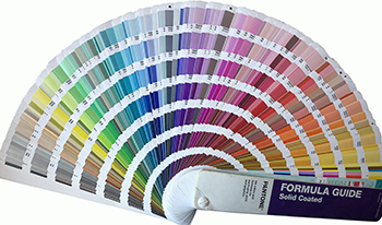
The Pantone® Formula Guide (or Guide), printed using specially-formulated inks on specified substrates, has been used widely by brands to specify brand color aims. While the Guide is silent on brand color tolerance, there are two competing criteria that influence the brand color tolerance, i.e., perceptibility and acceptability. Perceptibility-based color tolerance focuses on “Can I see the difference?” and the permissive difference is in the just-noticeable difference (JND) region. Acceptability-based color tolerance, focusing on “Can I accept the outcome?”, requires fit-for-use cases to identify what the just-acceptable difference (JAD) is. Instead of conducting psychometric tests, this research uses the 2019 Pantone® Formula (Coated) Guide, consisting of 2140 CIELAB colors, and data analyses of the “neighboring color difference” to investigate what is the acceptability-based color tolerance. The result shows that the acceptability-based color tolerance (3
Robert Y. Chung, Yan Liu, "Acceptability-based Brand Color Tolerance, A Case Study" in Journal of Imaging Science and Technology, 2022, pp 030509-1 - 030509-7, https://doi.org/10.2352/J.ImagingSci.Technol.2022.66.3.030509
 Find this author on Google Scholar
 Find this author on PubMed

