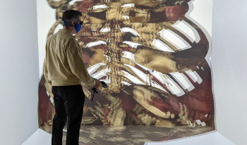
Virtual and augmented reality technologies have significantly advanced and come down in price during the last few years. These technologies can provide a great tool for highly interactive visualization approaches of a variety of data types. In addition, setting up and managing a virtual and augmented reality laboratory can be quite involved, particularly with large-screen display systems. Thus, this keynote presentation will outline some of the key elements to make this more manageable by discussing the frameworks and components needed to integrate the hardware and software into a more manageable package. Examples for visualizations and their applications using this environment will be discussed from a variety of disciplines to illustrate the versatility of the virtual and augmented reality environment available in the laboratories that are available to faculty and students to perform their research.
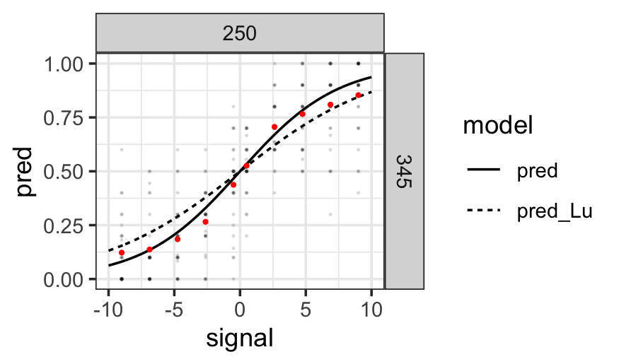
User experiments are essential for informing researchers what an audience is seeing in a chart. User experiments are generally quite expensive in monetary value and in the time spent getting data. It is crucial that we make the most out of the data we get from participants. Statistically, the best practice for data with repeated measurements is the use of (Generalized) Linear Mixed Effects Models (GLME). These models increase the statistical power, produce more reliable estimates, and provide better interpretability for population-level and individual-level effects. However, in the literature, a two-stage approach for analyzing results from user experiments is commonly used. We compare the two approaches with example data from psychophysics experiments. We present a strategy on how to evolve a two-stage analysis to a single GLME model and showcase diagnostics for each step of that process. We adhere to the best practices of open science and reproducible research by providing open access to all of our code and data.

Numerous studies of social media analytics (SMA) shed light upon interesting insights into the information flow in social media. As social media becomes a crucial part of human society, bridging and merging these studies could shape ideas and designs for real-world applications that allow more transparency and understanding of social media. Among several challenges of SMA, this paper focuses on two issues of 1) invasive and greedy analysis methods concerning user privacy, and 2) lack of comprehensive representations of analysis results. We use our analysis on Telegram data to propose that pursuing persona profiling using generalizing contextual analysis via Natural Language Processing (NLP) technologies could address the first problem. For the second problem, we propose to visualize the analysis results, i.e. persona profiles, to increase both comprehensibility and interpretability.
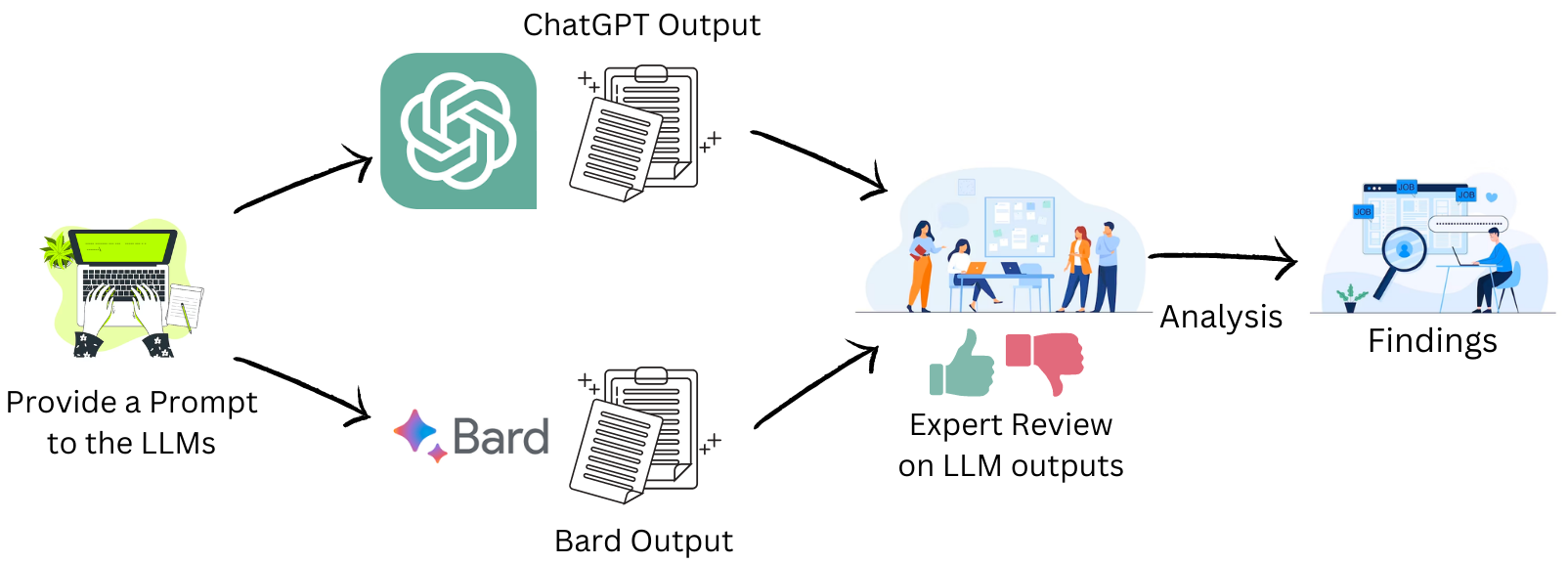
Large Language Models (LLMs) have demonstrated a huge impact on education and literacy in recent years. We evaluated the recommendations provided by two popular LLMs (OpenAI's ChatGPT and Google's Bard) to educate novices on the topic of Parallel Coordinate Plots (PCPs) using Bloom's taxonomy. We present the results of a human-expert evaluation of the recommendations provided by both the LLMs with experts from the visualization literacy field. Based on the analysis of the expert evaluation, we found that while both the LLMs provided some relevant and practical recommendations, some of the recommendations were either too difficult for novices or were in the wrong cognitive process (according to Bloom's taxonomy). In some cases, the hallucinations led to recommendations that were completely inapplicable to Parallel Coordinate Plots literacy.
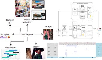
This study delves into the domain of mobile media planning applications and investigates advanced visualization and interaction modes within such an application. Media planning data is a collection of heterogeneous content (image/video/graphics, text, data analytics, logical expressions,...) that are aggregated, managed and displayed together. Consequently, ensuring the quality of experience for user interaction is challenging mainly in resources constraint environments, such as mobile devices. The paper reconsiders and extends an architecture we designed for media plan visualization, as to enrich its visualization and interactivity functionalities. The experiments correspond to objective assessments carried out on three anonymized real-life media planning databases. They show that the following beneficial features are granted: mobile data visualization solution for media planning, presenting all relevant information cohesively; the potential utilization of multiple technologies concurrently; ensuring ergonomic user interaction, regardless of the combination of technologies used to obtain the visualization solution.
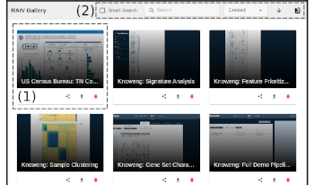
Web visualization dashboards are popular. We propose a system called RAIV that can capture and archive web visualizations into self-contained objects. RAIV also uses a client-server architecture to host and manage archived objects as online galleries, which users can use a standard web browser to experience without needing to install any additional software. RAIV supports intelligent search as well. When a search target has been found, RAIV can show the interaction path required to reach that target. We demonstrate RAIV’s capability using a genomics web visualization system called KnowEnG from NCSA and publicly available census data visualizations from US Census.

We present an interactive visualization tool to explore high-dimensional features of audiovisual data extracted from a video archive of live music performances. Our tool presents overviews of data features, similarities between song recordings, and details of the extracted visual and audio features. Features are extracted using neural networks, signal processing techniques, and audio analysis tools. Furthermore, we present a similarity metric to measure how different relevant recordings are compared to other videos. We illustrate our approach via use cases showing initial results to analyze song features, compare songs, identify outstanding songs, and detect song clusters.
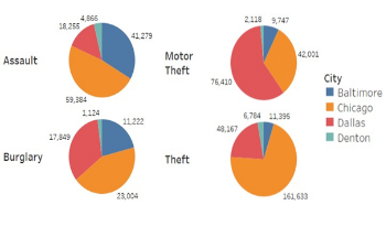
The rise in crime rates over the past few years is a major issue and is a huge source of worry for police departments and law enforcement organizations. Crime severely harms the lives of victims and the communities they live in many places throughout the world. It is an issue of public disturbance, and large cities often see criminal activity. Many studies, media, and websites include statistics on crime and it is contributing elements, such as population, unemployment, and poverty rate. This paper compares and visualizes the crime data for four different cities in the USA, namely Chicago, Baltimore, Dallas, and Denton. We assess areas that are significantly affected based on zip codes and variations in crime categories. As the crime rates have significantly changed both upward and downward throughout time, these changes are compared to their external causes such as population, unemployment, and poverty. The results show crime frequency and distribution across four different cities and supply valuable information about the complex relationship between social factors and criminal behavior. These results and outcomes will help the police department and law enforcement organizations better understand crime issues, map crime incidents onto a geographical map, and supply insight into factors affecting crime that will help them deploy resources and help in their decision-making process.