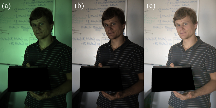
Color constancy algorithms play a crucial role in computer vision, and their performance needs to be accurately evaluated. However, recent years have seen scant systematic research on the correlation between human visual perception and objective distance measures for quantifying the performance of such algorithms. In this study, therefore, the authors systematically assessed the performance of 34 existing distance measures by psychophysical studies. Six classical color constancy algorithms and two recent algorithms were adopted to process over 110 images within 4 categories (Indoor, Human, Street, and Nature), and the influence of color space on the performance of distance measures was explored. Visual assessments obtained from 48 subjects were used to analyze the consistency between predictions of distance measures and human visual responses. It was found that the two most commonly used distance measures, the recovery angle error and the reproduction angle error in normalized RGB color space, exhibited high correlation with visual judgments, producing correlation coefficients of approximately 0.86. Meanwhile, significant performance variations among distance measures across different color spaces were also observed. Distance measures in uniform color spaces exhibited excellent consistency with human perception, yielding correlation coefficients of approximately 0.88. In addition, it was found that specific scenes also influenced the accuracy of distance measures. Our study highlights the importance of selecting appropriate color spaces for evaluating color constancy algorithms and offers more insights for the optimization of distance measures in the future.
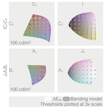
In perceptually uniform colour spaces, the perceptual differences in colour pairs are approximately the same as the Euclidean distance between them. Uniformity is of great importance in applications such as gamut mapping where the perceptual difference between original and mapped colour needs to be minimised. Ideally, in a perceptually uniform colour space, the locus of constant Just Noticeable Difference (JND) around different colour samples should be the unit sphere. While several perceptually uniform colour spaces for Standard Dynamic Range (SDR) and High Dynamic Range (HDR) have been proposed, there is not a standardized uniformity metric with respect to which we might judge whether one space is more uniform than another. In this paper, we propose and develop such a uniformity metric. Importantly, our approach takes into account changes in all three directions of a colour space including luminance and this is in contradistinction to prior art that focuses mainly on the colour signal (separate from luminance). The proposed metric can be based on any perceptual colour difference metric that models JNDs.
The Munsell dataset holds a prominent position in the field of color science. This dataset describes large color differences covering a wide color gamut, making it highly valuable for the development of color models. Currently, the widely used version is the Munsell Renotation, which is the second version of the dataset. In this paper, we analyze the third version, known as the Munsell Re-renotation, identify significant errors within it, and provide corrections for obvious typos. We propose a novel method for detecting nonuniformities, utilizing the L1-STRESS measure and the proLab uniform color space (UCS). Our findings demonstrate that the revised version of the Munsell Re-renotation dataset achieves significantly better consistency with established UCSs compared to the original Munsell Re-renotation data. Additionally, we discuss modifications of the STRESS measure for data with unknown scales. Unlike previous modifications, the proposed measure, STRESSgroup, is identical to the classic STRESS measure when the scales are the same.