
A collection of articles on remote research in cognition and perception using the Internet for the Journal of Perceptual Imaging is presented. Four original articles cover the topics of exact versus conceptual replication of cognitive effects (e.g., mental accounting), effects of facial cues on the perception of avatars, cultural influences on perceptual image and video quality assessment, and how Internet habits influence social cognition and social cognitive research. The essentials of these articles are summarized here, and their contributions are embedded within a wider view and historical perspective on remote research in cognition and perception using the Internet.
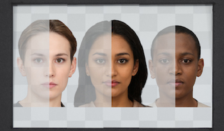
Augmented reality (AR) combines elements of the real world with additional virtual content, creating a blended viewing environment. Optical see-through AR (OST-AR) accomplishes this by using a transparent beam splitter to overlay virtual elements over a user’s view of the real world. However, the inherent see-through nature of OST-AR carries challenges for color appearance, especially around the appearance of darker and less chromatic objects. When displaying human faces—a promising application of AR technology—these challenges disproportionately affect darker skin tones, making them appear more transparent than lighter skin tones. Still, some transparency in the rendered object may not be entirely negative; people’s evaluations of transparency when interacting with other humans in AR-mediated modalities are not yet fully understood. In this work, two psychophysical experiments were conducted to assess how people evaluate OST-AR transparency across several characteristics including different skin tones, object types, lighting conditions, and display types. The results provide a scale of perceived transparency allowing comparisons to transparency for conventional emissive displays. The results also demonstrate how AR transparency impacts perceptions of object preference and fit within the environment. These results reveal several areas with need for further attention, particularly regarding darker skin tones, lighter ambient lighting, and displaying human faces more generally. This work may be useful in guiding the development of OST-AR technology, and emphasizes the importance of AR design goals, perception of human faces, and optimizing visual appearance in extended reality systems.

Augmented reality (AR) combines elements of the real world with additional virtual content, creating a blended viewing environment. Optical see-through AR (OST-AR) accomplishes this by using a transparent beam splitter to overlay virtual elements over a user’s view of the real world. However, the inherent see-through nature of OST-AR carries challenges for color appearance, especially around the appearance of darker and less chromatic objects. When displaying human faces—a promising application of AR technology—these challenges disproportionately affect darker skin tones, making them appear more transparent than lighter skin tones. Still, some transparency in the rendered object may not be entirely negative; people’s evaluations of transparency when interacting with other humans in AR-mediated modalities are not yet fully understood. In this work, two psychophysical experiments were conducted to assess how people evaluate OST-AR transparency across several characteristics including different skin tones, object types, lighting conditions, and display types. The results provide a scale of perceived transparency allowing comparisons to transparency for conventional emissive displays. The results also demonstrate how AR transparency impacts perceptions of object preference and fit within the environment. These results reveal several areas with need for further attention, particularly regarding darker skin tones, lighter ambient lighting, and displaying human faces more generally. This work may be useful in guiding the development of OST-AR technology, and emphasizes the importance of AR design goals, perception of human faces, and optimizing visual appearance in extended reality systems.


Whether two stimuli appear to be of different colors depends on a host of factors, ranging from the observer, via viewing conditions to content and context. Previously, studies have explored just noticeable difference thresholds for uniform colors viewed with or without spatial separation, for complex images and for fine features like lines in architectural drawings. An important case that has not been characterized to date is that of continuous color transitions, such as those obtained when selecting two colors and generating a sequence of intermediate colors between them. Such transitions are often part of natural scenes (e.g., sunsets, the sky, curved surfaces, soft shadows, etc.) and are also commonly used in visual design, including for backgrounds and various graphical elements. Where the just noticeable difference lies in this case will be explored here by way of a small-scale, pilot experiment, conducted in an uncontrolled, on-line way. Its results suggest a threshold in the region of 0.5 to 0.8 ΔE2000 for the few stimuli evaluated in the pilot experiment reported here and indicate a behavior that is in the region of viewing solid colors without a gap. A pilot verification with complex images also showed thresholds with a comparable range.
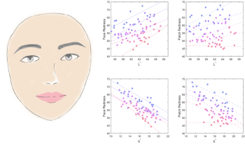
Facial redness is an important perceptual attribute that receives many concerns from application fields such as dermatology and cosmetics. Existing studies have commonly used the average CIELAB a* value of the facial skin area to represent the overall facial redness. Yet, the perception of facial redness has never been precisely examined. This research was designed to quantify the perception of facial redness and meanwhile investigate the perceptual difference between the faces and the uniform patches. Eighty images of real human faces and uniform skin colour patches were scaled in terms of their perceived redness by a panel of observers. The results showed that the CIELAB a* was not a good predictor of facial redness since the perceived redness was also affected by the L* and b* values. A new index, RIS was developed to accurately quantify the perception of facial skin redness, which promised a much higher accuracy (R2 = 0.874) than the a* value (R2 = 0.461). The perceptual differenc between facial redness and patch redness was also discussed.
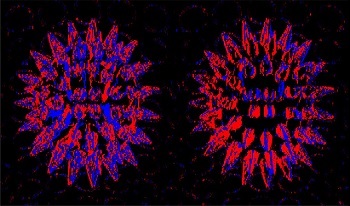
The visual mechanisms behind our ability to distinguish translucent and opaque materials is not fully understood. Disentanglement of the contributions of surface reflectance and subsurface light transport to the still image structure is an ill-posed problem. While the overwhelming majority of the works addressing translucency perception use static stimuli, behavioral studies show that human observers tend to move objects to assess their translucency. Therefore, we hypothesize that translucent objects appear more translucent and less opaque when observed in motion than when shown as still images. In this manuscript, we report two psychophysical experiments that we conducted using static and dynamic visual stimuli to investigate how motion affects perceived translucency.

Advancements in sensing, computing, image processing, and computer vision technologies are enabling unprecedented growth and interest in autonomous vehicles and intelligent machines, from self-driving cars to unmanned drones, to personal service robots. These new capabilities have the potential to fundamentally change the way people live, work, commute, and connect with each other, and will undoubtedly provoke entirely new applications and commercial opportunities for generations to come. The main focus of AVM is perception. This begins with sensing. While imaging continues to be an essential emphasis in all EI conferences, AVM also embraces other sensing modalities important to autonomous navigation, including radar, LiDAR, and time of flight. Realization of autonomous systems also includes purpose-built processors, e.g., ISPs, vision processors, DNN accelerators, as well core image processing and computer vision algorithms, system design and architecture, simulation, and image/video quality. AVM topics are at the intersection of these multi-disciplinary areas. AVM is the Perception Conference that bridges the imaging and vision communities, connecting the dots for the entire software and hardware stack for perception, helping people design globally optimized algorithms, processors, and systems for intelligent “eyes” for vehicles and machines.

Accurate models of the electroretinogram are important both for understanding the multifold processes of light transduction to ecologically useful signals by the retina, but also its diagnostic capabilities for the identification of the array of retinal diseases. The present neuroanalytic model of the human rod ERG is elaborated from the same general principles as that of Hood & Birch (1992), but incorporates the more recent understanding of the early stages of ERG generation by Robson & Frishman (2014). As a result, it provides a significantly better match in six different waveform features of the canonical ERG flash intensity series than previous models of rod responses.

During these past years, international COVID data have been collected by several reputable organizations and made available to the worldwide community. This has resulted in a wellspring of different visualizations. Many different measures can be selected (e.g., cases, deaths, hospitalizations). And for each measure, designers and policy makers can make a myriad of different choices of how to represent the data. Data from individual countries may be presented on linear or log scales, daily, weekly, or cumulative, alone or in the context of other countries, scaled to a common grid, or scaled to their own range, raw or per capita, etc. It is well known that the data representation can influence the interpretation of data. But, what visual features in these different representations affect our judgments? To explore this idea, we conducted an experiment where we asked participants to look at time-series data plots and assess how safe they would feel if they were traveling to one of the countries represented, and how confident they are of their judgment. Observers rated 48 visualizations of the same data, rendered differently along 6 controlled dimensions. Our initial results provide insight into how characteristics of the visual representation affect human judgments of time series data. We also discuss how these results could impact how public policy and news organizations choose to represent data to the public.