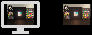
Reference-white placement is a central issue in HDR rendering because it determines the viewer’s adaptation state and strongly influences perceived color appearance. In HDR scenes that contain both reflective surfaces and bright emissive elements, it remains unclear how diffuse white should be placed on the display and how highlights should be tone mapped to preserve appearance. In this work, we investigate how reference-white placement and highlight tone mapping affect the perceptual reproduction of emissive colors in HDR scenes. To address this question, we captured a controlled HDR scene containing both reflective and emissive color targets and rendered it on a professional HDR display using different rendering strategies. These included varying the displayed diffuse-white luminance and comparing global tone mapping with selective processing of emissive regions. Due to scene complexities and the absence of standard color-difference metrics designed for such applications, our work relies on perceptual assessments. Observers viewed the real scene and then evaluated the display renderings in terms of appearance-based criteria. The results show that reference-white placement and tone-mapping strategy jointly influence perceived image quality and color appearance. In particular, the initial findings suggest that separately processing reflective and emissive regions—preserving colorimetric reproduction for reflective areas while compressing emissive highlights—produces the most favorable overall renderings.