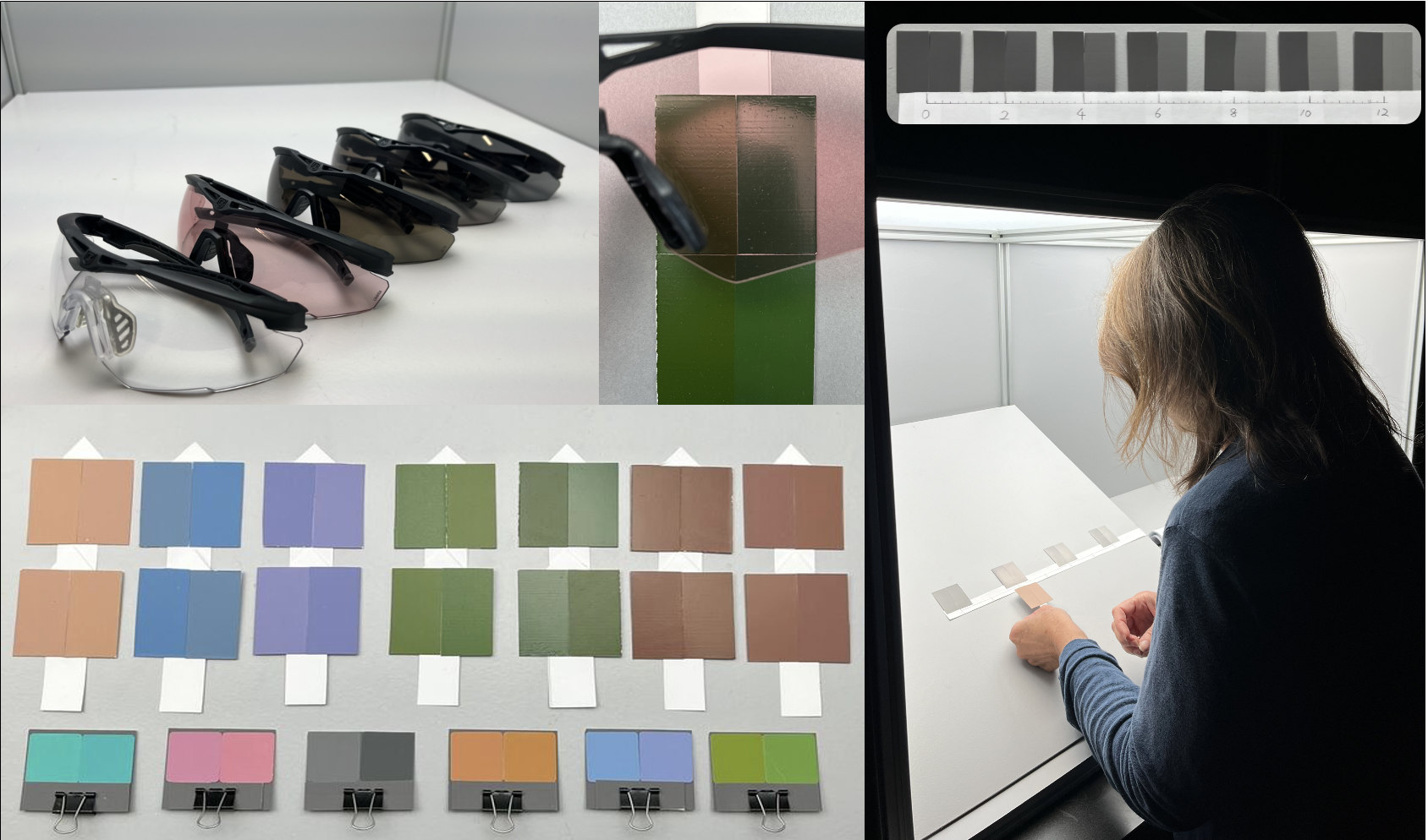
Tinted eyewear is increasingly utilized in outdoor environments to protect against ultraviolet radiation and manage luminance levels reaching the human visual system. While these protective functions are well-established, these modifications can also affect color perception. This research investigates how different tinted eyewear affects observers’ ability to distinguish small color differences in reflective samples, with implications for understanding how specific eyewear transmittance properties influence color discrimination ability in different environments. Two sets of stimuli are used: (1) six adjacent Munsell sample pairs varying only in hue, and (2) seven parameric pairs generated through Kubelka-Munk theory modeling of 16 pigments. Six eyewear with different transmittance properties were examined in this study under normalized lighting conditions. Color differences (ΔE2000) were predicted using spectral data and validated through psychophysical experiments with 27 observers using a scaling method. Results demonstrate that tinted eyewear can alter color discrimination ability compared to neutral eyewear, with effects varying based on the interaction between the eyewear’s spectral transmittance and the stimuli’s spectral reflectance. For example, one foliage pair showed a ΔE2000 of 2.37 under neutral eyewear that increased to 5.21 under a tinted eyewear, with corresponding mean observed visual differences of 2.79 and 5.51, respectively. Overall, the observed color difference evaluations aligned with predictions, with correlation coefficients (r) of 0.816. This research enhances the understanding of how tinted eyewear affects color perception and supports the development of eyewear optimized for specific outdoor environments.

Color accuracy is essential in digital imaging for Cultural Heritage when reproducing an object into digital format. As a practitioner in the field, curiosity rose as to what the long-term effects are of working in a low-light environment after chronic fatigue and strained eyes became the daily norm. Multiple literatures were reviewed to extract the groundwork of color vision in low light and what achieves proper and consistent information processing; however, there were no known specific studies for the impetus for this topic. This research aims to explore color vision in low light to recognize potential short- and long-term physiological vision changes. Studies uncovered multiple variables impact human vision when processing an image or scene. This paper investigates the structure of the eye by comparing human vision to the structure of a camera system, the processing of color in the retina, the recommended viewing environment for cultural heritage capture, different conditions that impact perception, and solutions for regular eye maintenance. As is often said, awareness is the first step to prevention.

It is necessary to avoid using of confusion colors of dichromats in order to mediate information defined by color in visual materials to anyone. Such a color design method is called color universal design. Dichromatic simulators have been widely used for the color universal design. Recently, a new color universal design method without a dichromatic simulator has been proposed. Yoshitake et al. made a color sample set for the new color universal design method by the Natural Color System chips containing 1948 colors. We designed a campus map using their sample set in a campus barrierfree design project at Kyushu University. We show the results of the Kyushu University barrier-free design project.